Forum Discussion
erdinch
Helper I
6 years agoWeekly graph data and YTD data in one chart
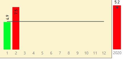
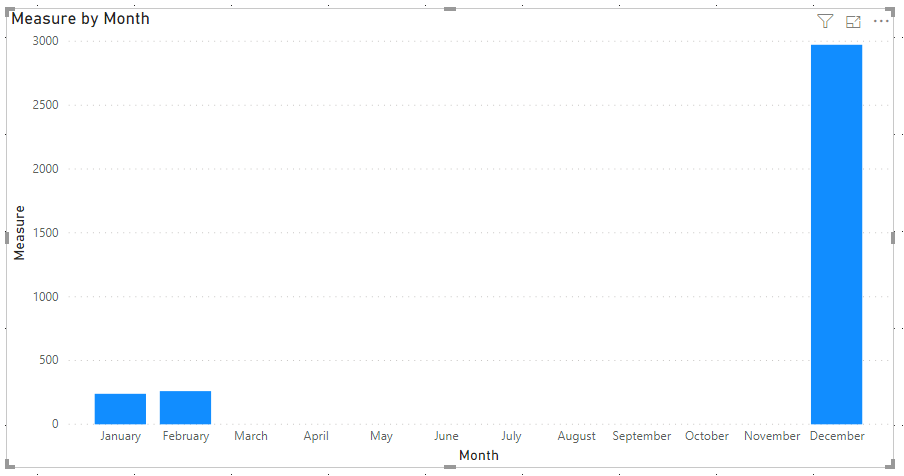
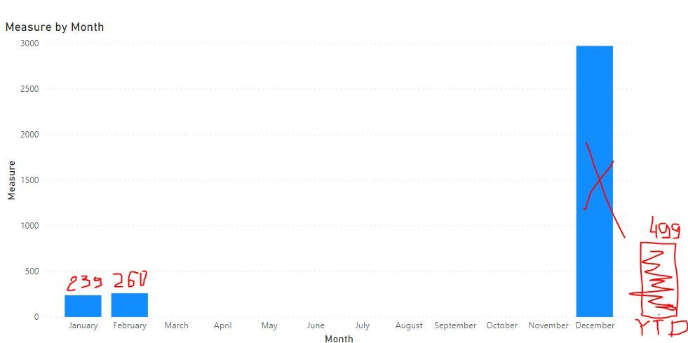
Hello, I am having one monthly measure refelected in bar chart and target shown as line. That measure1 is calculated based on data in table1. at the end of the same graph I would like to have Year...
- 6 years ago
Hi,
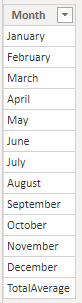
Please try to create a new table by Enter Data:
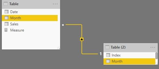
Create the relationship with original table by one-to-many:
Then create a measure:
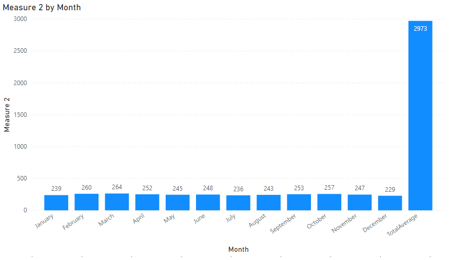
Measure 2 = IF(MAX('Table (2)'[Month])="TotalAverage",CALCULATE(SUM('Table'[Sales]),ALLSELECTED('Table')),SUM('Table'[Sales]))Choose the new table's [Month] and this measure as clustered column chart.
If you want to sort Month from 'January' to 'December', please add an index column in Query Editor.
After Apply&Close, sort [Month] by [Index], the result shows:
Here is my test pbix file:
Hope this helps.
Best Regards,
Giotto Zhi
amitchandak
Super User
6 years agoNot a direct way I am away of, But you can try a new table using summarize and do it
new table = union(summarize(table,table[Month],"Value",sum(table[Value])),summarize(table,table[Month],"Value",[YTD Value]))
Assumed you have ytd formula outside
Use this to display that chart