FabCon is coming to Atlanta
Join us at FabCon Atlanta from March 16 - 20, 2026, for the ultimate Fabric, Power BI, AI and SQL community-led event. Save $200 with code FABCOMM.
Register now!- Power BI forums
- Get Help with Power BI
- Desktop
- Service
- Report Server
- Power Query
- Mobile Apps
- Developer
- DAX Commands and Tips
- Custom Visuals Development Discussion
- Health and Life Sciences
- Power BI Spanish forums
- Translated Spanish Desktop
- Training and Consulting
- Instructor Led Training
- Dashboard in a Day for Women, by Women
- Galleries
- Data Stories Gallery
- Themes Gallery
- Contests Gallery
- QuickViz Gallery
- Quick Measures Gallery
- Visual Calculations Gallery
- Notebook Gallery
- Translytical Task Flow Gallery
- TMDL Gallery
- R Script Showcase
- Webinars and Video Gallery
- Ideas
- Custom Visuals Ideas (read-only)
- Issues
- Issues
- Events
- Upcoming Events
The Power BI Data Visualization World Championships is back! Get ahead of the game and start preparing now! Learn more
- Power BI forums
- Forums
- Get Help with Power BI
- Desktop
- Waterfall Chart only Showing Augments and not Decr...
- Subscribe to RSS Feed
- Mark Topic as New
- Mark Topic as Read
- Float this Topic for Current User
- Bookmark
- Subscribe
- Printer Friendly Page
- Mark as New
- Bookmark
- Subscribe
- Mute
- Subscribe to RSS Feed
- Permalink
- Report Inappropriate Content
Waterfall Chart only Showing Augments and not Decrease maybe because how my data is modeled?
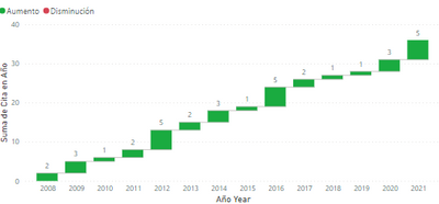
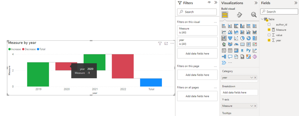
I have problem with how i should model my data for the waterfall chart, which has information of different people showing how many citations they have gained over the years. In the chart it shows the values of each year but it only does in increment.
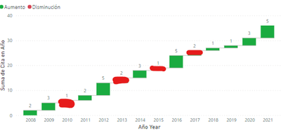
And i need it to kinda look like this.
Heres a sample of how the data looks
Should i somehow make a Measure that calculates the difference of the previous year and put it as a breakdown or just remodel my table to fit more the waterfall chart.
Solved! Go to Solution.
- Mark as New
- Bookmark
- Subscribe
- Mute
- Subscribe to RSS Feed
- Permalink
- Report Inappropriate Content
Hi @Pas58 ,
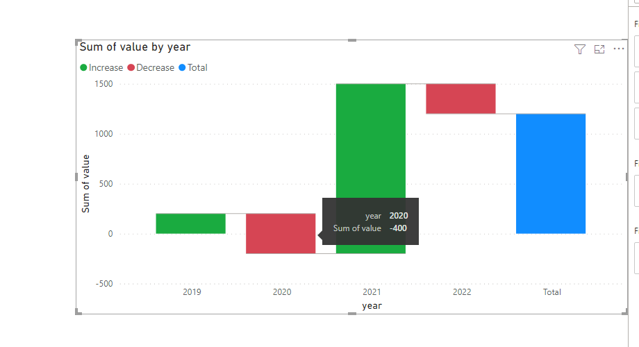
When the value of y-axis is negative, it will show decrease.
Therefore, you need to place your current value on the y axis to compare the change amount of the previous value, if the amount of change is negative, then it will show a decrease and turn red.
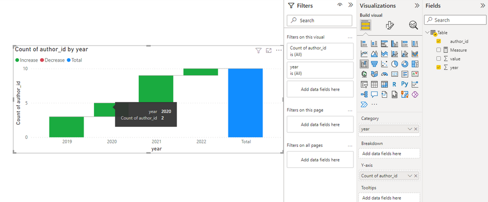
For example, putting the count of id will not show an increase or decrease effect, you need to create a measure to get the difference.
Measure = COUNT('Table'[author_id])-CALCULATE(COUNT('Table'[author_id]),FILTER(ALLSELECTED('Table'),[year]=MAX('Table'[year])-1))
Best Regards,
Stephen Tao
If this post helps, then please consider Accept it as the solution to help the other members find it more quickly.
- Mark as New
- Bookmark
- Subscribe
- Mute
- Subscribe to RSS Feed
- Permalink
- Report Inappropriate Content
It wasn't exactly the solution but with your insight and explanation of how the waterfall chart works i was able to resolve my problem, thanks!
Still new to PowerBI.
Helpful resources

Power BI Dataviz World Championships
The Power BI Data Visualization World Championships is back! Get ahead of the game and start preparing now!

| User | Count |
|---|---|
| 41 | |
| 38 | |
| 36 | |
| 31 | |
| 28 |
| User | Count |
|---|---|
| 129 | |
| 88 | |
| 79 | |
| 68 | |
| 63 |
