- Power BI forums
- Updates
- News & Announcements
- Get Help with Power BI
- Desktop
- Service
- Report Server
- Power Query
- Mobile Apps
- Developer
- DAX Commands and Tips
- Custom Visuals Development Discussion
- Health and Life Sciences
- Power BI Spanish forums
- Translated Spanish Desktop
- Power Platform Integration - Better Together!
- Power Platform Integrations (Read-only)
- Power Platform and Dynamics 365 Integrations (Read-only)
- Training and Consulting
- Instructor Led Training
- Dashboard in a Day for Women, by Women
- Galleries
- Community Connections & How-To Videos
- COVID-19 Data Stories Gallery
- Themes Gallery
- Data Stories Gallery
- R Script Showcase
- Webinars and Video Gallery
- Quick Measures Gallery
- 2021 MSBizAppsSummit Gallery
- 2020 MSBizAppsSummit Gallery
- 2019 MSBizAppsSummit Gallery
- Events
- Ideas
- Custom Visuals Ideas
- Issues
- Issues
- Events
- Upcoming Events
- Community Blog
- Power BI Community Blog
- Custom Visuals Community Blog
- Community Support
- Community Accounts & Registration
- Using the Community
- Community Feedback
Register now to learn Fabric in free live sessions led by the best Microsoft experts. From Apr 16 to May 9, in English and Spanish.
- Power BI forums
- Forums
- Get Help with Power BI
- Desktop
- Visualize time period that documents are active in...
- Subscribe to RSS Feed
- Mark Topic as New
- Mark Topic as Read
- Float this Topic for Current User
- Bookmark
- Subscribe
- Printer Friendly Page
- Mark as New
- Bookmark
- Subscribe
- Mute
- Subscribe to RSS Feed
- Permalink
- Report Inappropriate Content
Visualize time period that documents are active in bar chart.
Hello, I have a dataset with documents that are currently being updated. The team needs to visualize the time period where they are the busiest by showing counts of active documents within specific time periods based on Planned Start Date and Planned Completion Date. In the below example for these three documents. I would like the chart to show a count of 1 document active in the month of August 2022, and 3 documents active from Sepetember 2022 - December 2022. I would like this to work for the hundreds of documents that are currently in the pipeline but this is a small sample of what I would like to achieve. Once this is done I would also like to bring the document type field into the legend. I would also like them to be able to drill up to Quarter or year and still have it only reflect the same numbers. Correct numbers for Q3 2022 would be 3 and Q4 2022 would be 3.
- Mark as New
- Bookmark
- Subscribe
- Mute
- Subscribe to RSS Feed
- Permalink
- Report Inappropriate Content
Hi Yes, here is a sample dataset. I will follow this up with some sample outputs and charts that I am hoping to achieve.
Sample Dataset
| Index | Document Title | Document Type | Planned Start Date | Planned Completion Date |
| 1 | Sample Title 1 | DOC | 1/1/2022 | 4/1/2022 |
| 2 | Sample Title 2 | POL | 3/3/2022 | 6/1/2022 |
| 3 | Sample Title 3 | WI | 5/2/2022 | 7/31/2022 |
| 4 | Sample Title 4 | POL | 8/1/2022 | 10/30/2022 |
| 5 | Sample Title 5 | SOP | 11/25/2022 | 2/23/2023 |
| 6 | Sample Title 6 | WI | 12/1/2022 | 3/1/2023 |
| 7 | Sample Title 7 | POL | 1/1/2023 | 1/31/2023 |
| 8 | Sample Title 8 | DEV | 2/5/2023 | 3/20/2023 |
| 9 | Sample Title 9 | SOP | 6/1/2022 | 8/30/2022 |
| 10 | Sample Title 10 | FRM | 4/1/2022 | 6/30/2022 |
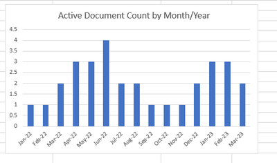
Sample Monthly Active Doc Count Output Example.
| Index | Document Title | Document Type | Jan-22 | Feb-22 | Mar-22 | Apr-22 | May-22 | Jun-22 | Jul-22 | Aug-22 | Sep-22 | Oct-22 | Nov-22 | Dec-22 | Jan-23 | Feb-23 | Mar-23 |
| 1 | Sample Title 1 | DOC | 1 | 1 | 1 | 1 | 0 | 0 | 0 | 0 | 0 | 0 | 0 | 0 | 0 | 0 | 0 |
| 2 | Sample Title 2 | POL | 0 | 0 | 1 | 1 | 1 | 1 | 0 | 0 | 0 | 0 | 0 | 0 | 0 | 0 | 0 |
| 3 | Sample Title 3 | WI | 0 | 0 | 0 | 0 | 1 | 1 | 1 | 0 | 0 | 0 | 0 | 0 | 0 | 0 | 0 |
| 4 | Sample Title 4 | POL | 0 | 0 | 0 | 0 | 0 | 0 | 0 | 1 | 1 | 1 | 0 | 0 | 0 | 0 | 0 |
| 5 | Sample Title 5 | SOP | 0 | 0 | 0 | 0 | 0 | 0 | 0 | 0 | 0 | 0 | 1 | 1 | 1 | 1 | |
| 6 | Sample Title 6 | WI | 0 | 0 | 0 | 0 | 0 | 0 | 0 | 0 | 0 | 0 | 0 | 1 | 1 | 1 | 1 |
| 7 | Sample Title 7 | POL | 0 | 0 | 0 | 0 | 0 | 0 | 0 | 0 | 0 | 0 | 0 | 0 | 1 | 0 | 0 |
| 8 | Sample Title 8 | DEV | 0 | 0 | 0 | 0 | 0 | 0 | 0 | 0 | 0 | 0 | 0 | 0 | 0 | 1 | 1 |
| 9 | Sample Title 9 | SOP | 0 | 0 | 0 | 0 | 0 | 1 | 1 | 1 | 0 | 0 | 0 | 0 | 0 | 0 | 0 |
| 10 | Sample Title 10 | FRM | 0 | 0 | 0 | 1 | 1 | 1 | 0 | 0 | 0 | 0 | 0 | 0 | 0 | 0 | 0 |
| Active Doc Total | 1 | 1 | 2 | 3 | 3 | 4 | 2 | 2 | 1 | 1 | 1 | 2 | 3 | 3 | 2 |
Sample Chart based on calculation: (I would also like to be able to drop Doc Type into the Legend)
Sample Qtr/Year Calc
| Index | Document Title | Q1 2022 | Q2 2022 | Q3 2022 | Q4 2022 | Q1 2023 |
| 1 | Sample Title 1 | 1 | 1 | 0 | 0 | 0 |
| 2 | Sample Title 2 | 1 | 1 | 0 | 0 | |
| 3 | Sample Title 3 | 0 | 1 | 1 | 0 | 0 |
| 4 | Sample Title 4 | 0 | 0 | 1 | 1 | 0 |
| 5 | Sample Title 5 | 0 | 0 | 0 | 1 | 1 |
| 6 | Sample Title 6 | 0 | 0 | 0 | 1 | 1 |
| 7 | Sample Title 7 | 0 | 0 | 0 | 0 | 1 |
| 8 | Sample Title 8 | 0 | 0 | 0 | 0 | 1 |
| 9 | Sample Title 9 | 0 | 1 | 1 | 0 | 0 |
| 10 | Sample Title 10 | 0 | 1 | 0 | 0 | 0 |
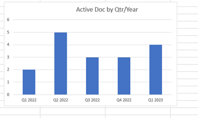
| Example Result | Active Docs by Quarter | 2 | 5 | 3 | 3 | 4 |
Sample Chart for Qtr/Year
- Mark as New
- Bookmark
- Subscribe
- Mute
- Subscribe to RSS Feed
- Permalink
- Report Inappropriate Content
Hi @Anonymous ,
Can you provide the relevant test data and screenshots with a description so that I can answer you as soon as possible?
Looking forward to your reply.
Best Regards,
Henry
Helpful resources

Microsoft Fabric Learn Together
Covering the world! 9:00-10:30 AM Sydney, 4:00-5:30 PM CET (Paris/Berlin), 7:00-8:30 PM Mexico City

Power BI Monthly Update - April 2024
Check out the April 2024 Power BI update to learn about new features.

| User | Count |
|---|---|
| 96 | |
| 95 | |
| 82 | |
| 71 | |
| 64 |
| User | Count |
|---|---|
| 115 | |
| 105 | |
| 95 | |
| 79 | |
| 72 |


