Fabric Data Days starts November 4th!
Advance your Data & AI career with 50 days of live learning, dataviz contests, hands-on challenges, study groups & certifications and more!
Get registered- Power BI forums
- Get Help with Power BI
- Desktop
- Service
- Report Server
- Power Query
- Mobile Apps
- Developer
- DAX Commands and Tips
- Custom Visuals Development Discussion
- Health and Life Sciences
- Power BI Spanish forums
- Translated Spanish Desktop
- Training and Consulting
- Instructor Led Training
- Dashboard in a Day for Women, by Women
- Galleries
- Data Stories Gallery
- Themes Gallery
- Contests Gallery
- Quick Measures Gallery
- Visual Calculations Gallery
- Notebook Gallery
- Translytical Task Flow Gallery
- TMDL Gallery
- R Script Showcase
- Webinars and Video Gallery
- Ideas
- Custom Visuals Ideas (read-only)
- Issues
- Issues
- Events
- Upcoming Events
Get Fabric Certified for FREE during Fabric Data Days. Don't miss your chance! Learn more
- Power BI forums
- Forums
- Get Help with Power BI
- Desktop
- Re: Visual displays the variation between 2 months
- Subscribe to RSS Feed
- Mark Topic as New
- Mark Topic as Read
- Float this Topic for Current User
- Bookmark
- Subscribe
- Printer Friendly Page
- Mark as New
- Bookmark
- Subscribe
- Mute
- Subscribe to RSS Feed
- Permalink
- Report Inappropriate Content
Visual displays the variation between 2 months
Hi team,
I'm looking for a visual to display the variation of a measure between the current month and the last month.
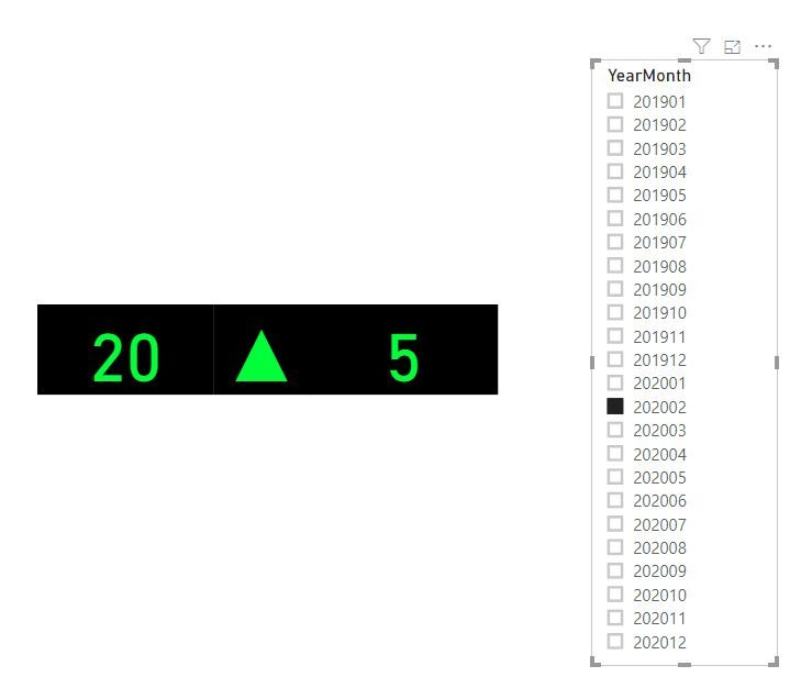
Something like this
The visual will display in red color if the measure in the last month is bigger than in the current month . It would be green if the opposite is true.
Do you have a link or a visual that I can import in my PIBX ?
Thank you guys !
Solved! Go to Solution.
- Mark as New
- Bookmark
- Subscribe
- Mute
- Subscribe to RSS Feed
- Permalink
- Report Inappropriate Content
hi @Anonymous
You could get it by use three card visual to custom it.
Create four measure as below:
current month = CALCULATE(SUM('Table'[Value]))

last month = CALCULATE(SUM('Table'[Value]),PREVIOUSMONTH('Date'[Date]))

variation = [current month]-[last month]
Icon =
VAR theIndicator = [variation]
RETURN
SWITCH (
TRUE(),
theIndicator >=0, UNICHAR(9650),
theIndicator <0, UNICHAR(9660)
)Drag [Current month], [variation], and [Icon] to three card visual.
Now, in format pane, remove Category and set background is back.
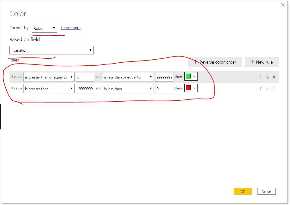
Then set conditional format for these three cards by the same logic for data label.
Next, resize and position for three card visual to get your requirement.
here is sample pbix file, please try it.
Regards,
Lin
If this post helps, then please consider Accept it as the solution to help the other members find it more quickly.
- Mark as New
- Bookmark
- Subscribe
- Mute
- Subscribe to RSS Feed
- Permalink
- Report Inappropriate Content
Thank you so much for your help, I really appreciated it and learnt something new.
Have a good day !
- Mark as New
- Bookmark
- Subscribe
- Mute
- Subscribe to RSS Feed
- Permalink
- Report Inappropriate Content
- Mark as New
- Bookmark
- Subscribe
- Mute
- Subscribe to RSS Feed
- Permalink
- Report Inappropriate Content
@@amitchand
It is close to what I'm looking for but it doesn't work in my case because I would like to compare the current month to the last month and this KPI display 2 measures calculated in the same periode of time , by example the sales vs the target for each month.
Do you have something else ?
- Mark as New
- Bookmark
- Subscribe
- Mute
- Subscribe to RSS Feed
- Permalink
- Report Inappropriate Content
Try Group visual. I think using image display you should be able to add that arrow
https://powerbi.microsoft.com/en-us/blog/power-bi-desktop-august-2019-feature-summary/#grouping
Group 2-3 cards
Also refer : https://community.powerbi.com/t5/Desktop/FORMAT-icon-set-for-use-in-a-data-card/td-p/811692
- Mark as New
- Bookmark
- Subscribe
- Mute
- Subscribe to RSS Feed
- Permalink
- Report Inappropriate Content
@Anonymous
Build something very near to you want. You need have the arrow in middle. Arrow code and arrow color code
/////Arrow
Arrow =
var _change =[Net Sales YTD]-[Net Sales LYTD]
return
SWITCH (
            TRUE(),
            _change > 0, UNICHAR(9650),
            _change = 0, UNICHAR(9654),
            _change < 0, UNICHAR(9660)
            )


/////Arrow Color
Arrow color =
var _change =[Net Sales YTD]-[Net Sales LYTD]
return
SWITCH (
            TRUE(),
            _change > 0, "green",
            _change = 0, "blue",
            _change < 0, "red"
            )
Link I have given in last update. The difference in conditional formatting I used field option and choose the measure
You can play with background-color etc
Helpful resources

Fabric Data Days
Advance your Data & AI career with 50 days of live learning, contests, hands-on challenges, study groups & certifications and more!

Power BI Monthly Update - October 2025
Check out the October 2025 Power BI update to learn about new features.


