- Subscribe to RSS Feed
- Mark Topic as New
- Mark Topic as Read
- Float this Topic for Current User
- Bookmark
- Subscribe
- Printer Friendly Page
- Mark as New
- Bookmark
- Subscribe
- Mute
- Subscribe to RSS Feed
- Permalink
- Report Inappropriate Content

Vertical Line on Line Chart (photo attached)
Hello everyone, I have this set of data, where for each month I have a medium value and a median value. I want to trace a vertical line connecting those two values for each month.
Is it possible to do? And if so, how?
Thank you
Solved! Go to Solution.
- Mark as New
- Bookmark
- Subscribe
- Mute
- Subscribe to RSS Feed
- Permalink
- Report Inappropriate Content

Hi @Anonymous ,
You can use feature called Error Bars. This feature is not available in all visuals, but for instance line chart contains it (In my example I removed lines in line chart and kept only connections).
You need to go to analytics of the visual:
Enable this feature.
Set up what should be your lower/upper border.
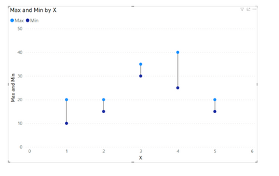
Final outcome will look like this:
If my answer was helpful please give me a Kudos or even accept as a Solution.
Let's connect on LinkedIn!
- Mark as New
- Bookmark
- Subscribe
- Mute
- Subscribe to RSS Feed
- Permalink
- Report Inappropriate Content

Hi @Anonymous ,
You can use feature called Error Bars. This feature is not available in all visuals, but for instance line chart contains it (In my example I removed lines in line chart and kept only connections).
You need to go to analytics of the visual:
Enable this feature.
Set up what should be your lower/upper border.
Final outcome will look like this:
If my answer was helpful please give me a Kudos or even accept as a Solution.
Let's connect on LinkedIn!
Helpful resources
| Subject | Author | Posted | |
|---|---|---|---|
| 12-24-2024 11:19 PM | |||
| 08-22-2024 12:04 PM | |||
| 11-11-2024 04:52 AM | |||
| 08-11-2022 07:25 AM | |||
| 01-13-2025 08:20 AM |
| User | Count |
|---|---|
| 128 | |
| 100 | |
| 85 | |
| 53 | |
| 46 |


