- Power BI forums
- Updates
- News & Announcements
- Get Help with Power BI
- Desktop
- Service
- Report Server
- Power Query
- Mobile Apps
- Developer
- DAX Commands and Tips
- Custom Visuals Development Discussion
- Health and Life Sciences
- Power BI Spanish forums
- Translated Spanish Desktop
- Power Platform Integration - Better Together!
- Power Platform Integrations (Read-only)
- Power Platform and Dynamics 365 Integrations (Read-only)
- Training and Consulting
- Instructor Led Training
- Dashboard in a Day for Women, by Women
- Galleries
- Community Connections & How-To Videos
- COVID-19 Data Stories Gallery
- Themes Gallery
- Data Stories Gallery
- R Script Showcase
- Webinars and Video Gallery
- Quick Measures Gallery
- 2021 MSBizAppsSummit Gallery
- 2020 MSBizAppsSummit Gallery
- 2019 MSBizAppsSummit Gallery
- Events
- Ideas
- Custom Visuals Ideas
- Issues
- Issues
- Events
- Upcoming Events
- Community Blog
- Power BI Community Blog
- Custom Visuals Community Blog
- Community Support
- Community Accounts & Registration
- Using the Community
- Community Feedback
Register now to learn Fabric in free live sessions led by the best Microsoft experts. From Apr 16 to May 9, in English and Spanish.
- Power BI forums
- Forums
- Get Help with Power BI
- Desktop
- Re: *URGENT* - Dual axis chart
- Subscribe to RSS Feed
- Mark Topic as New
- Mark Topic as Read
- Float this Topic for Current User
- Bookmark
- Subscribe
- Printer Friendly Page
- Mark as New
- Bookmark
- Subscribe
- Mute
- Subscribe to RSS Feed
- Permalink
- Report Inappropriate Content
*URGENT* - Dual axis chart
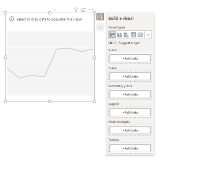
I have a column named Employee Name and these names are to be brought into a dual axis form.
Let's say region name is filtered and we are considering SOUTH.
Then we look for Employee Name within the region and select 2 names where both the names will be on value and secondary value. Please guide me on how this can be done.
- Mark as New
- Bookmark
- Subscribe
- Mute
- Subscribe to RSS Feed
- Permalink
- Report Inappropriate Content
@Idrissshatila This is a business requirement to have it as a line chart. I think this may work with DAX. Please share your thoughts.
- Mark as New
- Bookmark
- Subscribe
- Mute
- Subscribe to RSS Feed
- Permalink
- Report Inappropriate Content
maybe you could put the employees as legend so every employee have a line but it will be too much lines.
If I answered your question, please mark my post as solution, Appreciate your Kudos 👍
Proud to be a Super User! |  |
- Mark as New
- Bookmark
- Subscribe
- Mute
- Subscribe to RSS Feed
- Permalink
- Report Inappropriate Content
- Mark as New
- Bookmark
- Subscribe
- Mute
- Subscribe to RSS Feed
- Permalink
- Report Inappropriate Content
@Satya_04 , yes you could, and you could also do it as a small multiples.
If I answered your question, please mark my post as solution, Appreciate your Kudos 👍
Proud to be a Super User! |  |
- Mark as New
- Bookmark
- Subscribe
- Mute
- Subscribe to RSS Feed
- Permalink
- Report Inappropriate Content
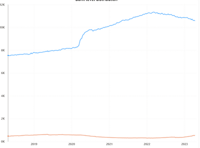
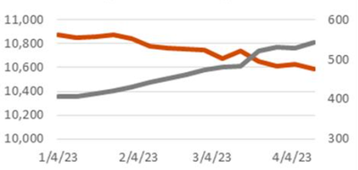
@Idrissshatila I could follow your approach. This is what I need.
This is where I am standing.
Please guide me on how this can be made similar to the one shared above.
- Mark as New
- Bookmark
- Subscribe
- Mute
- Subscribe to RSS Feed
- Permalink
- Report Inappropriate Content
@Satya_04 , check if this would help you .
If I answered your question, please mark my post as solution, Appreciate your Kudos 👍
Proud to be a Super User! |  |
- Mark as New
- Bookmark
- Subscribe
- Mute
- Subscribe to RSS Feed
- Permalink
- Report Inappropriate Content
@Idrissshatila In my case, the value is going to remain the same and I'm not able to keep it in both value and secondary value - it could be in only either of these.
- Mark as New
- Bookmark
- Subscribe
- Mute
- Subscribe to RSS Feed
- Permalink
- Report Inappropriate Content
if the value would still the same then you shouldn't be using a secondary y-axis
If I answered your question, please mark my post as solution, Appreciate your Kudos 👍
Proud to be a Super User! |  |
- Mark as New
- Bookmark
- Subscribe
- Mute
- Subscribe to RSS Feed
- Permalink
- Report Inappropriate Content
The objective is to replicate the chart in excel. If I create a duplicate measure, I'm still not able to add it to Secondary axis. Is there any reason why?
- Mark as New
- Bookmark
- Subscribe
- Mute
- Subscribe to RSS Feed
- Permalink
- Report Inappropriate Content
Hi @Satya_04,
Not sure why do you need a secondary axis for this. What am I missing here?
Generally, you use a secondary axis, when you have 2 measures and their scales are different.
My assumption is this that you will be showing only 1 measure, bifurcated by the employee names.
I think what @Idrissshatila suggested that you put the names as legends, should work!
Please provide sample data and result for us to understand the problem better along with your thoughts on why we need a secondary axis?
If yes, then please mark my post as a solution!
Thank you,
Vishesh Jain
Proud to be a Super User!
- Mark as New
- Bookmark
- Subscribe
- Mute
- Subscribe to RSS Feed
- Permalink
- Report Inappropriate Content
@visheshjain Please guide me on this.
Hi Vishesh, the objective it to bring the data points closer so that they may coincide at some point.
This is not possible in this case where there is significant difference between the two.
- Mark as New
- Bookmark
- Subscribe
- Mute
- Subscribe to RSS Feed
- Permalink
- Report Inappropriate Content
Hi @Satya_04,
Again, not sure why do you want the data lines to intersect?
Still if you want this, then create a duplicate column for Employee Names in the same table.
Define 2 measures, in both measure use REMOVEFILTERS() for the other Employee name column.
E.g. For measure 1, remove Employee Name filter from the Duplicate Column
For measure 2, remove Employee Name filter from the Original Column
Then keep 2 slicers for employee names on your report page and edit the interaction between these 2 slicers. This way, your region filter both Employee Names columns, original and duplicate, but both Employee Names column will not filter each other.
Then put both the measure on your line chart and have the secondary axis.
In my honest opinion, you do not need jump through hoops just to get the lines to intersect 'visually', unless there a very good reason behind it.
If yes, then please mark my post as a solution!
Thank you,
Vishesh Jain
Proud to be a Super User!
- Mark as New
- Bookmark
- Subscribe
- Mute
- Subscribe to RSS Feed
- Permalink
- Report Inappropriate Content
Hello @Satya_04 ,
Instead of having a dual axis, you could put them both as hierarchy, like in a bar chart put region name and employee name and when you drill down south region you can see all employees under this region.
If I answered your question, please mark my post as solution, Appreciate your Kudos 👍
Proud to be a Super User! |  |
Helpful resources

Microsoft Fabric Learn Together
Covering the world! 9:00-10:30 AM Sydney, 4:00-5:30 PM CET (Paris/Berlin), 7:00-8:30 PM Mexico City

Power BI Monthly Update - April 2024
Check out the April 2024 Power BI update to learn about new features.

| User | Count |
|---|---|
| 116 | |
| 105 | |
| 69 | |
| 67 | |
| 43 |
| User | Count |
|---|---|
| 148 | |
| 103 | |
| 103 | |
| 88 | |
| 66 |


