- Power BI forums
- Updates
- News & Announcements
- Get Help with Power BI
- Desktop
- Service
- Report Server
- Power Query
- Mobile Apps
- Developer
- DAX Commands and Tips
- Custom Visuals Development Discussion
- Health and Life Sciences
- Power BI Spanish forums
- Translated Spanish Desktop
- Power Platform Integration - Better Together!
- Power Platform Integrations (Read-only)
- Power Platform and Dynamics 365 Integrations (Read-only)
- Training and Consulting
- Instructor Led Training
- Dashboard in a Day for Women, by Women
- Galleries
- Community Connections & How-To Videos
- COVID-19 Data Stories Gallery
- Themes Gallery
- Data Stories Gallery
- R Script Showcase
- Webinars and Video Gallery
- Quick Measures Gallery
- 2021 MSBizAppsSummit Gallery
- 2020 MSBizAppsSummit Gallery
- 2019 MSBizAppsSummit Gallery
- Events
- Ideas
- Custom Visuals Ideas
- Issues
- Issues
- Events
- Upcoming Events
- Community Blog
- Power BI Community Blog
- Custom Visuals Community Blog
- Community Support
- Community Accounts & Registration
- Using the Community
- Community Feedback
Register now to learn Fabric in free live sessions led by the best Microsoft experts. From Apr 16 to May 9, in English and Spanish.
- Power BI forums
- Forums
- Get Help with Power BI
- Desktop
- Re: Trying to show more than 1 measure in a cluste...
- Subscribe to RSS Feed
- Mark Topic as New
- Mark Topic as Read
- Float this Topic for Current User
- Bookmark
- Subscribe
- Printer Friendly Page
- Mark as New
- Bookmark
- Subscribe
- Mute
- Subscribe to RSS Feed
- Permalink
- Report Inappropriate Content
Trying to show more than 1 measure in a clustered bar chart
Hi,
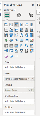
I have several measures that are working well. I have a requirement for a clustered bar chart, and I need to group the measures and show all of them accordingly. My issue is that when I group them only 1 appears. I'm using the Modeling->Fields and adding all the measures that are part of this group. I have something like this:
completenessMeasures = {
("cCountry", NAMEOF('Table'[cCountry]), 0),
("cEmail", NAMEOF('Table'[cEmail]), 1),
("cEmployeeRange", NAMEOF('Table'[cEmployeeRange]), 2),
("cFuncArea", NAMEOF('Table'[cFuncArea]), 3),
("cIndustry", NAMEOF('Table'[cIndustry]), 4)
}
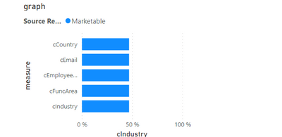
The clustered bar chart then is based on an attribute that gives semantic context, something like market segment and the X-Axis, I'm adding this group (above code). But only appearing like this:
So, in this visual I only see the first element of the group ( the one with index 0 ) ... I would like to see all the elements in the group and I don't know how to achieve that. Even a different approach if this is not correct, would help me. Thanks
Sample file: https://www.dropbox.com/s/1ykcvdz2dtontba/sample.zip?dl=0
MR
- Mark as New
- Bookmark
- Subscribe
- Mute
- Subscribe to RSS Feed
- Permalink
- Report Inappropriate Content
@amitchandak @Ritaf1983 Do you have any experience working with Parameters? I can't figure out how to solve this and I have already spent some days ( weeks?) on it...
- Mark as New
- Bookmark
- Subscribe
- Mute
- Subscribe to RSS Feed
- Permalink
- Report Inappropriate Content
Hey, Mario @mario_ruiz .
I'm happy to try to help, but I couldn't figure out from your question what you needed.
Please attach a sample file and a picture of the needed result
- Mark as New
- Bookmark
- Subscribe
- Mute
- Subscribe to RSS Feed
- Permalink
- Report Inappropriate Content
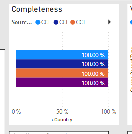
Hi @Ritaf1983 , I attached a link above in the description. I have 2 visuals there, the left one is okay as it shows all the info. But I need to be more like the second visual from the right. The problem with the right one is that only supports 1 measure from the parameter-group. I understood that when You use legend this happens, so I would like to support this same graph but with the respective titles of the measures on the left and all the measures visible per segment, overlapped would be better.
- Mark as New
- Bookmark
- Subscribe
- Mute
- Subscribe to RSS Feed
- Permalink
- Report Inappropriate Content
My apologies, but I did not understand what you were trying to accomplish from your file despite my best efforts.
Sketch what you intend to achieve in Excel...maybe it will be clearer
- Mark as New
- Bookmark
- Subscribe
- Mute
- Subscribe to RSS Feed
- Permalink
- Report Inappropriate Content
I got better results but still not able to reproduce what I need.
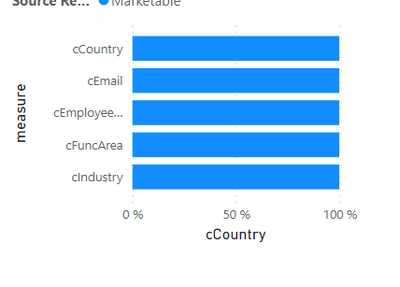
I'm getting this visual now:
However cIndustry is the only value like close to 50% the others are different, for instance country is like 100% so all the attributes are showing the same value but this is not the expected and not sure what I'm doing wrong.
Any help is appreciated!
Helpful resources

Microsoft Fabric Learn Together
Covering the world! 9:00-10:30 AM Sydney, 4:00-5:30 PM CET (Paris/Berlin), 7:00-8:30 PM Mexico City

Power BI Monthly Update - April 2024
Check out the April 2024 Power BI update to learn about new features.

| User | Count |
|---|---|
| 109 | |
| 99 | |
| 77 | |
| 66 | |
| 54 |
| User | Count |
|---|---|
| 144 | |
| 104 | |
| 102 | |
| 87 | |
| 64 |


