Fabric Data Days starts November 4th!
Advance your Data & AI career with 50 days of live learning, dataviz contests, hands-on challenges, study groups & certifications and more!
Get registered- Power BI forums
- Get Help with Power BI
- Desktop
- Service
- Report Server
- Power Query
- Mobile Apps
- Developer
- DAX Commands and Tips
- Custom Visuals Development Discussion
- Health and Life Sciences
- Power BI Spanish forums
- Translated Spanish Desktop
- Training and Consulting
- Instructor Led Training
- Dashboard in a Day for Women, by Women
- Galleries
- Data Stories Gallery
- Themes Gallery
- Contests Gallery
- QuickViz Gallery
- Quick Measures Gallery
- Visual Calculations Gallery
- Notebook Gallery
- Translytical Task Flow Gallery
- TMDL Gallery
- R Script Showcase
- Webinars and Video Gallery
- Ideas
- Custom Visuals Ideas (read-only)
- Issues
- Issues
- Events
- Upcoming Events
Get Fabric Certified for FREE during Fabric Data Days. Don't miss your chance! Request now
- Power BI forums
- Forums
- Get Help with Power BI
- Desktop
- Trying to show evolving average based on number of...
- Subscribe to RSS Feed
- Mark Topic as New
- Mark Topic as Read
- Float this Topic for Current User
- Bookmark
- Subscribe
- Printer Friendly Page
- Mark as New
- Bookmark
- Subscribe
- Mute
- Subscribe to RSS Feed
- Permalink
- Report Inappropriate Content
Trying to show evolving average based on number of records
I have a data set that looks like the following
| Index | Business Unit | Days to Hire |
| 1 | Operations | 13 |
| 2 | Operations | 51 |
| 3 | Head Office | 41 |
| 4 | Operations | 98 |
| 5 | Head Office | 205 |
| 6 | Operations | 172 |
| 7 | Operations | 237 |
| 8 | Operations | 112 |
| 9 | Operations | 126 |
| 10 | Operations | 27 |
| 11 | Operations | 153 |
| 12 | Head Office | 42 |
| 13 | Head Office | 72 |
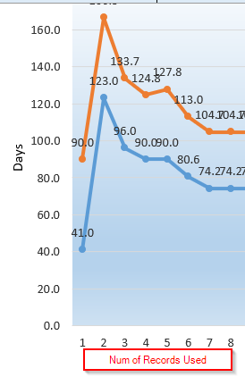
"Index" was added in PowerQuery, representing an ascending date field (e.g. 1 = Jan 1, 2 = Jan 5, 3 = Jan 17, etc). User wants to see the average of the "Days to Hire" column on a line chart where the X-axis is the number of records used to calculate the average. It was done in Excel like this:
The tricky part is user wants the line chart to be sliceable by Business Unit, so I can't use the just the Index field as the axis (numbers will be skipped). I know I can write a measure to dynamically count the number of records with an index <= the "current" index, but a measure can't be used as an X-axis. Calculated column doesn't refresh upon using the slicer, so that doesn't work either.
Anyone have the same use case and found a way to solve it?
Thanks
David
Solved! Go to Solution.
- Mark as New
- Bookmark
- Subscribe
- Mute
- Subscribe to RSS Feed
- Permalink
- Report Inappropriate Content
I'm afraid this can't achieved by using slicer and changing settings in the X-axis of line chart. As a workaround, you may try create several calculate columns using different filter condition instead of slicer, then create several line charts separately using these calculate columns in different pages. Finally create several bookmarks and buttons on these pages and configure the button action.
For more details about bookmark, please refer to doc below:
https://docs.microsoft.com/en-us/power-bi/desktop-bookmarks
Community Support Team _ Jimmy Tao
If this post helps, then please consider Accept it as the solution to help the other members find it more quickly.
- Mark as New
- Bookmark
- Subscribe
- Mute
- Subscribe to RSS Feed
- Permalink
- Report Inappropriate Content
Thanks @v-yuta-msft . I don't think that bookmarks is a good strategy in my specific case, as the user will be accessing the dashboard thru Power BI Desktop. But its good to know I'm not missing something obvious.
Thanks
David
Helpful resources

Fabric Data Days
Advance your Data & AI career with 50 days of live learning, contests, hands-on challenges, study groups & certifications and more!

Power BI Monthly Update - October 2025
Check out the October 2025 Power BI update to learn about new features.


