- Power BI forums
- Updates
- News & Announcements
- Get Help with Power BI
- Desktop
- Service
- Report Server
- Power Query
- Mobile Apps
- Developer
- DAX Commands and Tips
- Custom Visuals Development Discussion
- Health and Life Sciences
- Power BI Spanish forums
- Translated Spanish Desktop
- Power Platform Integration - Better Together!
- Power Platform Integrations (Read-only)
- Power Platform and Dynamics 365 Integrations (Read-only)
- Training and Consulting
- Instructor Led Training
- Dashboard in a Day for Women, by Women
- Galleries
- Community Connections & How-To Videos
- COVID-19 Data Stories Gallery
- Themes Gallery
- Data Stories Gallery
- R Script Showcase
- Webinars and Video Gallery
- Quick Measures Gallery
- 2021 MSBizAppsSummit Gallery
- 2020 MSBizAppsSummit Gallery
- 2019 MSBizAppsSummit Gallery
- Events
- Ideas
- Custom Visuals Ideas
- Issues
- Issues
- Events
- Upcoming Events
- Community Blog
- Power BI Community Blog
- Custom Visuals Community Blog
- Community Support
- Community Accounts & Registration
- Using the Community
- Community Feedback
Register now to learn Fabric in free live sessions led by the best Microsoft experts. From Apr 16 to May 9, in English and Spanish.
- Power BI forums
- Forums
- Get Help with Power BI
- Desktop
- Tour de france poule data !!!help!!!!
- Subscribe to RSS Feed
- Mark Topic as New
- Mark Topic as Read
- Float this Topic for Current User
- Bookmark
- Subscribe
- Printer Friendly Page
- Mark as New
- Bookmark
- Subscribe
- Mute
- Subscribe to RSS Feed
- Permalink
- Report Inappropriate Content
Tour de france poule data !!!help!!!!
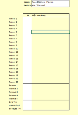
Hello i need some help for creating a tour de france poule data. we want to do a tour de france poule this year with some co-workers and we want to show it in a dashboard the scores everybody at each race can somebody help me with this to make it as a good excel format so i can use everybody prediction in a dashboard with points etc.
in the excel sheet screenshot i placed is a list how people can fill the poule
so everybody makes their own team they score there points by the way the runnes finish
anyone a idea to makes this in a way so i can make it as a dashboard so people can see and compete agaisnt each other
many thanks
Solved! Go to Solution.
- Mark as New
- Bookmark
- Subscribe
- Mute
- Subscribe to RSS Feed
- Permalink
- Report Inappropriate Content
Hi @Krijgerss21 ,
In Excel, you can create a table to store the predictions made by each participant. You can then use a formula to calculate the score for each participant based on the actual results of the contest. Once the scores are available, you can create a chart to visualize the scores for each participant. You can also use conditional formatting to highlight the winners of each match.
In Power BI, you can create a data model to store the predictions made by each participant as well as the actual results of the contest. You can then use the DAX formula to calculate the score for each participant based on the actual results of the contest. Once the scores are available, you can create a report to visualize the scores for each participant. You can also use conditional formatting to highlight the winners of each match.
For example, Power BI.
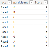
I created some data:
Here are the steps you can follow:
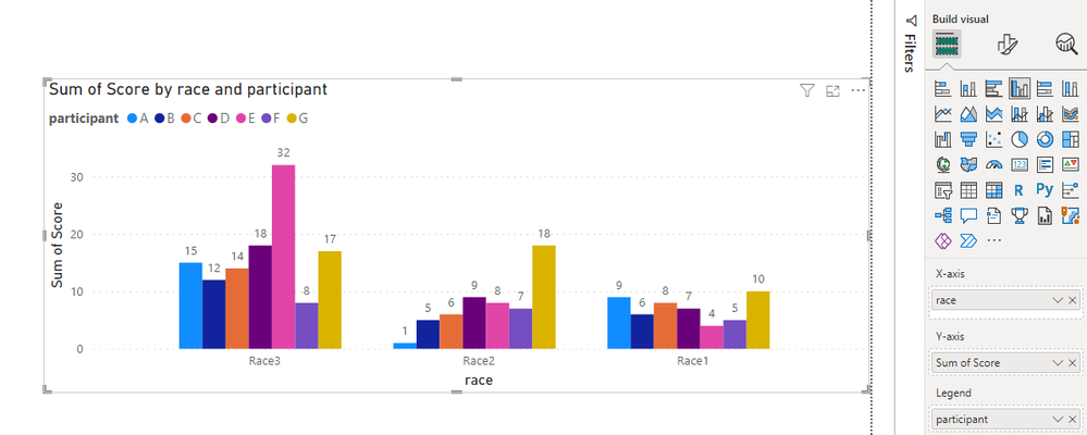
1. You can use the Clustered column chart to see the scores of each player in each game visually..
2. Create measure.
To see the fastest runners in each race:
Rank =
RANKX(
    FILTER(ALL('Table'),'Table'[race]=MAX('Table'[race])),CALCULATE(SUM('Table'[Score])),,ASC)
Flag =
IF(
[Rank]=MINX(FILTER(ALL('Table'),'Table'[race]=MAX('Table'[race])),[Rank]),1,0)3. Place [Flag]in Filters, set is=1, apply filter.
4. Result:
Best Regards,
Liu Yang
If this post helps, then please consider Accept it as the solution to help the other members find it more quickly
Helpful resources

Microsoft Fabric Learn Together
Covering the world! 9:00-10:30 AM Sydney, 4:00-5:30 PM CET (Paris/Berlin), 7:00-8:30 PM Mexico City

Power BI Monthly Update - April 2024
Check out the April 2024 Power BI update to learn about new features.

| User | Count |
|---|---|
| 112 | |
| 97 | |
| 85 | |
| 67 | |
| 59 |
| User | Count |
|---|---|
| 150 | |
| 120 | |
| 100 | |
| 87 | |
| 68 |


