- Power BI forums
- Updates
- News & Announcements
- Get Help with Power BI
- Desktop
- Service
- Report Server
- Power Query
- Mobile Apps
- Developer
- DAX Commands and Tips
- Custom Visuals Development Discussion
- Health and Life Sciences
- Power BI Spanish forums
- Translated Spanish Desktop
- Power Platform Integration - Better Together!
- Power Platform Integrations (Read-only)
- Power Platform and Dynamics 365 Integrations (Read-only)
- Training and Consulting
- Instructor Led Training
- Dashboard in a Day for Women, by Women
- Galleries
- Community Connections & How-To Videos
- COVID-19 Data Stories Gallery
- Themes Gallery
- Data Stories Gallery
- R Script Showcase
- Webinars and Video Gallery
- Quick Measures Gallery
- 2021 MSBizAppsSummit Gallery
- 2020 MSBizAppsSummit Gallery
- 2019 MSBizAppsSummit Gallery
- Events
- Ideas
- Custom Visuals Ideas
- Issues
- Issues
- Events
- Upcoming Events
- Community Blog
- Power BI Community Blog
- Custom Visuals Community Blog
- Community Support
- Community Accounts & Registration
- Using the Community
- Community Feedback
Earn a 50% discount on the DP-600 certification exam by completing the Fabric 30 Days to Learn It challenge.
- Power BI forums
- Forums
- Get Help with Power BI
- Desktop
- Top Ten Table for current month
- Subscribe to RSS Feed
- Mark Topic as New
- Mark Topic as Read
- Float this Topic for Current User
- Bookmark
- Subscribe
- Printer Friendly Page
- Mark as New
- Bookmark
- Subscribe
- Mute
- Subscribe to RSS Feed
- Permalink
- Report Inappropriate Content
Top Ten Table for current month
Hello,
I'm trying to create a Top 10 table by Carrier for the Current with the following structure that I can later use for a Top 10 Bar Chart:
Carrier Trips this Month Trips Previous Month
==================================
Carrier Name 1 Sum of Trips Sum of Trips
Carrier Name 2
etc.
Other
My data is in a table called Cargo which summarized looks like this
Carrier ID | Carrier Name | Date | Origin | Destination | Cargo Weight | Cargo Value
Thanks in advance for your help.
Solved! Go to Solution.
- Mark as New
- Bookmark
- Subscribe
- Mute
- Subscribe to RSS Feed
- Permalink
- Report Inappropriate Content
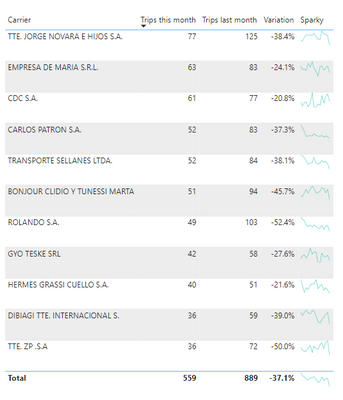
Here is the basic framework for what you are trying to achieve. To add sparklines you would need to use SVG.
- Mark as New
- Bookmark
- Subscribe
- Mute
- Subscribe to RSS Feed
- Permalink
- Report Inappropriate Content
- Mark as New
- Bookmark
- Subscribe
- Mute
- Subscribe to RSS Feed
- Permalink
- Report Inappropriate Content
No, because you want the sparklines to have a different filter context than the rest of the table. Remember you are filtering by a particular month. The built-in sparkline would only show a single dot. (try it out)
- Mark as New
- Bookmark
- Subscribe
- Mute
- Subscribe to RSS Feed
- Permalink
- Report Inappropriate Content
Thanks for your reply.
I've set up an Excel file with the sanitized data and an example of the output I'm aiming at. The example is done with pivot table and some subproduct formulas as well as a couple of bar charts made 'by hand' which wouldn't be the case in Power Bi.
Thanks in advance for your help.
- Mark as New
- Bookmark
- Subscribe
- Mute
- Subscribe to RSS Feed
- Permalink
- Report Inappropriate Content
- Mark as New
- Bookmark
- Subscribe
- Mute
- Subscribe to RSS Feed
- Permalink
- Report Inappropriate Content
Sparky =
// Static line color
VAR LineColor = "#01B8AA"
// Obtain overall min and overall max measure values when evaluated for each date
VAR SumData = CALCULATETABLE(SUMMARIZE(Cargo,[MonthYear],"ct",DISTINCTCOUNT(Cargo[Bill of Lading])),REMOVEFILTERS(Cargo[MonthYear]))
VAR YMinValue = MINX(SumData,[ct])
VAR YMaxValue = MAXX(SumData,[ct])
// "Date" field used in this example along the X axis
VAR XMinDate = MINX(SumData,[MonthYear])
VAR XMaxDate = MAXX(SumData,[MonthYear])
// Build table of X & Y coordinates and fit to 100 x 50 viewbox
VAR SparklineTable = ADDCOLUMNS(
    SumData,
        "X",INT(100 * DIVIDE([MonthYear] - XMinDate, XMaxDate - XMinDate)),
        "Y",INT(50 * DIVIDE([ct] - YMinValue,YMaxValue - YMinValue)))
// Concatenate X & Y coordinates to build the sparkline
VAR Lines = CONCATENATEX(SparklineTable,[X] & "," & 50-[Y]," ",Cargo[MonthYear])
// Add to SVG, and verify Data Category is set to Image URL for this measure
VAR SVGImageURL =
    "data:image/svg+xml;utf8," &
    "<svg xmlns='http://www.w3.org/2000/svg' x='0px' y='0px' viewBox='0 0 100 50'>" &
     "<polyline fill='none' stroke='" & LineColor &
     "' stroke-width='1' points='" & Lines &
     "'/></svg>"

RETURN SVGImageURL
- Mark as New
- Bookmark
- Subscribe
- Mute
- Subscribe to RSS Feed
- Permalink
- Report Inappropriate Content
Hi Ibendlin,
I hope this is my final question! How can I reduce the height of the sparklines to half of what it is? I tried changing where it says 100 to 50 but that doesn't work.
Thanks!
- Mark as New
- Bookmark
- Subscribe
- Mute
- Subscribe to RSS Feed
- Permalink
- Report Inappropriate Content
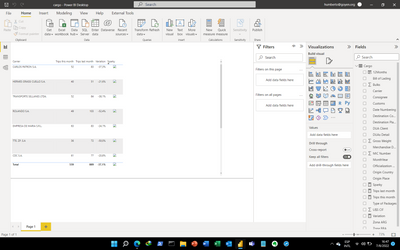
I inserted the code as a mesaure and categorized it as image url. This is what I get:
Maybe you cand send me the pbix file so I can check what I'm doing wrong.
Thanks in advance
- Mark as New
- Bookmark
- Subscribe
- Mute
- Subscribe to RSS Feed
- Permalink
- Report Inappropriate Content
- Mark as New
- Bookmark
- Subscribe
- Mute
- Subscribe to RSS Feed
- Permalink
- Report Inappropriate Content
Thank you! have been very kind in sharing your knowledge.
I have a final question. Isn't it possible to used the 'built-in' sparklines to do this?
- Mark as New
- Bookmark
- Subscribe
- Mute
- Subscribe to RSS Feed
- Permalink
- Report Inappropriate Content
I got it to work but the row height doesn't change... Is there a way to change it?
- Mark as New
- Bookmark
- Subscribe
- Mute
- Subscribe to RSS Feed
- Permalink
- Report Inappropriate Content
There is a row setting "Image height" ...
- Mark as New
- Bookmark
- Subscribe
- Mute
- Subscribe to RSS Feed
- Permalink
- Report Inappropriate Content
No, because you want the sparklines to have a different filter context than the rest of the table. Remember you are filtering by a particular month. The built-in sparkline would only show a single dot. (try it out)
- Mark as New
- Bookmark
- Subscribe
- Mute
- Subscribe to RSS Feed
- Permalink
- Report Inappropriate Content
Thanks. Tried and and got the single dot. Thanks for the master lesson!
- Mark as New
- Bookmark
- Subscribe
- Mute
- Subscribe to RSS Feed
- Permalink
- Report Inappropriate Content
Thanks! Where do I insert this code?
- Mark as New
- Bookmark
- Subscribe
- Mute
- Subscribe to RSS Feed
- Permalink
- Report Inappropriate Content
That would need to be a new measure, and it needs to be categorized as "Image URL".
NOTE: The code is rather blunt. I would recommend modifying it so the sparkline shows only the "last 12 months" instead of everything.
- Mark as New
- Bookmark
- Subscribe
- Mute
- Subscribe to RSS Feed
- Permalink
- Report Inappropriate Content
Thank you so mucho lbendlin! I will try to understand it and digest it.
I inserted it in a new Measure but as a result get text starting with "data&colon".
Thanks again!
- Mark as New
- Bookmark
- Subscribe
- Mute
- Subscribe to RSS Feed
- Permalink
- Report Inappropriate Content
Please provide sanitized sample data that fully covers your issue. I cannot help you without usable sample data.
Please paste the data into a table in your post or use one of the file services like OneDrive or Google Drive. I cannot use screenshots of your source data.
Please show the expected outcome based on the sample data you provided. Screenshots of the expected outcome are ok.
https://community.powerbi.com/t5/Desktop/How-to-Get-Your-Question-Answered-Quickly/m-p/1447523
Helpful resources

Microsoft Fabric Learn Together
Covering the world! 9:00-10:30 AM Sydney, 4:00-5:30 PM CET (Paris/Berlin), 7:00-8:30 PM Mexico City

Power BI Monthly Update - April 2024
Check out the April 2024 Power BI update to learn about new features.

| User | Count |
|---|---|
| 109 | |
| 102 | |
| 84 | |
| 79 | |
| 70 |
| User | Count |
|---|---|
| 120 | |
| 110 | |
| 95 | |
| 82 | |
| 77 |


