FabCon is coming to Atlanta
Join us at FabCon Atlanta from March 16 - 20, 2026, for the ultimate Fabric, Power BI, AI and SQL community-led event. Save $200 with code FABCOMM.
Register now!- Power BI forums
- Get Help with Power BI
- Desktop
- Service
- Report Server
- Power Query
- Mobile Apps
- Developer
- DAX Commands and Tips
- Custom Visuals Development Discussion
- Health and Life Sciences
- Power BI Spanish forums
- Translated Spanish Desktop
- Training and Consulting
- Instructor Led Training
- Dashboard in a Day for Women, by Women
- Galleries
- Data Stories Gallery
- Themes Gallery
- Contests Gallery
- QuickViz Gallery
- Quick Measures Gallery
- Visual Calculations Gallery
- Notebook Gallery
- Translytical Task Flow Gallery
- TMDL Gallery
- R Script Showcase
- Webinars and Video Gallery
- Ideas
- Custom Visuals Ideas (read-only)
- Issues
- Issues
- Events
- Upcoming Events
Get Fabric Certified for FREE during Fabric Data Days. Don't miss your chance! Request now
- Power BI forums
- Forums
- Get Help with Power BI
- Desktop
- Tooltip Value Showing Twice
- Subscribe to RSS Feed
- Mark Topic as New
- Mark Topic as Read
- Float this Topic for Current User
- Bookmark
- Subscribe
- Printer Friendly Page
- Mark as New
- Bookmark
- Subscribe
- Mute
- Subscribe to RSS Feed
- Permalink
- Report Inappropriate Content
Tooltip Value Showing Twice
Hello,
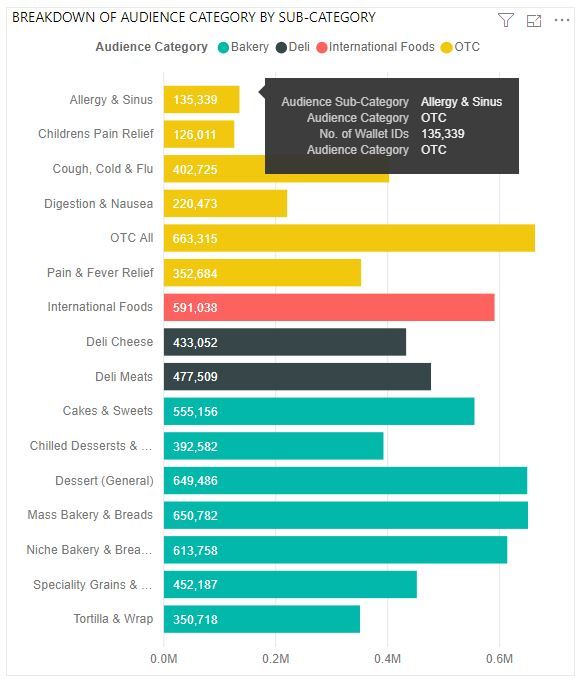
I'm wondering how to essentially sort a bar chart visualization by the legend. In the visualization below, I am visualizing the number of people belonging to a sub-category of an Audience; there are multiple sub-categories within an Audience Category.
I'd like to sort the bar chart by the Audience Category, and how I'm currently achieving this is moving the Audience Category field into the tooltip option. The issue with this is that the Audience Category shows twice in the tooltip (once for legend and once for having the field included manually in the tooltip). Not including the Audience Category field in the tooltip manually would only give me the options to sort the chart by number of people or by the sub-category (alphabetically). I'm looking for a way to only show this Audience Category once in the tooltip, is this possible?
Solved! Go to Solution.
- Mark as New
- Bookmark
- Subscribe
- Mute
- Subscribe to RSS Feed
- Permalink
- Report Inappropriate Content
Hi @Anonymous ,
The sorting of the default tooltip is made based on:
- Axis value
- Legend value
- Value
- Tooltip fields (in the order you place them)
You cannot change this behaviour so adding the Audience Category to the tooltip part duplicated the value and does nothing to sorting.
To achieve a custom sorting you need to create a custom tooltip para that way you can sort the values of the tooltip as you need.
https://docs.microsoft.com/en-us/power-bi/desktop-tooltips
Regards
Miguel Félix
Did I answer your question? Mark my post as a solution!
Proud to be a Super User!
Check out my blog: Power BI em Português- Mark as New
- Bookmark
- Subscribe
- Mute
- Subscribe to RSS Feed
- Permalink
- Report Inappropriate Content
Not am aware off. The workaround is to create a tooltip dashboard with a table visual formatted out to resemble exactly the way the tooltip is seen, and that is possible.
Helpful resources

Power BI Monthly Update - November 2025
Check out the November 2025 Power BI update to learn about new features.

Fabric Data Days
Advance your Data & AI career with 50 days of live learning, contests, hands-on challenges, study groups & certifications and more!


