Huge last-minute discounts for FabCon Vienna from September 15-18, 2025
Supplies are limited. Contact info@espc.tech right away to save your spot before the conference sells out.
Get your discount- Power BI forums
- Get Help with Power BI
- Desktop
- Service
- Report Server
- Power Query
- Mobile Apps
- Developer
- DAX Commands and Tips
- Custom Visuals Development Discussion
- Health and Life Sciences
- Power BI Spanish forums
- Translated Spanish Desktop
- Training and Consulting
- Instructor Led Training
- Dashboard in a Day for Women, by Women
- Galleries
- Data Stories Gallery
- Themes Gallery
- Contests Gallery
- Quick Measures Gallery
- Notebook Gallery
- Translytical Task Flow Gallery
- TMDL Gallery
- R Script Showcase
- Webinars and Video Gallery
- Ideas
- Custom Visuals Ideas (read-only)
- Issues
- Issues
- Events
- Upcoming Events
Score big with last-minute savings on the final tickets to FabCon Vienna. Secure your discount
- Power BI forums
- Forums
- Get Help with Power BI
- Desktop
- Too many data points- how to aggregate data points...
- Subscribe to RSS Feed
- Mark Topic as New
- Mark Topic as Read
- Float this Topic for Current User
- Bookmark
- Subscribe
- Printer Friendly Page
- Mark as New
- Bookmark
- Subscribe
- Mute
- Subscribe to RSS Feed
- Permalink
- Report Inappropriate Content
Too many data points- how to aggregate data points in line chart
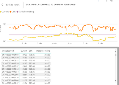
Hi! What is the best way to aggregate data in the line chart? I am plotting with time as the axis, and the graph becomes way too noisy (about 1000 data points per day, showing a week at a time) I can change the axis to "date hierarchy", but then the most frequent data point option is per day.
Thank you!
- Mark as New
- Bookmark
- Subscribe
- Mute
- Subscribe to RSS Feed
- Permalink
- Report Inappropriate Content
Hi @Anonymous ,
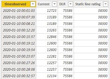
What do DLR fields represent and whether they have nothing to do with the fields on the X and Y axes will lead to the appearance of "not smooth then" on the line chart,can you share sample data and sample output in table format? Or a sample pbix after removing sensitive data.
If you want the average for every minute:
Create some data: the current column for the rolling average
Here are the steps you can follow:
1. Create measure.
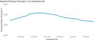
Expected Output (Average)_1 =
var _1=
MAX('Table'[timeobserved])
return
AVERAGEX(
    FILTER(
        SUMMARIZE(
            ALLSELECTED('Table'),
            [timeobserved],
            "Avg Value",AVERAGE('Table'[Current])
            ),
            [timeobserved]<=_1
            ),
            [Avg Value]
            )
2. Result.
You can downloaded PBIX file from here.
Best Regards
Liu Yang
If this post helps, then please consider Accept it as the solution to help the other members find it more quickly.
- Mark as New
- Bookmark
- Subscribe
- Mute
- Subscribe to RSS Feed
- Permalink
- Report Inappropriate Content
- Mark as New
- Bookmark
- Subscribe
- Mute
- Subscribe to RSS Feed
- Permalink
- Report Inappropriate Content
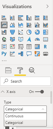
@amitchandak I had it on continuous, so the axis was great. However, the graph itself is ugly because of the high number of data points (with different values). For example, it would be perfect if the average for every minute could be calculated before the graph was displayed.
- Mark as New
- Bookmark
- Subscribe
- Mute
- Subscribe to RSS Feed
- Permalink
- Report Inappropriate Content
- Mark as New
- Bookmark
- Subscribe
- Mute
- Subscribe to RSS Feed
- Permalink
- Report Inappropriate Content
I want to smoothen the orange graph:


