Party with Power BI’s own Guy in a Cube
Power BI is turning 10! Tune in for a special live episode on July 24 with behind-the-scenes stories, product evolution highlights, and a sneak peek at what’s in store for the future.
Save the date- Power BI forums
- Get Help with Power BI
- Desktop
- Service
- Report Server
- Power Query
- Mobile Apps
- Developer
- DAX Commands and Tips
- Custom Visuals Development Discussion
- Health and Life Sciences
- Power BI Spanish forums
- Translated Spanish Desktop
- Training and Consulting
- Instructor Led Training
- Dashboard in a Day for Women, by Women
- Galleries
- Webinars and Video Gallery
- Data Stories Gallery
- Themes Gallery
- Contests Gallery
- Quick Measures Gallery
- Notebook Gallery
- Translytical Task Flow Gallery
- R Script Showcase
- Ideas
- Custom Visuals Ideas (read-only)
- Issues
- Issues
- Events
- Upcoming Events
Enhance your career with this limited time 50% discount on Fabric and Power BI exams. Ends August 31st. Request your voucher.
- Power BI forums
- Forums
- Get Help with Power BI
- Desktop
- Re: Text Measure not displaying in Visual
- Subscribe to RSS Feed
- Mark Topic as New
- Mark Topic as Read
- Float this Topic for Current User
- Bookmark
- Subscribe
- Printer Friendly Page
- Mark as New
- Bookmark
- Subscribe
- Mute
- Subscribe to RSS Feed
- Permalink
- Report Inappropriate Content
Text Measure not displaying in Visual
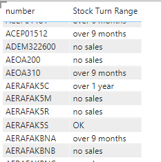
Hi, (sorry I'm a novice...) I have created a Measure to return a text string with 6 possible results (depending on which range a calculated result falls into).
In Visuals I can create a table (below) but I can't get any other Visual to show the number of results in each of the 6 result categories (e.g. bar chart; pie chart) - it won't let me drag the Measure into Values to perform a Count of the 6 result categories.
I can get the result if I export to Excel and create a Pivot Table...but I want to be able to show it in a Power BI Visual
Solved! Go to Solution.
- Mark as New
- Bookmark
- Subscribe
- Mute
- Subscribe to RSS Feed
- Permalink
- Report Inappropriate Content
What you can do is create a different measure to each category, and put each of those in the chart.
Each measure Would likely be something similar to:
No Sales=
CALCULATE(
COUNT(Table[number]),
FILTER(Table,
[Stock Turn Range] = "no sales"
)Data analyst by day, hockey goalie by night.
Did I help? Then please hit that "kudos" or "accept as a solution" button!
- Mark as New
- Bookmark
- Subscribe
- Mute
- Subscribe to RSS Feed
- Permalink
- Report Inappropriate Content
@dcimcclelland think about it, how would you represent texts in charts? What will be the scale?
You can't use charts to show text as the values.
You can however use Calculation Groups to change the format strings of the result to that ever you want, but the actual values need to be numeric.
Helpful resources

Power BI Monthly Update - July 2025
Check out the July 2025 Power BI update to learn about new features.

Join our Fabric User Panel
This is your chance to engage directly with the engineering team behind Fabric and Power BI. Share your experiences and shape the future.

| User | Count |
|---|---|
| 69 | |
| 68 | |
| 40 | |
| 29 | |
| 26 |
| User | Count |
|---|---|
| 88 | |
| 49 | |
| 45 | |
| 38 | |
| 37 |


