Join us at the 2025 Microsoft Fabric Community Conference
Microsoft Fabric Community Conference 2025, March 31 - April 2, Las Vegas, Nevada. Use code MSCUST for a $150 discount.
Register now- Power BI forums
- Get Help with Power BI
- Desktop
- Service
- Report Server
- Power Query
- Mobile Apps
- Developer
- DAX Commands and Tips
- Custom Visuals Development Discussion
- Health and Life Sciences
- Power BI Spanish forums
- Translated Spanish Desktop
- Training and Consulting
- Instructor Led Training
- Dashboard in a Day for Women, by Women
- Galleries
- Webinars and Video Gallery
- Data Stories Gallery
- Themes Gallery
- Contests Gallery
- Quick Measures Gallery
- R Script Showcase
- COVID-19 Data Stories Gallery
- Community Connections & How-To Videos
- 2021 MSBizAppsSummit Gallery
- 2020 MSBizAppsSummit Gallery
- 2019 MSBizAppsSummit Gallery
- Events
- Ideas
- Custom Visuals Ideas
- Issues
- Issues
- Events
- Upcoming Events
The Power BI DataViz World Championships are on! With four chances to enter, you could win a spot in the LIVE Grand Finale in Las Vegas. Show off your skills.
- Power BI forums
- Forums
- Get Help with Power BI
- Desktop
- Table with grouped rows
- Subscribe to RSS Feed
- Mark Topic as New
- Mark Topic as Read
- Float this Topic for Current User
- Bookmark
- Subscribe
- Printer Friendly Page
- Mark as New
- Bookmark
- Subscribe
- Mute
- Subscribe to RSS Feed
- Permalink
- Report Inappropriate Content
Table with grouped rows
Hello,
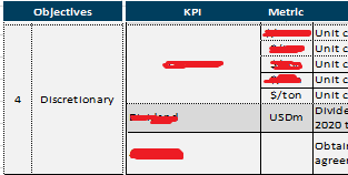
I'm trying to replicate this table:
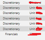
And this how the data is in the table:
We have multiple objectives and the idea is to group them but show their KPIs in different rows next to them, is there any way to repliacate that?
TIA
Solved! Go to Solution.
- Mark as New
- Bookmark
- Subscribe
- Mute
- Subscribe to RSS Feed
- Permalink
- Report Inappropriate Content
Hi @Anonymous ,
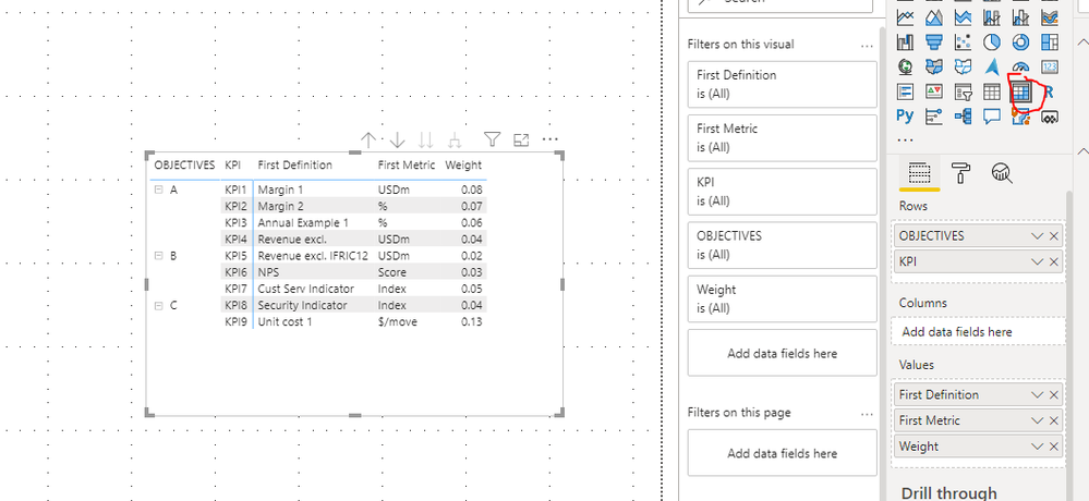
Use matrix in power bi, Put objectives and KPI in Rows,
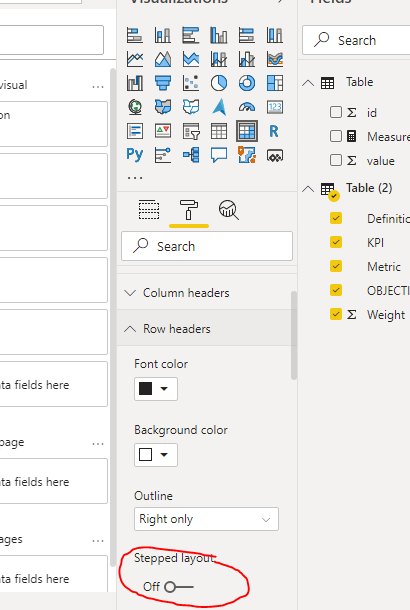
Close the stepped layout in row header:
You can refer to https://www.burningsuit.co.uk/blog/2019/04/7-secrets-of-the-matrix-visual/ for using of matrix.
If this post helps, then please consider Accept it as the solution to help the other members find it more quickly.
Best Regards,
Dedmon Dai
- Mark as New
- Bookmark
- Subscribe
- Mute
- Subscribe to RSS Feed
- Permalink
- Report Inappropriate Content
@Anonymous The first image looks like a matrix with row stepped layout turned off. Overall it's hard to tell from the images exactly what you need. Sample data as text?
Follow on LinkedIn
@ me in replies or I'll lose your thread!!!
Instead of a Kudo, please vote for this idea
Become an expert!: Enterprise DNA
External Tools: MSHGQM
YouTube Channel!: Microsoft Hates Greg
Latest book!: Power BI Cookbook Third Edition (Color)
DAX is easy, CALCULATE makes DAX hard...
- Mark as New
- Bookmark
- Subscribe
- Mute
- Subscribe to RSS Feed
- Permalink
- Report Inappropriate Content
Oh sorry, I'll give more detail.
This is how the data (shortened) is in the Excel (keep in mind, we are open to modifying the Excel file in order to get the data visualized better):
| OBJECTIVES | KPI | Metric | Definition | Weight |
| A | KPI1 | USDm | Margin 1 | 8% |
| A | KPI2 | % | Margin 2 | 7% |
| A | KPI3 | % | Annual Example 1 | 6% |
| A | KPI4 | USDm | Revenue excl. | 4% |
| B | KPI5 | USDm | Revenue excl. IFRIC12 | 2% |
| B | KPI6 | Score | NPS | 3% |
| B | KPI7 | Index | Cust Serv Indicator | 5% |
| C | KPI8 | Index | Security Indicator | 4% |
| C | KPI9 | $/move | Unit cost 1 | 8% |
| C | KPI9 | $/ton | Unit cost 2 | 5% |
And this is how we'd like it to look with the sample data:
Like you see, the difference between how the data is stored to how is it shown is to group those objectives and KPIs that are the same (we could let go the grouped KPIs).
Is this enough or do you need more info?
TIA
- Mark as New
- Bookmark
- Subscribe
- Mute
- Subscribe to RSS Feed
- Permalink
- Report Inappropriate Content
Hi @Anonymous ,
Not very clear what is your expected ouput. Would you please show us the expected output by your sample data? And does the screenshot below meet your requirement?
Best Regards,
Dedmon Dai
- Mark as New
- Bookmark
- Subscribe
- Mute
- Subscribe to RSS Feed
- Permalink
- Report Inappropriate Content
Hello @v-deddai1-msft,
Oh I just saw it, the image I put as the expected output wasn't loaded or shown, that was unfortunate.
But yes, the screenshot you posted would be the expected output, the grouping of similar values in objectives and (if possible) in KPIs. Can I ask how did you do it?
TIA
- Mark as New
- Bookmark
- Subscribe
- Mute
- Subscribe to RSS Feed
- Permalink
- Report Inappropriate Content
Hi @Anonymous ,
Use matrix in power bi, Put objectives and KPI in Rows,
Close the stepped layout in row header:
You can refer to https://www.burningsuit.co.uk/blog/2019/04/7-secrets-of-the-matrix-visual/ for using of matrix.
If this post helps, then please consider Accept it as the solution to help the other members find it more quickly.
Best Regards,
Dedmon Dai
Helpful resources

Join us at the Microsoft Fabric Community Conference
March 31 - April 2, 2025, in Las Vegas, Nevada. Use code MSCUST for a $150 discount!

Join our Community Sticker Challenge 2025
If you love stickers, then you will definitely want to check out our Community Sticker Challenge!

| User | Count |
|---|---|
| 126 | |
| 78 | |
| 78 | |
| 59 | |
| 51 |
| User | Count |
|---|---|
| 165 | |
| 83 | |
| 68 | |
| 68 | |
| 59 |


