- Power BI forums
- Updates
- News & Announcements
- Get Help with Power BI
- Desktop
- Service
- Report Server
- Power Query
- Mobile Apps
- Developer
- DAX Commands and Tips
- Custom Visuals Development Discussion
- Health and Life Sciences
- Power BI Spanish forums
- Translated Spanish Desktop
- Power Platform Integration - Better Together!
- Power Platform Integrations (Read-only)
- Power Platform and Dynamics 365 Integrations (Read-only)
- Training and Consulting
- Instructor Led Training
- Dashboard in a Day for Women, by Women
- Galleries
- Community Connections & How-To Videos
- COVID-19 Data Stories Gallery
- Themes Gallery
- Data Stories Gallery
- R Script Showcase
- Webinars and Video Gallery
- Quick Measures Gallery
- 2021 MSBizAppsSummit Gallery
- 2020 MSBizAppsSummit Gallery
- 2019 MSBizAppsSummit Gallery
- Events
- Ideas
- Custom Visuals Ideas
- Issues
- Issues
- Events
- Upcoming Events
- Community Blog
- Power BI Community Blog
- Custom Visuals Community Blog
- Community Support
- Community Accounts & Registration
- Using the Community
- Community Feedback
Register now to learn Fabric in free live sessions led by the best Microsoft experts. From Apr 16 to May 9, in English and Spanish.
- Power BI forums
- Forums
- Get Help with Power BI
- Desktop
- Re: Stacked chart - Show all Y axis value
- Subscribe to RSS Feed
- Mark Topic as New
- Mark Topic as Read
- Float this Topic for Current User
- Bookmark
- Subscribe
- Printer Friendly Page
- Mark as New
- Bookmark
- Subscribe
- Mute
- Subscribe to RSS Feed
- Permalink
- Report Inappropriate Content
Stacked chart - Show all Y axis value
Hello everyone,
I have a stacked chart ofr which I'd like to show all possible values for the Y axis even when null.
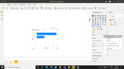
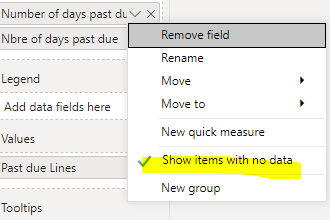
I did do a right click on the Axis data and selected "Show items with no value" but that doesn't change anything.
More concretly, this is what I want the Y axis to show:
>15days
<= 15 days
<= 10 days
<= 5 days
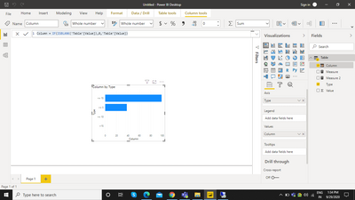
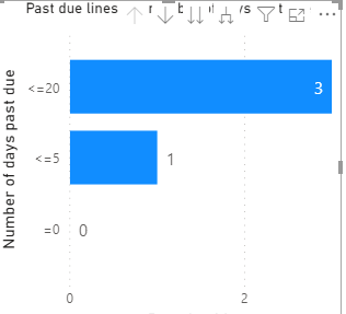
and this is what I get:
<= 15 days
<= 5 days
Because there is no data for the categories <= 10 days and >15days.
Any tips ?
Thank you!
Solved! Go to Solution.
- Mark as New
- Bookmark
- Subscribe
- Mute
- Subscribe to RSS Feed
- Permalink
- Report Inappropriate Content
Thank you for your follow up. I have just solved the problem by adding an extra table with all categories for each type of order in my report and then I created a measure with a filter on the type of order to avoid using the filter on the visual. That worked just fine 🙂
- Mark as New
- Bookmark
- Subscribe
- Mute
- Subscribe to RSS Feed
- Permalink
- Report Inappropriate Content
Hi @FannyZ ,
I have created sample data with the same that you have explained. And I did use Show Items with No data, it is working.
Could you check again and let me know.
Regards,
Manikumar
If this helps, Appreciate your KUDOS!
Did I answer your question? Mark my post as a solution!
Proud to be a Super User!
- Mark as New
- Bookmark
- Subscribe
- Mute
- Subscribe to RSS Feed
- Permalink
- Report Inappropriate Content
If that doesn't works , please create a calculated column or measure and use that.
Use the below DAX to convert the blank cells to 0.

Please accept this as solution if works and leave a like.
Regards,
Manikumar
If this helps, Appreciate your KUDOS!
Did I answer your question? Mark my post as a solution!
Proud to be a Super User!
- Mark as New
- Bookmark
- Subscribe
- Mute
- Subscribe to RSS Feed
- Permalink
- Report Inappropriate Content
Hello Manikumar,
I don't have any blank cells in the categories data.
Could I get those results because of the filters I'm using ? It does show category "=0" when there is 0 lines, but not the other ones..
Thank you,
- Mark as New
- Bookmark
- Subscribe
- Mute
- Subscribe to RSS Feed
- Permalink
- Report Inappropriate Content
@FannyZ ,
Are you using the slicer which is on Y-Axis of the chart??
If so it will happen, to do not filter the data with the slicer on this chart stop interactions from View>Edit Interactions
If possible can you share the slicer screenshot with the slicer and chart?
If you think this is helpful please Accept as Solution and leave a like.
Regards,
Manikunar
If this helps, Appreciate your KUDOS!
Did I answer your question? Mark my post as a solution!
Proud to be a Super User!
- Mark as New
- Bookmark
- Subscribe
- Mute
- Subscribe to RSS Feed
- Permalink
- Report Inappropriate Content
Thank you for your follow up. I have just solved the problem by adding an extra table with all categories for each type of order in my report and then I created a measure with a filter on the type of order to avoid using the filter on the visual. That worked just fine 🙂
- Mark as New
- Bookmark
- Subscribe
- Mute
- Subscribe to RSS Feed
- Permalink
- Report Inappropriate Content
Thank you manikumar34 for your quick reply. I did check again, but it doesn't work. I'm also using slicers with this visual, could it be the cause ? If so, how can I counter it ?
Helpful resources

Microsoft Fabric Learn Together
Covering the world! 9:00-10:30 AM Sydney, 4:00-5:30 PM CET (Paris/Berlin), 7:00-8:30 PM Mexico City

Power BI Monthly Update - April 2024
Check out the April 2024 Power BI update to learn about new features.

| User | Count |
|---|---|
| 114 | |
| 99 | |
| 82 | |
| 70 | |
| 60 |
| User | Count |
|---|---|
| 148 | |
| 116 | |
| 104 | |
| 89 | |
| 65 |


