- Power BI forums
- Updates
- News & Announcements
- Get Help with Power BI
- Desktop
- Service
- Report Server
- Power Query
- Mobile Apps
- Developer
- DAX Commands and Tips
- Custom Visuals Development Discussion
- Health and Life Sciences
- Power BI Spanish forums
- Translated Spanish Desktop
- Power Platform Integration - Better Together!
- Power Platform Integrations (Read-only)
- Power Platform and Dynamics 365 Integrations (Read-only)
- Training and Consulting
- Instructor Led Training
- Dashboard in a Day for Women, by Women
- Galleries
- Community Connections & How-To Videos
- COVID-19 Data Stories Gallery
- Themes Gallery
- Data Stories Gallery
- R Script Showcase
- Webinars and Video Gallery
- Quick Measures Gallery
- 2021 MSBizAppsSummit Gallery
- 2020 MSBizAppsSummit Gallery
- 2019 MSBizAppsSummit Gallery
- Events
- Ideas
- Custom Visuals Ideas
- Issues
- Issues
- Events
- Upcoming Events
- Community Blog
- Power BI Community Blog
- Custom Visuals Community Blog
- Community Support
- Community Accounts & Registration
- Using the Community
- Community Feedback
Register now to learn Fabric in free live sessions led by the best Microsoft experts. From Apr 16 to May 9, in English and Spanish.
- Power BI forums
- Forums
- Get Help with Power BI
- Desktop
- Stacked bar With Percentage Label Keeping the Size...
- Subscribe to RSS Feed
- Mark Topic as New
- Mark Topic as Read
- Float this Topic for Current User
- Bookmark
- Subscribe
- Printer Friendly Page
- Mark as New
- Bookmark
- Subscribe
- Mute
- Subscribe to RSS Feed
- Permalink
- Report Inappropriate Content
Stacked bar With Percentage Label Keeping the Sizes
Hi,
I'm having an issue while trying to turn the labels of my stacked bar graph into percentage. The point is that the percent have to look up only for to the total of the column and not for the grand total as it does when we select "show value as" > "percentage of grand total"
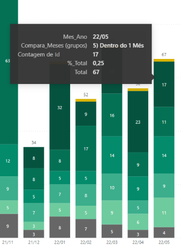
I googled it, and tried to find some soluction on Microsoft Power BI forum but I couldn't find a soluction. The best that I found was creating the measure of the percent of total to put into the tooltip box so I can see the percentage in the lightbox that show informations of the bar when using the mouse. like this:
The total of the month 2020/05 is 67 and 17 is 25% of it.
The measure %_Total in Dax:
%_Total =
var Total = CALCULATE(DISTINCTCOUNT(Analise_Reativados[Id]),REMOVEFILTERS(Analise_Reativados[Compara_Meses (grupos)]))
var Clientes = DISTINCTCOUNT(Analise_Reativados[Id])
return Clientes/Total
Where Analise_Reativados[Compara_Meses (grupos)] is a group that aggregates through a list.
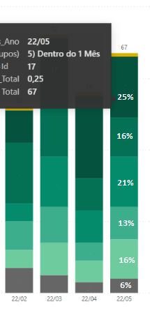
It should be like this in the end:
But I don't know how to solve it.
Can someone help me?
Thanks!
Solved! Go to Solution.
- Mark as New
- Bookmark
- Subscribe
- Mute
- Subscribe to RSS Feed
- Permalink
- Report Inappropriate Content
Hi, @Ncsbr
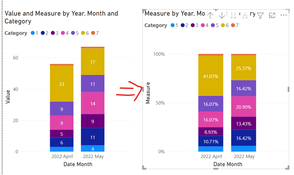
After testing, if you want to use the column sum as the denominator, the size of the bar chart cannot be kept the same as the original one, because the sum is 100%. Only as shown in the figure.
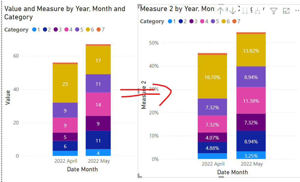
If you want to keep the size of the bar chart constant, you can only use the total sum as the denominator.
Best Regards,
Community Support Team _Charlotte
If this post helps, then please consider Accept it as the solution to help the other members find it more quickly.
- Mark as New
- Bookmark
- Subscribe
- Mute
- Subscribe to RSS Feed
- Permalink
- Report Inappropriate Content
Thanks for the support @v-zhangti! Probably I will have to use Python or R code to work with this graph so ;)!
Helpful resources

Microsoft Fabric Learn Together
Covering the world! 9:00-10:30 AM Sydney, 4:00-5:30 PM CET (Paris/Berlin), 7:00-8:30 PM Mexico City

Power BI Monthly Update - April 2024
Check out the April 2024 Power BI update to learn about new features.

| User | Count |
|---|---|
| 114 | |
| 100 | |
| 78 | |
| 75 | |
| 50 |
| User | Count |
|---|---|
| 144 | |
| 109 | |
| 108 | |
| 87 | |
| 61 |


