Join us at the 2025 Microsoft Fabric Community Conference
Microsoft Fabric Community Conference 2025, March 31 - April 2, Las Vegas, Nevada. Use code MSCUST for a $150 discount.
Register now- Power BI forums
- Get Help with Power BI
- Desktop
- Service
- Report Server
- Power Query
- Mobile Apps
- Developer
- DAX Commands and Tips
- Custom Visuals Development Discussion
- Health and Life Sciences
- Power BI Spanish forums
- Translated Spanish Desktop
- Training and Consulting
- Instructor Led Training
- Dashboard in a Day for Women, by Women
- Galleries
- Community Connections & How-To Videos
- COVID-19 Data Stories Gallery
- Themes Gallery
- Data Stories Gallery
- R Script Showcase
- Webinars and Video Gallery
- Quick Measures Gallery
- 2021 MSBizAppsSummit Gallery
- 2020 MSBizAppsSummit Gallery
- 2019 MSBizAppsSummit Gallery
- Events
- Ideas
- Custom Visuals Ideas
- Issues
- Issues
- Events
- Upcoming Events
The Power BI DataViz World Championships are on! With four chances to enter, you could win a spot in the LIVE Grand Finale in Las Vegas. Show off your skills.
- Power BI forums
- Forums
- Get Help with Power BI
- Desktop
- Stacked Bar Format: Different Format Across Series...
- Subscribe to RSS Feed
- Mark Topic as New
- Mark Topic as Read
- Float this Topic for Current User
- Bookmark
- Subscribe
- Printer Friendly Page
- Mark as New
- Bookmark
- Subscribe
- Mute
- Subscribe to RSS Feed
- Permalink
- Report Inappropriate Content
Stacked Bar Format: Different Format Across Series AND Categories
Hi,
Apologies if this has been posted already but the only answer I could find were doing same color across a given series or not using stack bars at all...
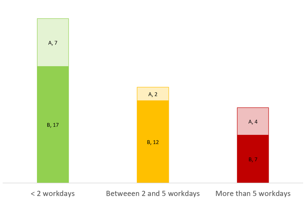
I'm trying to reproduce this visual (especially the color scheme) in Power BI (not necessarily using stackbar, any other visual will do)
I've been able to create it in excel using a stack bar chart and manually coloring each box (intrested in hint to make it work automatically there as well ;)).
This is the data
| Aging Category | Team | Issue Count |
| < 2 workdays | A | 7 |
| < 2 workdays | B | 17 |
| Between 2 and 5 workdays | A | 2 |
| Between 2 and 5 workdays | B | 12 |
| > 5 workdays | A | 4 |
| > 5 workdays | B | 7 |
Many thanks
PS: I'm also not opposed to revisting how I present the data; so far I find that this visual conveys the information in a very clear way, i.e., the issues in green are ok, amber: so-so, red: bad and the split between the teams is clear and the number of issue with each team clearly displayed.
Solved! Go to Solution.
- Mark as New
- Bookmark
- Subscribe
- Mute
- Subscribe to RSS Feed
- Permalink
- Report Inappropriate Content
I don't think there's a way to dual-color bar charts in Power BI, but I'll let others respond...
Here's one potential work-around that kinda sucks, but should give you what you need.
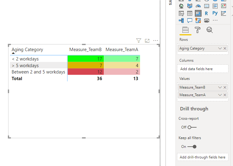
I've created a Matrix here with Aging Category as Rows, * BLANK * for Columns, then Manually created these two measures above to be added individually to the Values section. Doing so, allows you to assign DIFFERENT Conditional Formatting to each Set of Measures. Now for Team B, you can choose darker colors based on the new 'Color' column, and a lighter set of 3 colors for Team A. ** Sucks if the teams ever swap places, you have to correct the coloring, but it's a work-around for a reason... **
Please give Kudos or Mark as a Solution!
https://www.linkedin.com/in/forrest-hill-04480730/
Proud to give back to the community!
Thank You!
- Mark as New
- Bookmark
- Subscribe
- Mute
- Subscribe to RSS Feed
- Permalink
- Report Inappropriate Content
HI @Anonymous,
As fhill said, current you can't achieve this by default power bi visual. I'd like to suggest you take a look at custom visuals in power bi store or try to use r script to manually plot this graph.
Regards,
Xiaoxin Sheng
If this post helps, please consider accept as solution to help other members find it more quickly.
- Mark as New
- Bookmark
- Subscribe
- Mute
- Subscribe to RSS Feed
- Permalink
- Report Inappropriate Content
Thanks for the confirmation.
As far as custom visuals go I couldn't really find any. The closet I came to are the ones from Akvelon but it didn't quite do the trick.
I will look into R/Python see what's up.
Thanks
- Mark as New
- Bookmark
- Subscribe
- Mute
- Subscribe to RSS Feed
- Permalink
- Report Inappropriate Content
I don't think there's a way to dual-color bar charts in Power BI, but I'll let others respond...
Here's one potential work-around that kinda sucks, but should give you what you need.
I've created a Matrix here with Aging Category as Rows, * BLANK * for Columns, then Manually created these two measures above to be added individually to the Values section. Doing so, allows you to assign DIFFERENT Conditional Formatting to each Set of Measures. Now for Team B, you can choose darker colors based on the new 'Color' column, and a lighter set of 3 colors for Team A. ** Sucks if the teams ever swap places, you have to correct the coloring, but it's a work-around for a reason... **
Please give Kudos or Mark as a Solution!
https://www.linkedin.com/in/forrest-hill-04480730/
Proud to give back to the community!
Thank You!
- Mark as New
- Bookmark
- Subscribe
- Mute
- Subscribe to RSS Feed
- Permalink
- Report Inappropriate Content
Thanks a lot for the suggestion but this does not quite cover it as the height of the bar is also relevant.
It seems we have either the color or the bars but at the moment we can't combine both.
Thanks anyway for the color trick, very neat for other applications
Helpful resources
| User | Count |
|---|---|
| 143 | |
| 71 | |
| 69 | |
| 53 | |
| 52 |
| User | Count |
|---|---|
| 208 | |
| 94 | |
| 64 | |
| 60 | |
| 57 |


