- Power BI forums
- Updates
- News & Announcements
- Get Help with Power BI
- Desktop
- Service
- Report Server
- Power Query
- Mobile Apps
- Developer
- DAX Commands and Tips
- Custom Visuals Development Discussion
- Health and Life Sciences
- Power BI Spanish forums
- Translated Spanish Desktop
- Power Platform Integration - Better Together!
- Power Platform Integrations (Read-only)
- Power Platform and Dynamics 365 Integrations (Read-only)
- Training and Consulting
- Instructor Led Training
- Dashboard in a Day for Women, by Women
- Galleries
- Community Connections & How-To Videos
- COVID-19 Data Stories Gallery
- Themes Gallery
- Data Stories Gallery
- R Script Showcase
- Webinars and Video Gallery
- Quick Measures Gallery
- 2021 MSBizAppsSummit Gallery
- 2020 MSBizAppsSummit Gallery
- 2019 MSBizAppsSummit Gallery
- Events
- Ideas
- Custom Visuals Ideas
- Issues
- Issues
- Events
- Upcoming Events
- Community Blog
- Power BI Community Blog
- Custom Visuals Community Blog
- Community Support
- Community Accounts & Registration
- Using the Community
- Community Feedback
Register now to learn Fabric in free live sessions led by the best Microsoft experts. From Apr 16 to May 9, in English and Spanish.
- Power BI forums
- Forums
- Get Help with Power BI
- Desktop
- Re: Stacked Bar Chart - Set Limit to A Certain Amo...
- Subscribe to RSS Feed
- Mark Topic as New
- Mark Topic as Read
- Float this Topic for Current User
- Bookmark
- Subscribe
- Printer Friendly Page
- Mark as New
- Bookmark
- Subscribe
- Mute
- Subscribe to RSS Feed
- Permalink
- Report Inappropriate Content
Stacked Bar Chart - Set Limit to A Certain Amount
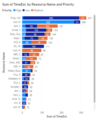
I am trying to visualize data based on a Resource being the Y-axis, Time Allocation being the X-Axis and a Legend which I've set to Priority, but would need to set the maximum value of 70 hours for the Stacked Bar Chart, which would be based on priority (low, medium, high). I would need to display the higher priority allocations first to fill the 70 hours and move to display the lower priority if there's any remaining time. I can display the first part of the visualization fine but where I am struggling is setting the limit based on Priority. I can't figure out how to calculate the limit in DAX and couldn't find any answers on how to limit the Stacked Bar Chart values. Asking for help on it.
- Mark as New
- Bookmark
- Subscribe
- Mute
- Subscribe to RSS Feed
- Permalink
- Report Inappropriate Content
@RenPBI ,
Here is a potential solution for you. Create 3 new Calculated Columns as follows:
High_Display = SWITCH(
                  TRUE(),
                  [HIGH] >= 70, 70,
                  [HIGH] )

Medium_Display = SWITCH(
                     TRUE(),
                70-[High_Display] >= [Medium], [Medium],
                70-[High] )

Low_Display = SWITCH(
                     TRUE(),
                70-[High_Display]-[Medium_Display] <= 0, 0,
70-[High_Display] - [Medium_Display] )| Resource | High | Medium | Low | High_Display | Medium_Display | Low_Display |
| GHI, Y | 17 | 105 | 59 | 17 | 53 | 0 |
| Ping 123 | 5 | 37 | 285 | 5 | 37 | 28 |
| Busy Guy | 18 | 30 | 96 | 18 | 30 | 22 |
Then use these display columns in your Visual.
If your capacity of 70 is going to change, then you can just create a new Measure for [Capacity] and use this in the formulas above.
Hope I interpreted your question correctly and this solution works for you.
Regards,
- Mark as New
- Bookmark
- Subscribe
- Mute
- Subscribe to RSS Feed
- Permalink
- Report Inappropriate Content
Thank you for this. Since I had to pivot and unpivot my data for the Bar chart, I derived a similar solution during the data transformation using if statements.
Here's what I ended up with after adding an additional layer of priority and changing the hours to 50:
| = Table.AddColumn(#"Previous Step", "Critical_1", each if [Critical] = null then 0 else if [Critical] >= 50 then 50 else [Critical]) |
| = Table.AddColumn(#"Derive Critical Display", "High_1", each if [High] = null then 0 else if [High] >= (50-[Critical_1]) then (50-[Critical_1]) else [High]) |
[Continued on till the lowest level priority]
Helpful resources

Microsoft Fabric Learn Together
Covering the world! 9:00-10:30 AM Sydney, 4:00-5:30 PM CET (Paris/Berlin), 7:00-8:30 PM Mexico City

Power BI Monthly Update - April 2024
Check out the April 2024 Power BI update to learn about new features.

| User | Count |
|---|---|
| 114 | |
| 99 | |
| 83 | |
| 70 | |
| 61 |
| User | Count |
|---|---|
| 149 | |
| 114 | |
| 107 | |
| 89 | |
| 67 |

