- Power BI forums
- Updates
- News & Announcements
- Get Help with Power BI
- Desktop
- Service
- Report Server
- Power Query
- Mobile Apps
- Developer
- DAX Commands and Tips
- Custom Visuals Development Discussion
- Health and Life Sciences
- Power BI Spanish forums
- Translated Spanish Desktop
- Power Platform Integration - Better Together!
- Power Platform Integrations (Read-only)
- Power Platform and Dynamics 365 Integrations (Read-only)
- Training and Consulting
- Instructor Led Training
- Dashboard in a Day for Women, by Women
- Galleries
- Community Connections & How-To Videos
- COVID-19 Data Stories Gallery
- Themes Gallery
- Data Stories Gallery
- R Script Showcase
- Webinars and Video Gallery
- Quick Measures Gallery
- 2021 MSBizAppsSummit Gallery
- 2020 MSBizAppsSummit Gallery
- 2019 MSBizAppsSummit Gallery
- Events
- Ideas
- Custom Visuals Ideas
- Issues
- Issues
- Events
- Upcoming Events
- Community Blog
- Power BI Community Blog
- Custom Visuals Community Blog
- Community Support
- Community Accounts & Registration
- Using the Community
- Community Feedback
Register now to learn Fabric in free live sessions led by the best Microsoft experts. From Apr 16 to May 9, in English and Spanish.
- Power BI forums
- Forums
- Get Help with Power BI
- Desktop
- Spacing between columns (different measures)
- Subscribe to RSS Feed
- Mark Topic as New
- Mark Topic as Read
- Float this Topic for Current User
- Bookmark
- Subscribe
- Printer Friendly Page
- Mark as New
- Bookmark
- Subscribe
- Mute
- Subscribe to RSS Feed
- Permalink
- Report Inappropriate Content
Spacing between columns (different measures)
Hi there 😊
I'm a beginner and need some help 🙂
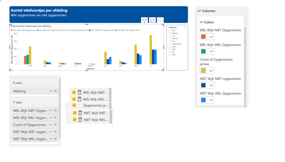
Hopefully the chart below shows the score of department WKZ (WEL Wijk) compared to the scores of the other departments (NIET Wijk).
(Afdeling = Department)
It’s about phonecalls answered (WEL opgenomen) or Missed (NIET opgenomen).
Therefore I made (quick?) measures.
For department WKZ I use (quick?) measures “WEL Wijk NIET opgenomen”, “WEL Wijk WEL opgenomen” and I use “Count of opgenomen ja/nee” (for all the calls).
For other departments I use (quick?) measures “NIET Wijk NIET opgenomen”, “NIET Wijk WEL opgenomen” and I use “Count of opgenomen ja/nee” (for all the calls).
Because I don’t use the same measures for all categories (the departments) I get differences in the chart in the visualization of the two different categories (WEL / NIET Wijk).
You can see that the name of the category WKZ is at the right of the 3 columns, the names of the other categories are on the left of the 3 columns.
That’s because in both cases, not all the columns are shown, because not all the columns apply to both categories.
But… Can I change this?
Can I get the spacing between “WKZ” and the next (other) department the same as between the other categories?
And, can I get the labels at the same position in relation to the columns shown?
Hope to hear from you!
Kind regards,
Simone
- Mark as New
- Bookmark
- Subscribe
- Mute
- Subscribe to RSS Feed
- Permalink
- Report Inappropriate Content
Hi @cowboyracer ,
You can consider selecting the relevant columns for Unpivot Columns and comparing them through mesaure.
Refer to :
https://docs.microsoft.com/en-us/power-query/unpivot-column
Can you share sample data and sample output in table format? Or a sample pbix after removing sensitive data. We can better understand the problem and help you.
Best Regards,
Liu Yang
If this post helps, then please consider Accept it as the solution to help the other members find it more quickly.
- Mark as New
- Bookmark
- Subscribe
- Mute
- Subscribe to RSS Feed
- Permalink
- Report Inappropriate Content
Hi @v-yangliu-msft, Here is the link to the pbix file: https://www.dropbox.com/s/w7kzflrjxw4updc/TelephoneCalls%20Forum.pbix?dl=0
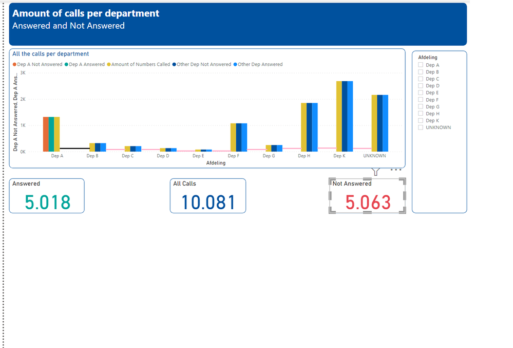
I also copied an image of my visual As you can see I marked the distance between Dep A and Dep B with a black line, the distance between the other Dep's with a pink line. The pink lines are shorter than the black line --> The space between Dep A and Dep B is bigger than the space between the rest. I want the same space between all the collumns. How to fix this?
Helpful resources

Microsoft Fabric Learn Together
Covering the world! 9:00-10:30 AM Sydney, 4:00-5:30 PM CET (Paris/Berlin), 7:00-8:30 PM Mexico City

Power BI Monthly Update - April 2024
Check out the April 2024 Power BI update to learn about new features.

| User | Count |
|---|---|
| 112 | |
| 97 | |
| 85 | |
| 67 | |
| 59 |
| User | Count |
|---|---|
| 150 | |
| 120 | |
| 100 | |
| 87 | |
| 68 |


