- Power BI forums
- Updates
- News & Announcements
- Get Help with Power BI
- Desktop
- Service
- Report Server
- Power Query
- Mobile Apps
- Developer
- DAX Commands and Tips
- Custom Visuals Development Discussion
- Health and Life Sciences
- Power BI Spanish forums
- Translated Spanish Desktop
- Power Platform Integration - Better Together!
- Power Platform Integrations (Read-only)
- Power Platform and Dynamics 365 Integrations (Read-only)
- Training and Consulting
- Instructor Led Training
- Dashboard in a Day for Women, by Women
- Galleries
- Community Connections & How-To Videos
- COVID-19 Data Stories Gallery
- Themes Gallery
- Data Stories Gallery
- R Script Showcase
- Webinars and Video Gallery
- Quick Measures Gallery
- 2021 MSBizAppsSummit Gallery
- 2020 MSBizAppsSummit Gallery
- 2019 MSBizAppsSummit Gallery
- Events
- Ideas
- Custom Visuals Ideas
- Issues
- Issues
- Events
- Upcoming Events
- Community Blog
- Power BI Community Blog
- Custom Visuals Community Blog
- Community Support
- Community Accounts & Registration
- Using the Community
- Community Feedback
Register now to learn Fabric in free live sessions led by the best Microsoft experts. From Apr 16 to May 9, in English and Spanish.
- Power BI forums
- Forums
- Get Help with Power BI
- Desktop
- Slicer to show customers that make up X% of Total ...
- Subscribe to RSS Feed
- Mark Topic as New
- Mark Topic as Read
- Float this Topic for Current User
- Bookmark
- Subscribe
- Printer Friendly Page
- Mark as New
- Bookmark
- Subscribe
- Mute
- Subscribe to RSS Feed
- Permalink
- Report Inappropriate Content
Slicer to show customers that make up X% of Total Sales
https://community.powerbi.com/t5/Desktop/Show-items-that-make-up-x-of-the-sales/m-p/645622
Good afternoon - I have been attempting to model my solution with the above link, but am having issues (most likely myself)
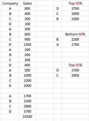
I am looking to have a slicer that I can use to display the customers that make up X% of the sales (not the # of customers) for the time period. Could anyone be of assistance?
Thanks
Solved! Go to Solution.
- Mark as New
- Bookmark
- Subscribe
- Mute
- Subscribe to RSS Feed
- Permalink
- Report Inappropriate Content
Hi @jbr9999,
You can create a table visual use company as category group and value with aggregate mode 'sum'.
You can create a ‘what if’ parameter table with 1 to 100 , a ‘type’ table with top and bottom. Then you can write a measure formula to compare selections and table visual records and use on 'visual level filter' to filter records.
formula =
VAR summary =
    SUMMARIZE ( ALLSELECTED ( Table ), [Company], "Amount", SUM ( Table[Amount] ) )
VAR selected =
    MAX ( ParaTable[Value] )
VAR fRate =
    selected / 100
        * SUMX ( summary, [Amount] )
VAR fType =
    SELECTEDVALUE ( TypeTable[Type] ) //top, Bottem
VAR filtered =
    FILTER ( summary, IF ( fType = "Top", [Amount] <= fRate, [Amount] >= fRate ) )
VAR currCompany =
    SELECTEDVALUE ( RawTable[Company] )
RETURN
    IF ( currCompany IN SELECTCOLUMNS ( filtered, "Company", [Company] ), "Y", "N" )
Regards,
Xiaoxin Sheng
If this post helps, please consider accept as solution to help other members find it more quickly.
- Mark as New
- Bookmark
- Subscribe
- Mute
- Subscribe to RSS Feed
- Permalink
- Report Inappropriate Content
Thank you for the response.
Effectively I want to be able to display the customers that make up a % of sales.
Thank you
- Mark as New
- Bookmark
- Subscribe
- Mute
- Subscribe to RSS Feed
- Permalink
- Report Inappropriate Content
Hi @jbr9999,
You can create a table visual use company as category group and value with aggregate mode 'sum'.
You can create a ‘what if’ parameter table with 1 to 100 , a ‘type’ table with top and bottom. Then you can write a measure formula to compare selections and table visual records and use on 'visual level filter' to filter records.
formula =
VAR summary =
    SUMMARIZE ( ALLSELECTED ( Table ), [Company], "Amount", SUM ( Table[Amount] ) )
VAR selected =
    MAX ( ParaTable[Value] )
VAR fRate =
    selected / 100
        * SUMX ( summary, [Amount] )
VAR fType =
    SELECTEDVALUE ( TypeTable[Type] ) //top, Bottem
VAR filtered =
    FILTER ( summary, IF ( fType = "Top", [Amount] <= fRate, [Amount] >= fRate ) )
VAR currCompany =
    SELECTEDVALUE ( RawTable[Company] )
RETURN
    IF ( currCompany IN SELECTCOLUMNS ( filtered, "Company", [Company] ), "Y", "N" )
Regards,
Xiaoxin Sheng
If this post helps, please consider accept as solution to help other members find it more quickly.
- Mark as New
- Bookmark
- Subscribe
- Mute
- Subscribe to RSS Feed
- Permalink
- Report Inappropriate Content
Hi @jbr9999,
Can you please share a pbix or some dummy data that keep the raw data structure with expected results? It should help us clarify your scenario and test to coding formula.
How to Get Your Question Answered Quickly
Regards,
Xiaoxin Sheng
If this post helps, please consider accept as solution to help other members find it more quickly.
Helpful resources

Microsoft Fabric Learn Together
Covering the world! 9:00-10:30 AM Sydney, 4:00-5:30 PM CET (Paris/Berlin), 7:00-8:30 PM Mexico City

Power BI Monthly Update - April 2024
Check out the April 2024 Power BI update to learn about new features.

| User | Count |
|---|---|
| 113 | |
| 99 | |
| 82 | |
| 70 | |
| 60 |
| User | Count |
|---|---|
| 149 | |
| 114 | |
| 107 | |
| 89 | |
| 67 |

