New Offer! Become a Certified Fabric Data Engineer
Check your eligibility for this 50% exam voucher offer and join us for free live learning sessions to get prepared for Exam DP-700.
Get Started- Power BI forums
- Get Help with Power BI
- Desktop
- Service
- Report Server
- Power Query
- Mobile Apps
- Developer
- DAX Commands and Tips
- Custom Visuals Development Discussion
- Health and Life Sciences
- Power BI Spanish forums
- Translated Spanish Desktop
- Training and Consulting
- Instructor Led Training
- Dashboard in a Day for Women, by Women
- Galleries
- Community Connections & How-To Videos
- COVID-19 Data Stories Gallery
- Themes Gallery
- Data Stories Gallery
- R Script Showcase
- Webinars and Video Gallery
- Quick Measures Gallery
- 2021 MSBizAppsSummit Gallery
- 2020 MSBizAppsSummit Gallery
- 2019 MSBizAppsSummit Gallery
- Events
- Ideas
- Custom Visuals Ideas
- Issues
- Issues
- Events
- Upcoming Events
Don't miss out! 2025 Microsoft Fabric Community Conference, March 31 - April 2, Las Vegas, Nevada. Use code MSCUST for a $150 discount. Prices go up February 11th. Register now.
- Power BI forums
- Forums
- Get Help with Power BI
- Desktop
- Simple Graphic with multiple Date values on X Axis...
- Subscribe to RSS Feed
- Mark Topic as New
- Mark Topic as Read
- Float this Topic for Current User
- Bookmark
- Subscribe
- Printer Friendly Page
- Mark as New
- Bookmark
- Subscribe
- Mute
- Subscribe to RSS Feed
- Permalink
- Report Inappropriate Content
Simple Graphic with multiple Date values on X Axis of a graph non visible
Hi everybody,
I have a Power BI Report with 1 Excel files used as data source.
This data sources have 4 columns :
Ex : Data Source 1 :
1 > Date 1 (Data Source1)
2 > Date 2 (Data Source1)
3 > Date 3 (Data Source1)
4 > Index column
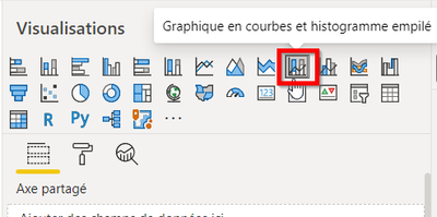
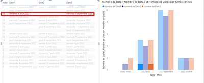
I create two simple visuals (1 Table view of my Data Set, I Graph using Data in X Axis) :
But when I put On X Axis,:
1 > Date 1 (Data Source1)
2 > Date 2 (Data Source1)
3 > Date 3 (Data Source1)
Elements into the following graphical visual :
I use Drill Down to see element grouped by Year Month :
If I click on a item of the table list view of my DataSet I am only able to see the filter on the first element of the Date 1 and I cannot view the items of Date 2 and Date 3
Is it possible to see values of Date 1, Date 2 and Date 3 Group By Year Month ? Please
I want to see items of Date 1, Date 2 and Date 3 Group By Year Month on X Axis when I click on an item on the table view list, but it not works well…
Have you got any ideas for it ? Please
Please find in attach the DataSource and the Power BI (PBIX file) have more informations,
Please change the datasource path with the attach file if you try to run the report,
Many thanks in advance,
Best regards,
Antoine MICK
- Mark as New
- Bookmark
- Subscribe
- Mute
- Subscribe to RSS Feed
- Permalink
- Report Inappropriate Content
Hi,
You should select the Index column, right click on the column heading and select "Unpivot Other Columns". Ensure that the Value column is formatted as Date. Now build a Calendar Table and create a relationship (Many to One and Single) from the Value column of the Data Table to the Date column of the Calendar Table. Write calculated column formulas for Year, Month name and Month number. Sort the Month name column by the Month number column. To any visual/slicer/filter, drag Year, Month name from the Calendar Table. Now create yoru visual.
Regards,
Ashish Mathur
http://www.ashishmathur.com
https://www.linkedin.com/in/excelenthusiasts/
Helpful resources

Join us at the Microsoft Fabric Community Conference
March 31 - April 2, 2025, in Las Vegas, Nevada. Use code MSCUST for a $150 discount! Prices go up Feb. 11th.

Power BI Monthly Update - January 2025
Check out the January 2025 Power BI update to learn about new features in Reporting, Modeling, and Data Connectivity.

| User | Count |
|---|---|
| 147 | |
| 85 | |
| 66 | |
| 52 | |
| 46 |
| User | Count |
|---|---|
| 215 | |
| 90 | |
| 83 | |
| 66 | |
| 58 |


