- Power BI forums
- Updates
- News & Announcements
- Get Help with Power BI
- Desktop
- Service
- Report Server
- Power Query
- Mobile Apps
- Developer
- DAX Commands and Tips
- Custom Visuals Development Discussion
- Health and Life Sciences
- Power BI Spanish forums
- Translated Spanish Desktop
- Power Platform Integration - Better Together!
- Power Platform Integrations (Read-only)
- Power Platform and Dynamics 365 Integrations (Read-only)
- Training and Consulting
- Instructor Led Training
- Dashboard in a Day for Women, by Women
- Galleries
- Community Connections & How-To Videos
- COVID-19 Data Stories Gallery
- Themes Gallery
- Data Stories Gallery
- R Script Showcase
- Webinars and Video Gallery
- Quick Measures Gallery
- 2021 MSBizAppsSummit Gallery
- 2020 MSBizAppsSummit Gallery
- 2019 MSBizAppsSummit Gallery
- Events
- Ideas
- Custom Visuals Ideas
- Issues
- Issues
- Events
- Upcoming Events
- Community Blog
- Power BI Community Blog
- Custom Visuals Community Blog
- Community Support
- Community Accounts & Registration
- Using the Community
- Community Feedback
Register now to learn Fabric in free live sessions led by the best Microsoft experts. From Apr 16 to May 9, in English and Spanish.
- Power BI forums
- Forums
- Get Help with Power BI
- Desktop
- Re: Show starting and ending data label for line c...
- Subscribe to RSS Feed
- Mark Topic as New
- Mark Topic as Read
- Float this Topic for Current User
- Bookmark
- Subscribe
- Printer Friendly Page
- Mark as New
- Bookmark
- Subscribe
- Mute
- Subscribe to RSS Feed
- Permalink
- Report Inappropriate Content
Show starting and ending data label for line charts
Hi everyone
I have line graphs on my Dahboard where only start and end data labels are shown using two measures:


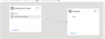
D_date is the main calendar, FilterCalendar is used for visuals.
The problem I have is if the graph does not show all the 12 month because no data is present then the data labels do not appear.

How can I make these measures dynamical so they always point at the two available data point at the start and end?
For example on the graph you can see that 3/22 has a data label but the 9/22 does not because in the filter context 2/2023 was chosen as a month. So if the graph showed 2/23 the data label for that data point would be available.
Thank you!
- Mark as New
- Bookmark
- Subscribe
- Mute
- Subscribe to RSS Feed
- Permalink
- Report Inappropriate Content
@Mateja ,
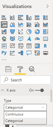
Reason one -> You are using a continuous axis, it skips periods to adjust. Use a categorical axis if needed
if need use a measure like this with the categorical axis
0 between range
Measure = var _1= SUM(Opportunity[Opportunity count]) +0
var _min = minx(ALLSELECTED('Calendar'), 'Calendar'[Date])
var _max = maxx(ALLSELECTED('Calendar'), 'Calendar'[Date])
return
CALCULATE(if(max('Calendar'[Date]) <_min || max('Calendar'[Date]) >_max , BLANK(), _1))
Microsoft Power BI Learning Resources, 2023 !!
Learn Power BI - Full Course with Dec-2022, with Window, Index, Offset, 100+ Topics !!
Did I answer your question? Mark my post as a solution! Appreciate your Kudos !! Proud to be a Super User! !!
- Mark as New
- Bookmark
- Subscribe
- Mute
- Subscribe to RSS Feed
- Permalink
- Report Inappropriate Content
Hi @amitchandak
Thank you for your fast answer!
Unfortunately, I cannot use the categorical axis because every month label needs to visible. Also the graphs are quite small so the M/YY works great for the visualisation.
I incorporated your solution and it works.
It shows the value for the month in the filter context even if there are no values
The problem is it only shows data label for the max value or the month that is in the filter context as seen on the picture. So it does not show the minimum value represented on the graph
Can you maybe help with this?
Note, I use a helping calendar to show rolling 12 values when there is only one month selected in the filter context.
So to be clear is it possible to develop a measure that would always put data labels at the start and end values so on the graph above for 2/22 and 9/22?
Helpful resources

Microsoft Fabric Learn Together
Covering the world! 9:00-10:30 AM Sydney, 4:00-5:30 PM CET (Paris/Berlin), 7:00-8:30 PM Mexico City

Power BI Monthly Update - April 2024
Check out the April 2024 Power BI update to learn about new features.

| User | Count |
|---|---|
| 108 | |
| 98 | |
| 78 | |
| 66 | |
| 53 |
| User | Count |
|---|---|
| 139 | |
| 100 | |
| 95 | |
| 85 | |
| 63 |


