- Power BI forums
- Updates
- News & Announcements
- Get Help with Power BI
- Desktop
- Service
- Report Server
- Power Query
- Mobile Apps
- Developer
- DAX Commands and Tips
- Custom Visuals Development Discussion
- Health and Life Sciences
- Power BI Spanish forums
- Translated Spanish Desktop
- Power Platform Integration - Better Together!
- Power Platform Integrations (Read-only)
- Power Platform and Dynamics 365 Integrations (Read-only)
- Training and Consulting
- Instructor Led Training
- Dashboard in a Day for Women, by Women
- Galleries
- Community Connections & How-To Videos
- COVID-19 Data Stories Gallery
- Themes Gallery
- Data Stories Gallery
- R Script Showcase
- Webinars and Video Gallery
- Quick Measures Gallery
- 2021 MSBizAppsSummit Gallery
- 2020 MSBizAppsSummit Gallery
- 2019 MSBizAppsSummit Gallery
- Events
- Ideas
- Custom Visuals Ideas
- Issues
- Issues
- Events
- Upcoming Events
- Community Blog
- Power BI Community Blog
- Custom Visuals Community Blog
- Community Support
- Community Accounts & Registration
- Using the Community
- Community Feedback
Register now to learn Fabric in free live sessions led by the best Microsoft experts. From Apr 16 to May 9, in English and Spanish.
- Power BI forums
- Forums
- Get Help with Power BI
- Desktop
- Show only two colors on chart
- Subscribe to RSS Feed
- Mark Topic as New
- Mark Topic as Read
- Float this Topic for Current User
- Bookmark
- Subscribe
- Printer Friendly Page
- Mark as New
- Bookmark
- Subscribe
- Mute
- Subscribe to RSS Feed
- Permalink
- Report Inappropriate Content
Show only two colors on chart
I have a table that contains fields: company name, sales, date, rating. And a time table to her. There is also a time slicer that sets the beginning and end of the period.
I want to show on the chart the rating in comparison for two periods (the beginning and the end from the slicer). However, if I change the borders of the slaser, then the "color" of one of the columns is automatically changed. I want the two colors to stay the same (eg blue and green) no matter how the slicer moves.
Can someone tell / show how to do this?
Attached a file with an example.https://1drv.ms/u/s!AkdBRPknhBwvgqhZvHcgtU7aSoLzcA?e=PedTjV
Solved! Go to Solution.
- Mark as New
- Bookmark
- Subscribe
- Mute
- Subscribe to RSS Feed
- Permalink
- Report Inappropriate Content
Hi @Anonymous ,
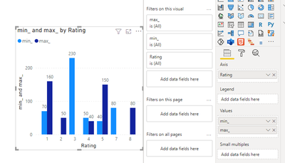
Create two measures for min date and max date.
min_ = CALCULATE(SUM('table'[Sales]),FILTER('table','table'[Date]=MIN('Date Table'[Date])))

max_ = CALCULATE(SUM('table'[Sales]),FILTER('table','table'[Date]=MAX('Date Table'[Date])))
Then create a visual as below.
Best Regards,
Jay
If this post helps, then please consider Accept it as the solution to help the other members find it.
- Mark as New
- Bookmark
- Subscribe
- Mute
- Subscribe to RSS Feed
- Permalink
- Report Inappropriate Content
Thanks it that i need.
But in this case if dont have date in table1 ( that in slicer of date table), then it is not shown on chart. Can measure take nearly date ?
( For example if in slicer period( from 01.03.2021 to 10.03.2021),and in table in 03.2021 is near date 02.03.2021, than it show on chart: 02.03.2021 and 10.03.2021.
Any idea?
Helpful resources

Microsoft Fabric Learn Together
Covering the world! 9:00-10:30 AM Sydney, 4:00-5:30 PM CET (Paris/Berlin), 7:00-8:30 PM Mexico City

Power BI Monthly Update - April 2024
Check out the April 2024 Power BI update to learn about new features.

| User | Count |
|---|---|
| 114 | |
| 100 | |
| 78 | |
| 75 | |
| 50 |
| User | Count |
|---|---|
| 144 | |
| 109 | |
| 108 | |
| 88 | |
| 61 |

