This time we’re going bigger than ever. Fabric, Power BI, SQL, AI and more. We're covering it all. You won't want to miss it.
Learn moreLevel up your Power BI skills this month - build one visual each week and tell better stories with data! Get started
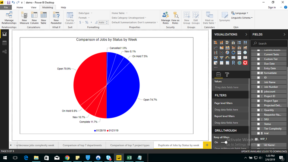
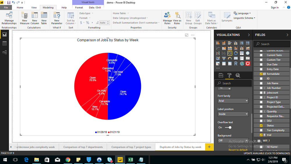
I have a pie chart and I would like to see all the data labels in that. I'm able to see the data labels when I select the label position as "INSIDE" but the chart is getting too messy. I would like to see the data labels outside but when I select that option some of them are hidden.
Please find the attached images.
Could you please help me out with this
Take advantage of Slicers in Power BI and use ALL and ALLSELECTED in measures if necessary.
When I use slicer functionalty and select all it's the same result there's no change.
Check out the April 2026 Power BI update to learn about new features.
Sign up to receive a private message when registration opens and key events begin.
If you have recently started exploring Fabric, we'd love to hear how it's going. Your feedback can help with product improvements.
| User | Count |
|---|---|
| 35 | |
| 27 | |
| 26 | |
| 22 | |
| 18 |
| User | Count |
|---|---|
| 66 | |
| 36 | |
| 32 | |
| 26 | |
| 23 |