- Power BI forums
- Updates
- News & Announcements
- Get Help with Power BI
- Desktop
- Service
- Report Server
- Power Query
- Mobile Apps
- Developer
- DAX Commands and Tips
- Custom Visuals Development Discussion
- Health and Life Sciences
- Power BI Spanish forums
- Translated Spanish Desktop
- Power Platform Integration - Better Together!
- Power Platform Integrations (Read-only)
- Power Platform and Dynamics 365 Integrations (Read-only)
- Training and Consulting
- Instructor Led Training
- Dashboard in a Day for Women, by Women
- Galleries
- Community Connections & How-To Videos
- COVID-19 Data Stories Gallery
- Themes Gallery
- Data Stories Gallery
- R Script Showcase
- Webinars and Video Gallery
- Quick Measures Gallery
- 2021 MSBizAppsSummit Gallery
- 2020 MSBizAppsSummit Gallery
- 2019 MSBizAppsSummit Gallery
- Events
- Ideas
- Custom Visuals Ideas
- Issues
- Issues
- Events
- Upcoming Events
- Community Blog
- Power BI Community Blog
- Custom Visuals Community Blog
- Community Support
- Community Accounts & Registration
- Using the Community
- Community Feedback
Register now to learn Fabric in free live sessions led by the best Microsoft experts. From Apr 16 to May 9, in English and Spanish.
- Power BI forums
- Forums
- Get Help with Power BI
- Desktop
- Show acumulated values
- Subscribe to RSS Feed
- Mark Topic as New
- Mark Topic as Read
- Float this Topic for Current User
- Bookmark
- Subscribe
- Printer Friendly Page
- Mark as New
- Bookmark
- Subscribe
- Mute
- Subscribe to RSS Feed
- Permalink
- Report Inappropriate Content
Show acumulated values
Hi!
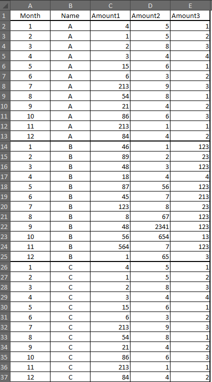
I've got the following table in excel:
What I need to do is to show in a line chart graph the 3 amounts.
But the first must be accumulated, for example:
In month 1 I've got 54 (4+46+4)
In month 2 Iv'e got 91 (1+89+1) but in the chart month 2 must have the value of month 1 + month 2 : 54+91=145. And so on, in Month 3 = month 2 + month 3
Month 4 = month 3 + month 4
etc..
Is it possible?
Do I have to do something in the excel file or directly in power bi?
Kind regards
Solved! Go to Solution.
- Mark as New
- Bookmark
- Subscribe
- Mute
- Subscribe to RSS Feed
- Permalink
- Report Inappropriate Content
Hi,
One way to do this would be to create three separate measures in Power BI with the following code:
Measure1=Calculate(Sum('TableName'[Amount1]);
Filter(All('TableName'[Month]);
'TableName'[Month]<=MAX('TableName'[Month])
)
)
Substitute 'TableName' with the name that your table has when imported into Power BI.
Then Measure2, Measure3 similar but use columns Amount2, 3...
Create the visual by adding a line chart and put Month on Axis and the three measures in Values.
Br,
Magnus
- Mark as New
- Bookmark
- Subscribe
- Mute
- Subscribe to RSS Feed
- Permalink
- Report Inappropriate Content
Helpful resources

Microsoft Fabric Learn Together
Covering the world! 9:00-10:30 AM Sydney, 4:00-5:30 PM CET (Paris/Berlin), 7:00-8:30 PM Mexico City

Power BI Monthly Update - April 2024
Check out the April 2024 Power BI update to learn about new features.

| User | Count |
|---|---|
| 107 | |
| 98 | |
| 78 | |
| 65 | |
| 53 |
| User | Count |
|---|---|
| 144 | |
| 103 | |
| 98 | |
| 85 | |
| 64 |

