- Power BI forums
- Updates
- News & Announcements
- Get Help with Power BI
- Desktop
- Service
- Report Server
- Power Query
- Mobile Apps
- Developer
- DAX Commands and Tips
- Custom Visuals Development Discussion
- Health and Life Sciences
- Power BI Spanish forums
- Translated Spanish Desktop
- Power Platform Integration - Better Together!
- Power Platform Integrations (Read-only)
- Power Platform and Dynamics 365 Integrations (Read-only)
- Training and Consulting
- Instructor Led Training
- Dashboard in a Day for Women, by Women
- Galleries
- Community Connections & How-To Videos
- COVID-19 Data Stories Gallery
- Themes Gallery
- Data Stories Gallery
- R Script Showcase
- Webinars and Video Gallery
- Quick Measures Gallery
- 2021 MSBizAppsSummit Gallery
- 2020 MSBizAppsSummit Gallery
- 2019 MSBizAppsSummit Gallery
- Events
- Ideas
- Custom Visuals Ideas
- Issues
- Issues
- Events
- Upcoming Events
- Community Blog
- Power BI Community Blog
- Custom Visuals Community Blog
- Community Support
- Community Accounts & Registration
- Using the Community
- Community Feedback
Register now to learn Fabric in free live sessions led by the best Microsoft experts. From Apr 16 to May 9, in English and Spanish.
- Power BI forums
- Forums
- Get Help with Power BI
- Desktop
- Show /Hide two overlapped visuals based on slicer ...
- Subscribe to RSS Feed
- Mark Topic as New
- Mark Topic as Read
- Float this Topic for Current User
- Bookmark
- Subscribe
- Printer Friendly Page
- Mark as New
- Bookmark
- Subscribe
- Mute
- Subscribe to RSS Feed
- Permalink
- Report Inappropriate Content
Show /Hide two overlapped visuals based on slicer selection
Hello Community ,
I have two visuals on top of each other (overlapped) : one is line chart (visual displayed by default) and the other is clustred column chart
I would like to display the clustred column chart visual when I select one of the first three slicer values
and the visual line chart for the fourth slicer
so it displays one and disappears the other
how I can do it with the dax language
Thanks a lot
Solved! Go to Solution.
- Mark as New
- Bookmark
- Subscribe
- Mute
- Subscribe to RSS Feed
- Permalink
- Report Inappropriate Content
@Anonymous
Please check this video https://www.youtube.com/watch?v=_Afcj8mT5_Q
Thanks,
Ritesh
Mark my post as a solution if it helped you| Munde and Kudis (Ladies and Gentlemen) I like your Kudos!! !!
My YT Channel Dancing With Data !! Connect on Linkedin !! PL 300 Certification Series
- Mark as New
- Bookmark
- Subscribe
- Mute
- Subscribe to RSS Feed
- Permalink
- Report Inappropriate Content
not using a slicer, you will a woraround using buttons:
1) create two visual bottons lets say for example "on" and "off"
2) create the 2 visuals and overlap them in the position they going
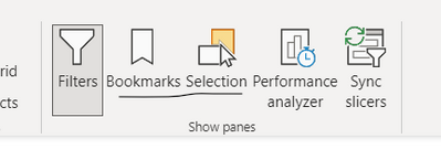
3) open the selection tab, bookmark tap
them create 2 bookmarks, hide the 1 visual and 1 botton, create a bookmark with it int ehe given condiitons and effects you want, them create a second bookmark with the contrary hide/show visuals botton icon
them assing a bookmark to each botton and when clicked there you go the visual changes,
Note: this workaround if used for tons of visual will affect the report page performance.
Did I answer your question? Mark my post as a solution! / Did it help? Give some Kudos!
Proud to be a Super User!
- Mark as New
- Bookmark
- Subscribe
- Mute
- Subscribe to RSS Feed
- Permalink
- Report Inappropriate Content
@Anonymous
Please check this video https://www.youtube.com/watch?v=_Afcj8mT5_Q
Thanks,
Ritesh
Mark my post as a solution if it helped you| Munde and Kudis (Ladies and Gentlemen) I like your Kudos!! !!
My YT Channel Dancing With Data !! Connect on Linkedin !! PL 300 Certification Series
Helpful resources

Microsoft Fabric Learn Together
Covering the world! 9:00-10:30 AM Sydney, 4:00-5:30 PM CET (Paris/Berlin), 7:00-8:30 PM Mexico City

Power BI Monthly Update - April 2024
Check out the April 2024 Power BI update to learn about new features.

| User | Count |
|---|---|
| 114 | |
| 100 | |
| 81 | |
| 70 | |
| 62 |
| User | Count |
|---|---|
| 148 | |
| 116 | |
| 104 | |
| 90 | |
| 65 |

