- Power BI forums
- Updates
- News & Announcements
- Get Help with Power BI
- Desktop
- Service
- Report Server
- Power Query
- Mobile Apps
- Developer
- DAX Commands and Tips
- Custom Visuals Development Discussion
- Health and Life Sciences
- Power BI Spanish forums
- Translated Spanish Desktop
- Power Platform Integration - Better Together!
- Power Platform Integrations (Read-only)
- Power Platform and Dynamics 365 Integrations (Read-only)
- Training and Consulting
- Instructor Led Training
- Dashboard in a Day for Women, by Women
- Galleries
- Community Connections & How-To Videos
- COVID-19 Data Stories Gallery
- Themes Gallery
- Data Stories Gallery
- R Script Showcase
- Webinars and Video Gallery
- Quick Measures Gallery
- 2021 MSBizAppsSummit Gallery
- 2020 MSBizAppsSummit Gallery
- 2019 MSBizAppsSummit Gallery
- Events
- Ideas
- Custom Visuals Ideas
- Issues
- Issues
- Events
- Upcoming Events
- Community Blog
- Power BI Community Blog
- Custom Visuals Community Blog
- Community Support
- Community Accounts & Registration
- Using the Community
- Community Feedback
Register now to learn Fabric in free live sessions led by the best Microsoft experts. From Apr 16 to May 9, in English and Spanish.
- Power BI forums
- Forums
- Get Help with Power BI
- Desktop
- Re: Share your thoughts on the new format pane (pr...
- Subscribe to RSS Feed
- Mark Topic as New
- Mark Topic as Read
- Float this Topic for Current User
- Bookmark
- Subscribe
- Printer Friendly Page
- Mark as New
- Bookmark
- Subscribe
- Mute
- Subscribe to RSS Feed
- Permalink
- Report Inappropriate Content
Share your thoughts on the new format pane (preview)
Hit Reply to tell us what you think about the new format pane so we can continue to improve.
For example:
- What changes would you like to see?
- If you turned off the preview switch, why?
- Any suggestions for addititional settings or capabilities?
Thanks,
-Power BI team
To read more about the feature see the announcement in the Power BI Product Blog
- Mark as New
- Bookmark
- Subscribe
- Mute
- Subscribe to RSS Feed
- Permalink
- Report Inappropriate Content
We have fixed this issue for the upcoming April release!
- Mark as New
- Bookmark
- Subscribe
- Mute
- Subscribe to RSS Feed
- Permalink
- Report Inappropriate Content
Have turned off the new format pane. It's a poor design that adds many additional clicks to something that was already clunky. Basic formatting options are harder to find or no longer exist. Final straw was when I tried to change the text size of items in a slicer, I assume this has setting wasn't migrated as using the search bar didn't even help.
- Mark as New
- Bookmark
- Subscribe
- Mute
- Subscribe to RSS Feed
- Permalink
- Report Inappropriate Content
Text size for slicer items should be under the "Values" card. What did you search for? Perhaps there's more we can do here for search aliases so you can better find what you're looking for.
We are planning to add a user preference setting to maintain expansion of the subcategories when you open a card very similar to the old format pane behavior. Would this help cut down on the added clicks? What other improvements would help you?
- Mark as New
- Bookmark
- Subscribe
- Mute
- Subscribe to RSS Feed
- Permalink
- Report Inappropriate Content
Needs improvement.
Already mentioned here, missing controls and much more awkward to use. Potentially could be better, but I really don't appreciate having it forced upon me at the drop of a hat. And for goodness sake, please do not turn off the classic view until this is improved.
- Mark as New
- Bookmark
- Subscribe
- Mute
- Subscribe to RSS Feed
- Permalink
- Report Inappropriate Content
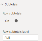
I needed to switch back to the old Format pane to update the 'Row Subtotal Label'. it was a value different than 'Total' and the text was not available in the new format pane menus.
In OLD formating pane, I can modify the lable
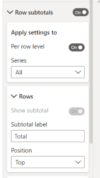
In the new Formating pane I see this (below) for the same table. The Total label is set to default and I can't edit it and the lable is actually at the bottom and changing TOP or Bottom makes no difference.
- Mark as New
- Bookmark
- Subscribe
- Mute
- Subscribe to RSS Feed
- Permalink
- Report Inappropriate Content
Hi,
I have this issue too. I cannot change subtotals labels in new formating pane.
Regards
- Mark as New
- Bookmark
- Subscribe
- Mute
- Subscribe to RSS Feed
- Permalink
- Report Inappropriate Content
Thanks for reporting. We're investigating the position bug. The label should be editable by just typing in the box, but it looks like our highlight and delete for the default text isn't working as expected. I'll file a bug to take a look at this as well.
- Mark as New
- Bookmark
- Subscribe
- Mute
- Subscribe to RSS Feed
- Permalink
- Report Inappropriate Content
Just checked the April update - the issue reported above is still there.
For the record, I like the new formating pane and after some usage, can be very powerful to use. However, I am concerned now that after the next (May) update, we'll lose the option to revert back if we are still missing essestial features or still buggy.
- Mark as New
- Bookmark
- Subscribe
- Mute
- Subscribe to RSS Feed
- Permalink
- Report Inappropriate Content
Thanks for the follow up. Are you referring to the position bug or the label entry issue? Could you file a ticket at https://powerbi.microsoft.com/support/ so we can take a closer look.
- Mark as New
- Bookmark
- Subscribe
- Mute
- Subscribe to RSS Feed
- Permalink
- Report Inappropriate Content
I as well as everyone else in my org have turned off the preview after using it for awhile. We're really not a fan of this new pane as it adds a lot of extra clicks and confusion. We now have unfamiliar categories and subcategories along with too many clicks to get to a simple format change.
- Mark as New
- Bookmark
- Subscribe
- Mute
- Subscribe to RSS Feed
- Permalink
- Report Inappropriate Content
There are some bugs and missing features:
Date slider: You can no longer set the slider to not being dynamic (I used that feature to change the large slider controls to the small bars instead, as these take up much less space).
When correcting the title of a graph, the input stops after 3-4 characters and either continues at the end of the text or simply does not register the input. As it is now, I am forced to input 3 characters at a time, pause for a second, and then input 3 more characters, which is sooooo frustrating. This is the same behaviour for all the text input boxes in the new format pane (Title, slider header, button text etc.).
- Mark as New
- Bookmark
- Subscribe
- Mute
- Subscribe to RSS Feed
- Permalink
- Report Inappropriate Content
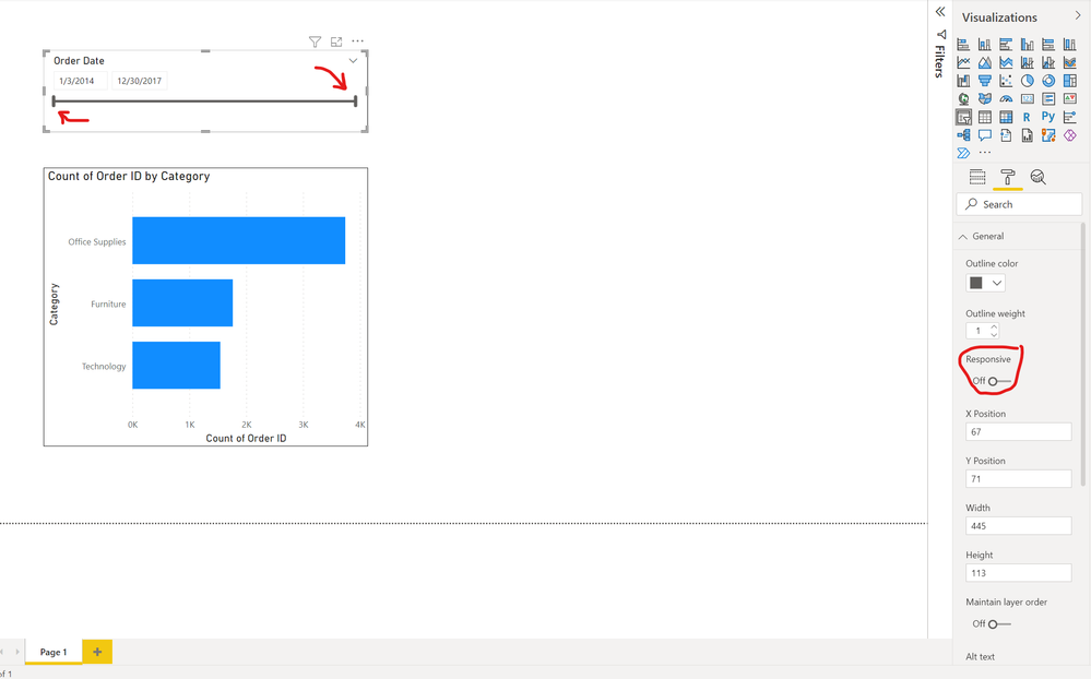
The date slider issue has been a major concern of mine as well. The old format pane had a toggle to easily switch "responsive" off (see image below).
The new pane has this button completely disabled in the advanced options setting underneath the properties section of 'general' (see image below). It was stated that this would've been addressed in the 2021 December release, but the issue is still present:
https://powerbi.microsoft.com/en-us/blog/introducing-the-new-format-pane-preview/
Little things like this + additional clicks that now have to be made to perform simple formatting changes (i.e. turning on a visual border) have been very frustrating and I've also opted to keep the new pane off until some of these issues can be addressed.
- Mark as New
- Bookmark
- Subscribe
- Mute
- Subscribe to RSS Feed
- Permalink
- Report Inappropriate Content
I found the same issue with titles. I told Microsoft this as well as a number of other issues with this feature, and haven't seen any comments. I sure hope all my bookmarks don't break when they go live with this new feature.
- Mark as New
- Bookmark
- Subscribe
- Mute
- Subscribe to RSS Feed
- Permalink
- Report Inappropriate Content
Hi phelmsdk, Shelley,
When you say "Date slider" are you referring to the slicer? We have fixed this bug for the upcoming April release. We also have a fix for the delay in the cursor position causing this weird behavior for text input also coming for April! Apologies for the inconvenience this has caused you.
Shelley, regarding your other feedback I have routed those to the according folks on the team. The new format pane should not be impacting your bookmarks, we are investigating the issue.
- Mark as New
- Bookmark
- Subscribe
- Mute
- Subscribe to RSS Feed
- Permalink
- Report Inappropriate Content
I had to turn it off because you can't put Actions onto Shapes anymore. We used the circle shape to create buttons with booksmark actions etc. which can't be adjusted with the new format pane anymore.
- Mark as New
- Bookmark
- Subscribe
- Mute
- Subscribe to RSS Feed
- Permalink
- Report Inappropriate Content
Actually, you can do the same by inserting a blank button, change the shape to Oval and adjust width and height to the same size.
For custom images, just insert the image (without the circle) as a custom icon.
...or just insert your image as a custom icon in a blank button - it has the same effect.
- Mark as New
- Bookmark
- Subscribe
- Mute
- Subscribe to RSS Feed
- Permalink
- Report Inappropriate Content
Thanks for the adivce , that would actually work. Yet, to adjust around 60 reports, each with several pages, each with the same four custom buttons on it, would be a very unpleasant thing to do. So I hope they just reintroduce actions for shapes.
- Mark as New
- Bookmark
- Subscribe
- Mute
- Subscribe to RSS Feed
- Permalink
- Report Inappropriate Content
Hi Jan, action for shapes should be available, do you have the latest version of desktop?
- Mark as New
- Bookmark
- Subscribe
- Mute
- Subscribe to RSS Feed
- Permalink
- Report Inappropriate Content
I turned it off. I don't think the per row level subtotals works. I tried every variation and nothing seemed to work. Also, way too many clicks in between settings. I tab through the position and size, now have to open up two seperate sections. Also, BRING BACK DARK MODE lol. I know it's an idea, which I voted for a few YEARS ago.
- Mark as New
- Bookmark
- Subscribe
- Mute
- Subscribe to RSS Feed
- Permalink
- Report Inappropriate Content
Now that I've used the format pane a bit more, I still maintain there's a bit too much clicking.
Secondly, I dont like that the highlighted portion of the format pane changes for each chart type. For Horizontal bar charts its Bars, For Vertical bar charts its columns, for KPI's its Callout value, etc. Now that I know what to look for I may be less lost but I think it adds to the confusion of where things are and may not be so intuitive to everyone.
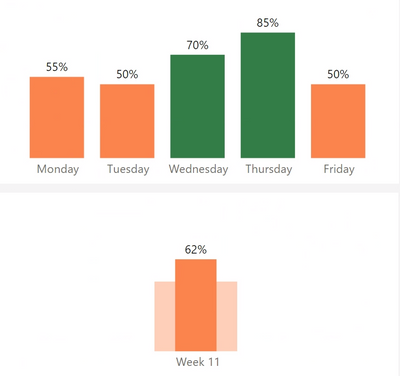
Thirdly, the custom format does not seem to work when a chart is in highlight mode. Has this always been the case? The image below show that a value turns green when above 60% in the filtered chart but in the highlighted chat, the custom filter does not work until the interaction is changed to filter. Would be nice to see the custom color work whether on filter or highlight interaction mode.
- Mark as New
- Bookmark
- Subscribe
- Mute
- Subscribe to RSS Feed
- Permalink
- Report Inappropriate Content
Ok I've Spent more time with the formatting pane and getting used to where things are but maintan that there's still so much clicking so will say that.
Secondly, it seems this attribute changes based on what type of chart you're using. I dont know about others but it is possible this could be what is adding to the confusion of where things are. There's Bar for horizontal bar charts, Column for vertical bar charts, Callout Value for KPIs, etc. Now that I know this, I kind of know what to look for but having a more consistent name regardless of the chart may be more intuitive.
Thirdly, it appears that when a chart is filtered by another chart and the interaction on the filtered chart is on highlight, the custom formatting does not seem to apply on the filtered chart. Has that always been or is this possibly a change in behavior?
For example, there's a threshold that converts colors to green 60% and above. The top chart shows as desired because the interaction mode is filtered so values above 60% are green, the bottom one does not because its interaction mode is set to highlight. Would be nice if the custom format color applies to the highlight as well.
Helpful resources

Microsoft Fabric Learn Together
Covering the world! 9:00-10:30 AM Sydney, 4:00-5:30 PM CET (Paris/Berlin), 7:00-8:30 PM Mexico City

Power BI Monthly Update - April 2024
Check out the April 2024 Power BI update to learn about new features.

| User | Count |
|---|---|
| 110 | |
| 95 | |
| 76 | |
| 65 | |
| 51 |
| User | Count |
|---|---|
| 146 | |
| 109 | |
| 106 | |
| 88 | |
| 61 |


