- Power BI forums
- Updates
- News & Announcements
- Get Help with Power BI
- Desktop
- Service
- Report Server
- Power Query
- Mobile Apps
- Developer
- DAX Commands and Tips
- Custom Visuals Development Discussion
- Health and Life Sciences
- Power BI Spanish forums
- Translated Spanish Desktop
- Power Platform Integration - Better Together!
- Power Platform Integrations (Read-only)
- Power Platform and Dynamics 365 Integrations (Read-only)
- Training and Consulting
- Instructor Led Training
- Dashboard in a Day for Women, by Women
- Galleries
- Community Connections & How-To Videos
- COVID-19 Data Stories Gallery
- Themes Gallery
- Data Stories Gallery
- R Script Showcase
- Webinars and Video Gallery
- Quick Measures Gallery
- 2021 MSBizAppsSummit Gallery
- 2020 MSBizAppsSummit Gallery
- 2019 MSBizAppsSummit Gallery
- Events
- Ideas
- Custom Visuals Ideas
- Issues
- Issues
- Events
- Upcoming Events
- Community Blog
- Power BI Community Blog
- Custom Visuals Community Blog
- Community Support
- Community Accounts & Registration
- Using the Community
- Community Feedback
Register now to learn Fabric in free live sessions led by the best Microsoft experts. From Apr 16 to May 9, in English and Spanish.
- Power BI forums
- Forums
- Get Help with Power BI
- Desktop
- Re: Share your thoughts on the new On-Object Inter...
- Subscribe to RSS Feed
- Mark Topic as New
- Mark Topic as Read
- Float this Topic for Current User
- Bookmark
- Subscribe
- Printer Friendly Page
- Mark as New
- Bookmark
- Subscribe
- Mute
- Subscribe to RSS Feed
- Permalink
- Report Inappropriate Content
Share your thoughts on the new On-Object Interaction feature (preview)
Hit Reply to tell us what you think about the new On-Object Interaction feature so we can continue to improve.
For example:
- What changes would you like to see?
- If you turned off the preview switch, why?
- Any suggestions for addititional settings or capabilities?
Thanks,
-Power BI team
To read more about the feature, see the announcement in the Power BI Product Blog or our documentation on how to Use on-object interaction
FAQs:
- Q: How can I open multiple panes at once?
- A: You can CTRL + click or right click on the unselected pane you wish to open and choose "Open in new pane"
- Q: Where did aggregations move to?
- A: It's still on right click of a field, or you can use the new flyout aggregations dropdown while choosing or swapping a field.
- Q: Where did drillthrough and tooltip page setup move to?
- A: Drillthrough is now in the page settings of the format pane under Page Information > Page type > Drillthrough or Tooltip.
- Mark as New
- Bookmark
- Subscribe
- Mute
- Subscribe to RSS Feed
- Permalink
- Report Inappropriate Content
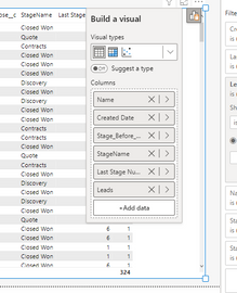
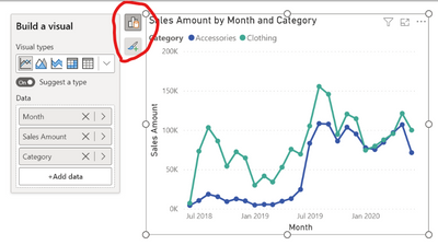
I do not like that popping open the menu requires an extra step and pops open a menu that covers up other visuals, sometimes even the one I'm actually working on (see pic). You've actually decreased my visibility in the attempt to make it bigger.
In order to compare fields used across visuals I have to click on each chart, then click again on the build visuals box (which may or may not show up on the side I was expecting, and then make comparisons. Because the box shows up in random places, depending on the location of the visual itself on the canvas, this is no longer an automatic glance back and forth, plus it may have just covered up the chart I was comparing it to. To compare fields I have to click 4 times instead of two. That adds up when I'm checking multiple fields on multiple visuals. And adding fields is no longer adjacent to the data pane. I eventually realized that there is a way to open it on the build visuals tab, but that again requires an extra step.
I've also noticed that if I accidentally click on the chart behind the build pane that it closes the build pane. This doesn't matter much most of the time, but if I'm adjusting the size of columns it's easy to miss. Not enough on its own to make me remove the feature, but another headache on something I'm already frustrated with.
I'd be satisfied if I just had the option to pin it open in the old spot, similar to the option to pin other panes from the right side, but I've searched online to no avail. It is further frustrating that when I do pin the other panes open, the sidebar you use to do so is still pinned in place and now takes up an extra half inch, making my screen size actually smaller than it was before. When I'm working on the laptop, as opposed to my larger monitors, even this sliver matters a great deal.
I was excited about the release, hoping it would make accessing the formatting easier and faster, but instead it's now created severe aggravation on issues that weren't broken to start with. Ironically, I can pin the format menu open now, but not the build visual option with the fields.
- Mark as New
- Bookmark
- Subscribe
- Mute
- Subscribe to RSS Feed
- Permalink
- Report Inappropriate Content
Hi tableauspoiled,
Please stay tuned for the June and July releases. There will be options for the positioning of menus that should help out with the issues you mentioned
- Mark as New
- Bookmark
- Subscribe
- Mute
- Subscribe to RSS Feed
- Permalink
- Report Inappropriate Content
I cannot find the drill through option. I had to switch back.
- Mark as New
- Bookmark
- Subscribe
- Mute
- Subscribe to RSS Feed
- Permalink
- Report Inappropriate Content
You have to set that up within the page info section, see the following link:
Solved: Preview - On-object interaction: Where's the Drill... - Microsoft Power BI Community
- Mark as New
- Bookmark
- Subscribe
- Mute
- Subscribe to RSS Feed
- Permalink
- Report Inappropriate Content
Please allow for widening of the Build a visual box so we can read longer field names without hovering over them.
Also, please make it easier to change the order of fields in a visual. It appears the drag and drop function is is only available once we turn off the 'Suggest a type' toggle... This is not at all intuitive.
Thanks.
- Mark as New
- Bookmark
- Subscribe
- Mute
- Subscribe to RSS Feed
- Permalink
- Report Inappropriate Content
Hi VanessaWilson,
Thanks for the feedback. The ability to resize the menus that is also accessible is something we are looking into now. TBD on the release though
The "Suggest a type" feature looks at the data that you have added and doesn't take into consideration the order, so reorder fields wouldn't affect the visual. This feature is optional if it isn't helpful for you. If you open the Options dialog and look under Global Report settings, you can uncheck "Suggest a type by default". Then you will be able to select your visual type and reorder like you would previously
- Mark as New
- Bookmark
- Subscribe
- Mute
- Subscribe to RSS Feed
- Permalink
- Report Inappropriate Content
I have turned off the preview of this feature. What I found most frustrating is the difficulty of managing the data fields / measures on visuals like matrix or table view. It is not friendly, difficult to make changes. Instead of a single smooth drag-and-drop, not I need to click, scroll, click and then drag-and-drop.
Sure I could just check the checkbox in the data pane, but it seems to put the field on the wrong axis (or column vs row) most of the time, so I still have to go through the above process to fix it. Even if it works, the above process is still required to change the ordering of items.
- Mark as New
- Bookmark
- Subscribe
- Mute
- Subscribe to RSS Feed
- Permalink
- Report Inappropriate Content
Hi Janos,
Thank you. I completely understand the feedback you are sharing. We are looking into making the menus more dynamic so they better utilize the available space to reduce scrolling. This should allow you to just use drag and drop. It is TBD for when this will be available
- Mark as New
- Bookmark
- Subscribe
- Mute
- Subscribe to RSS Feed
- Permalink
- Report Inappropriate Content
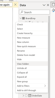
I think this was overlooked. There is no need for hidden tables to be visible here.
- Mark as New
- Bookmark
- Subscribe
- Mute
- Subscribe to RSS Feed
- Permalink
- Report Inappropriate Content
Hi enb080,
Thanks for the feedback. At the moment the View hidden option is synced from the Data pane. Would you need these options to not be synced in this case? Could you tell me a little bit more about why you would need this?
- Mark as New
- Bookmark
- Subscribe
- Mute
- Subscribe to RSS Feed
- Permalink
- Report Inappropriate Content
I might have missed it, but while working with some maps, I found myself wondering which map type I had selected. Normally, I'd be able to get a visual indicator of that (without clicks) by looking under the Visualizations pane, on the "Add data to your visual" tab. I couldn't easily find a visual clue like that. Maybe you could do that in the ribbon similar to how Excel has a visual indicator when the "Chart Design" main tab is enabled.
Overall, I like the direction this is going, but it needs a lot of public preview time. I'll try to submit more concrete feedback as I have time.
- Mark as New
- Bookmark
- Subscribe
- Mute
- Subscribe to RSS Feed
- Permalink
- Report Inappropriate Content
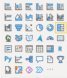
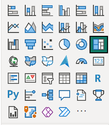
I agree. The selection is way too subtle even in the non-preview version. I regularly stare at the screen 5-15 seconds trying to figure out which one is selected.
Here's an example of how subtle the selection is:
Suggestion - Make the square bigger and a color distinct from the icons. I like Power BI Yellow here. It jumps out:
If you have to use Power BI Teal, how about this?
Even just a larger black square would help immensely!
- Mark as New
- Bookmark
- Subscribe
- Mute
- Subscribe to RSS Feed
- Permalink
- Report Inappropriate Content
I tried it for about an hour. It just doesn't feel intuitive or organized.
As the saying goes "if it ain't broke, don't fix it"
This imo is a completely unnecessary change and just causes more friction when working with reports and visuals.
- Mark as New
- Bookmark
- Subscribe
- Mute
- Subscribe to RSS Feed
- Permalink
- Report Inappropriate Content
Hi peterg0417,
Even an hour of testing time is appreciated by the team.
There is a lot of functionality that came with this preview. So, we can better categorize your feedback within the team, can you let us know which areas are causing the friction for you?
This way if you do like something about formatting, but you really do not like the build menu moving to the side of the visuals we can address the specifics. This is just an example. It could be any of the areas you are/are not liking.
Thank you
- Mark as New
- Bookmark
- Subscribe
- Mute
- Subscribe to RSS Feed
- Permalink
- Report Inappropriate Content
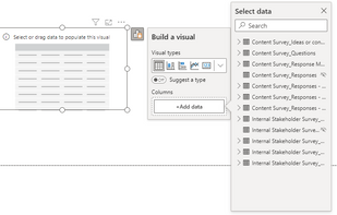
I tried it since its release but have since turned it off. i like the idea, but as implemented it simply isnt working well for me. I found it annoying not only because it increased development time but also because the screen overlays, like those circled in red below, interfere with other objects the most notable of which is the editor pane.
- Mark as New
- Bookmark
- Subscribe
- Mute
- Subscribe to RSS Feed
- Permalink
- Report Inappropriate Content
Hi Huffd,
Thank you for your feedback. We are looking into ways to cut increased development time across the board. If you want to highlight any specific scenarios where your development time is increasing, please tell us. This is always helpful when we prioritize what order we work on updates. Please stay tuned for our June update and later updates as we are incorporating feedback to help in this area.
We have a bug right now where the overlays are showing above specific surfaces. We are working on a fix for that. Our bug mentions the formula bar and the file menu presently.
Can you let me know which pane you mean by editor pane? I want to make sure this bug is fixed if we have missed a surface. Thank you
- Mark as New
- Bookmark
- Subscribe
- Mute
- Subscribe to RSS Feed
- Permalink
- Report Inappropriate Content
Takes a bit to get used but I've started to like this feature. One enhancement that I feel would improve the experience is the ability to filter in the "Build a Visual" pane or whatever you call it. That way the Filters pane that's still needed can be minimized. Still would be needed for Page and Report filters but the specific visualization filters can be eliminated.
One option that would be nice is if when you click on a field in the On-Object Interaction, you were shown the data in that attribute and could create the filters there rather than having to navigate to another part of the canvas.
- Mark as New
- Bookmark
- Subscribe
- Mute
- Subscribe to RSS Feed
- Permalink
- Report Inappropriate Content
Trying to turn this off, but nothing happens. Tried:
- Turning it off with a visual selected, saving the report and reopening it
- Turning it off without any visual selected, saving the report and reopening it
- Opening a blank report and turning it off and restarting the program
Please advise how I can remove this feature! Not being able to drag and drop fields but having to select them on the visual itself is messing with my workflow.
- Mark as New
- Bookmark
- Subscribe
- Mute
- Subscribe to RSS Feed
- Permalink
- Report Inappropriate Content
You can turn off the preview from the File > Options and settings > Options > Preview features and uncheck "On-object interaction."
Are you saying the preview switch reflects unchecked (off) and it's still on for you?
- Mark as New
- Bookmark
- Subscribe
- Mute
- Subscribe to RSS Feed
- Permalink
- Report Inappropriate Content
Hi, yes. Is there another way to turn it off? I have done exactly that for all three scenarios. I have now also done it trying to close the program by ending the task in task manager to make sure it does not "revert" somehow because of seeing visuals with the feature before closing the program. In all of the scenarios, I unchecked that box and clicked OK. Clicking OK just keeps the options open (I take it that it is not supposed to - but rather close). Also tried other settings, and since that update, I cannot change a single setting (none) in my Power BI Desktop application - nothing sticks.
Still no luck.
- Mark as New
- Bookmark
- Subscribe
- Mute
- Subscribe to RSS Feed
- Permalink
- Report Inappropriate Content
We need the fixed data fields pane back. The new feature takes way more time to locate the place to drop fields.
In the old, fixed pane - muscle memory does the trick. Please make it an option
Helpful resources

Microsoft Fabric Learn Together
Covering the world! 9:00-10:30 AM Sydney, 4:00-5:30 PM CET (Paris/Berlin), 7:00-8:30 PM Mexico City

Power BI Monthly Update - April 2024
Check out the April 2024 Power BI update to learn about new features.

| User | Count |
|---|---|
| 110 | |
| 94 | |
| 81 | |
| 66 | |
| 58 |
| User | Count |
|---|---|
| 150 | |
| 119 | |
| 104 | |
| 87 | |
| 67 |
