- Power BI forums
- Updates
- News & Announcements
- Get Help with Power BI
- Desktop
- Service
- Report Server
- Power Query
- Mobile Apps
- Developer
- DAX Commands and Tips
- Custom Visuals Development Discussion
- Health and Life Sciences
- Power BI Spanish forums
- Translated Spanish Desktop
- Power Platform Integration - Better Together!
- Power Platform Integrations (Read-only)
- Power Platform and Dynamics 365 Integrations (Read-only)
- Training and Consulting
- Instructor Led Training
- Dashboard in a Day for Women, by Women
- Galleries
- Community Connections & How-To Videos
- COVID-19 Data Stories Gallery
- Themes Gallery
- Data Stories Gallery
- R Script Showcase
- Webinars and Video Gallery
- Quick Measures Gallery
- 2021 MSBizAppsSummit Gallery
- 2020 MSBizAppsSummit Gallery
- 2019 MSBizAppsSummit Gallery
- Events
- Ideas
- Custom Visuals Ideas
- Issues
- Issues
- Events
- Upcoming Events
- Community Blog
- Power BI Community Blog
- Custom Visuals Community Blog
- Community Support
- Community Accounts & Registration
- Using the Community
- Community Feedback
Register now to learn Fabric in free live sessions led by the best Microsoft experts. From Apr 16 to May 9, in English and Spanish.
- Power BI forums
- Forums
- Get Help with Power BI
- Desktop
- Re: Share your thoughts on the new On-Object Inter...
- Subscribe to RSS Feed
- Mark Topic as New
- Mark Topic as Read
- Float this Topic for Current User
- Bookmark
- Subscribe
- Printer Friendly Page
- Mark as New
- Bookmark
- Subscribe
- Mute
- Subscribe to RSS Feed
- Permalink
- Report Inappropriate Content
Share your thoughts on the new On-Object Interaction feature (preview)
Hit Reply to tell us what you think about the new On-Object Interaction feature so we can continue to improve.
For example:
- What changes would you like to see?
- If you turned off the preview switch, why?
- Any suggestions for addititional settings or capabilities?
Thanks,
-Power BI team
To read more about the feature, see the announcement in the Power BI Product Blog or our documentation on how to Use on-object interaction
FAQs:
- Q: How can I open multiple panes at once?
- A: You can CTRL + click or right click on the unselected pane you wish to open and choose "Open in new pane"
- Q: Where did aggregations move to?
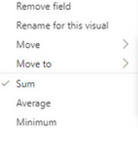
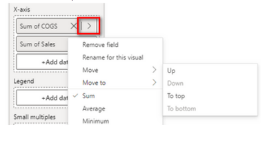
- A: It's still on right click of a field, or you can use the new flyout aggregations dropdown while choosing or swapping a field.
- Q: Where did drillthrough and tooltip page setup move to?
- A: Drillthrough is now in the page settings of the format pane under Page Information > Page type > Drillthrough or Tooltip.
- Mark as New
- Bookmark
- Subscribe
- Mute
- Subscribe to RSS Feed
- Permalink
- Report Inappropriate Content
Perfect assessment. There seems to be a lack of consideration for the volume of report building being done, we don't need to get "cutesy" with it this far into the programs development. Keep it predictable and logical.
- Mark as New
- Bookmark
- Subscribe
- Mute
- Subscribe to RSS Feed
- Permalink
- Report Inappropriate Content
Hi
I've turned this feature on about 10 minutes ago and I've litterally just tunred it off again... I think it's a great feature and I fully support enhancing the report creation/editing experience in the Power BI desktop, but with the fetaure turned on some of the older functionality has dissapeared, the new Format tab, used to becalled Visualizations and you could flick between Format and Build... it looks like the build features are now all on-object
You're giving but also taking away... i thought the Microsoft model was to offer mutiple ways to acheive the same thing!
If you're goign to make some changes, then add more formatting options to visuals, allow drill through from multi-row cards, add stacked and clustered charts... there's lots of improvements needed to the actual functionality of the visuals before you start changing where we make changes
Thanks
Jim
- Mark as New
- Bookmark
- Subscribe
- Mute
- Subscribe to RSS Feed
- Permalink
- Report Inappropriate Content
Although I appreciate that the Design team is trying to make Power BI more interactive at the granular level, it does nothing more than impact the efficiency by which we can actually do our work. The time it takes to go through multiple clicks and find multiple tables every single time just to add data to a visual is beyond anything I have seen. For example:
Previously Creating a Visual:
1. Click on Visual which is situated right next to Data pane.
2. Drag fields into Visual which is an "inch" movement of my mouse.
3. Right click to select option (i.e. Count / Distinct Count / etc).
New Approach of Creating a Visual:
1. Click on Home tab in the vertical ribbon.
2. Click on Visual which is approx three to four inches of mouse movement.
3. Move mouse to top corner of visual to make a visual change
4. Click on "Add Data"
5. Click on the "Table"
6. Click on the field from the Table.
7. Right click to select option.
8. Go through the exact same process for the "next" column.
With all the respect in the world, this is by far the worst feature to date. I highly recommend never making this a permanent change. The level of inefficiency this creates is extreme. What took 2-4 seconds to do now takes 10-12 seconds.
The above strictly focuses on the Visual pane and does not include any other impacts that arise where you need to adjust filters associated with visuals. For example, I cannot just drag and drop a field into the Filters pane without now having to leave the Visual Format pane and clicking the tiny little cylinder, first. If I am working on a visual on the far left of the canvas, that is approx 30-40 inches of screen movement (dependent on screen size).
(Note - data set is just randomly generated data and is not PII).
Again, I appreciate that the Design team wants to upgrade BI's looks and feel, but making these changes is NOT beneficial and all it does is cause significant inefficiencies and complexities that previously did not exist.
All the best,
Theo.
If I have posted a response that resolves your question, please accept it as a solution to formally close the post.
Also, if you are as passionate about Power BI, DAX and data as I am, please feel free to reach out if you have any questions, queries, or if you simply want to connect and talk to another data geek!
Want to connect?www.linkedin.com/in/theoconias
- Mark as New
- Bookmark
- Subscribe
- Mute
- Subscribe to RSS Feed
- Permalink
- Report Inappropriate Content
I am with you there. Changes to the UX just seem designed to add to the click-burden of the application. I absolutely love what I can achive with PBI, but it would be so much more productive with some thoughtful keyboard shortcuts or even just remembering UI settings between sessions! There are so many things in the do list for PBI desktop I can't help but think the team is under resourced.....
- Mark as New
- Bookmark
- Subscribe
- Mute
- Subscribe to RSS Feed
- Permalink
- Report Inappropriate Content
I turned off the preview feature as it was immediately more complex to edit reports than before. I've spent thousands of hours editing Power BI reports at this point and there is a flow to it. Each time these type of changes come out, it breaks the known flow and almost always results in more clicks and time than before.
It often seems that decisions are made as if Power BI report creators are doing simple tasks, when reports can be very detailed and having on-object is not needed and in the way.
An example of this thinking was the forced default of "Auto-Create Report" in Power BI Service. This move suggest Power BI developers think our Datasets are as simple as 3 tables with 4 columns each, when in reality we are managing massive Datasets and there is no possible way to "Auto-Create" anything. It just becomes a hassle to explain to Users why they shouldn't use it.
- Mark as New
- Bookmark
- Subscribe
- Mute
- Subscribe to RSS Feed
- Permalink
- Report Inappropriate Content
Really love these udpates. Overall very userfriendly.
@RosieL have noticed though that now in the matrix visual you cannot move the subtotals to the bottom of the visual. The subotal position is grayed out. the only way is to turned the stepped layered feature off. It would be great to go back to the old way and allow the stepped feature to be on and still allow the selection of the subtotal position to go to the bottom
Thanks!!
- Mark as New
- Bookmark
- Subscribe
- Mute
- Subscribe to RSS Feed
- Permalink
- Report Inappropriate Content
I cannot edit a measure, because there is no panel. it disappeared
- Mark as New
- Bookmark
- Subscribe
- Mute
- Subscribe to RSS Feed
- Permalink
- Report Inappropriate Content
I found how to switch on the panels, maybe the feature is ok
- Mark as New
- Bookmark
- Subscribe
- Mute
- Subscribe to RSS Feed
- Permalink
- Report Inappropriate Content
I've been using the new interaction and find it confusing, the fields/options related to drillthrough https://learn.microsoft.com/fr-fr/power-bi/create-reports/desktop-drillthrough have just disapeared. I had to switch back to the old style. As mentionned before, leave both options: interaction+the ability to show the old right hand pane.
- Mark as New
- Bookmark
- Subscribe
- Mute
- Subscribe to RSS Feed
- Permalink
- Report Inappropriate Content
So as long as the visual is' a normal table there is no 'paintbrush' icon to format visual.
- Mark as New
- Bookmark
- Subscribe
- Mute
- Subscribe to RSS Feed
- Permalink
- Report Inappropriate Content
I have two idea.
- Can you remove the boder in show panes. It is better for visual.
- Change the way to show option below .Currently i need to right click to show it.
I want to show popup above by click on arrow. Because if i click on text it will show datasource, then i click on this arrow datasource show again. I thinks it is duplicate action to view datasource.
- Mark as New
- Bookmark
- Subscribe
- Mute
- Subscribe to RSS Feed
- Permalink
- Report Inappropriate Content
I love the horizontal layout of data / format etc on the right side but I dont like the general idea of formatting Excel in PowerBI. I wish it would be optional. It is counterintuitive and oldschool. The new feature is bugged - I see new icons through the code window. Overall I wish we have dark mode instead of such features as in every single modern app. Current view hurt my ill eyes and it looks really like from other era.
- Mark as New
- Bookmark
- Subscribe
- Mute
- Subscribe to RSS Feed
- Permalink
- Report Inappropriate Content
Hi! In general this feature seems promising. Main problem I have is I'm unable to switch visualizations once I've picked one. Clicking on the icons in the Insert pane just inserts a new viz instead of switching. I'm used to the behavior where I can change a visualization on demand by clicking on a different viz icon in the visualizations pane.
- Mark as New
- Bookmark
- Subscribe
- Mute
- Subscribe to RSS Feed
- Permalink
- Report Inappropriate Content
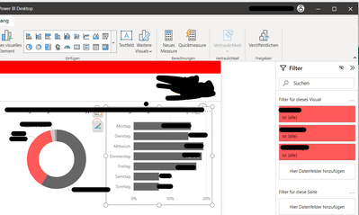
Thank you for the feedback. After you insert a new visual from the ribbon, you should see this new menu. You can change the visual type from here. There is a known bug where this menu is not open automatically. We hope to have the fix soon
- Mark as New
- Bookmark
- Subscribe
- Mute
- Subscribe to RSS Feed
- Permalink
- Report Inappropriate Content
Awesome. Thank you so much for the response. This is the kind of user engagement that makes people loyal!
- Mark as New
- Bookmark
- Subscribe
- Mute
- Subscribe to RSS Feed
- Permalink
- Report Inappropriate Content
Thank you for reaching out to gather feedback about the new On-Object Interaction feature. Here are some thoughts:
- I really like the new feature as it allows for more interactivity within the report without having to drill down to another page.
- One change I would like to see is the ability to have more customization options for the actions that can be taken on an object. Currently, the available options are limited to simple actions like changing filters or navigating to another report page.
- I haven't turned off the preview switch, as I find the feature to be useful.
- An additional capability that could be useful is the ability to have different interactions for different user roles or permissions. For example, certain interactions may only be available to admin users.
Thank you for considering our feedback, and I look forward to seeing how this feature continues to evolve.
- Mark as New
- Bookmark
- Subscribe
- Mute
- Subscribe to RSS Feed
- Permalink
- Report Inappropriate Content
Hi Power BI team,
I tried the new on-object interaction feature for a view weeks.
From my perspective I have to say that the former structure was better for working effectively. So I had to deactivate the preview feature.
One excample that created a lot of issues for me was the creation and optimization inside a report by using bookmarks and selections. In the new view it is not possible to the both settings at the same time. That makes it much more difficult to handle these features.
Also the handling on the visual itself is more confusing now.
Maybe there should be some more adjustments to optimize the user expierience.
Regards, Thomas
- Mark as New
- Bookmark
- Subscribe
- Mute
- Subscribe to RSS Feed
- Permalink
- Report Inappropriate Content
Hello Thomas,
Thanks for the feedback. There are some improvements coming that will give you options to make the structure closer to what you are used to. Please stay tuned.
You can work with the Bookmark and Selection panes at the same time. While you have the Bookmarks pane open, right click the icon for the Selection pane in the sidebar, then select the option "Open in new pane." I've attached screenshots below.
Could you give me more details around the handling on the visual itself is more confusing? This will help me better understand the issue you are having, so the team can look into possible solutions in the future. Thanks
- Mark as New
- Bookmark
- Subscribe
- Mute
- Subscribe to RSS Feed
- Permalink
- Report Inappropriate Content
I personally prefer the using the previous way. However, to cater to both preferences maybe add it is an option in View>>Show Panes.
Thanks.
- Mark as New
- Bookmark
- Subscribe
- Mute
- Subscribe to RSS Feed
- Permalink
- Report Inappropriate Content
Nice Feature, but requires some improvements.
- field order on a table can't be changed, by draging fields up or down;
- Data Panel, can't be collapsed, must be closed, then, through the menu, be activated again! It should be kept working as before, the same way the filters still do.
I've turned it off, for now.
- Mark as New
- Bookmark
- Subscribe
- Mute
- Subscribe to RSS Feed
- Permalink
- Report Inappropriate Content
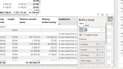
Column & measure names are difficult to read due to the fixed width of the pane and the size of the X | > icons.
I'm really missing the ability to resize the width of the pane. See image.
I have switched off the preview as I find it too difficult to have an overview of what I am working with.
Helpful resources

Microsoft Fabric Learn Together
Covering the world! 9:00-10:30 AM Sydney, 4:00-5:30 PM CET (Paris/Berlin), 7:00-8:30 PM Mexico City

Power BI Monthly Update - April 2024
Check out the April 2024 Power BI update to learn about new features.

| User | Count |
|---|---|
| 113 | |
| 100 | |
| 78 | |
| 76 | |
| 52 |
| User | Count |
|---|---|
| 144 | |
| 109 | |
| 108 | |
| 88 | |
| 61 |


