- Power BI forums
- Updates
- News & Announcements
- Get Help with Power BI
- Desktop
- Service
- Report Server
- Power Query
- Mobile Apps
- Developer
- DAX Commands and Tips
- Custom Visuals Development Discussion
- Health and Life Sciences
- Power BI Spanish forums
- Translated Spanish Desktop
- Power Platform Integration - Better Together!
- Power Platform Integrations (Read-only)
- Power Platform and Dynamics 365 Integrations (Read-only)
- Training and Consulting
- Instructor Led Training
- Dashboard in a Day for Women, by Women
- Galleries
- Community Connections & How-To Videos
- COVID-19 Data Stories Gallery
- Themes Gallery
- Data Stories Gallery
- R Script Showcase
- Webinars and Video Gallery
- Quick Measures Gallery
- 2021 MSBizAppsSummit Gallery
- 2020 MSBizAppsSummit Gallery
- 2019 MSBizAppsSummit Gallery
- Events
- Ideas
- Custom Visuals Ideas
- Issues
- Issues
- Events
- Upcoming Events
- Community Blog
- Power BI Community Blog
- Custom Visuals Community Blog
- Community Support
- Community Accounts & Registration
- Using the Community
- Community Feedback
Register now to learn Fabric in free live sessions led by the best Microsoft experts. From Apr 16 to May 9, in English and Spanish.
- Power BI forums
- Forums
- Get Help with Power BI
- Desktop
- Re: Shape Map color saturation not working
- Subscribe to RSS Feed
- Mark Topic as New
- Mark Topic as Read
- Float this Topic for Current User
- Bookmark
- Subscribe
- Printer Friendly Page
- Mark as New
- Bookmark
- Subscribe
- Mute
- Subscribe to RSS Feed
- Permalink
- Report Inappropriate Content
Shape Map color saturation not working
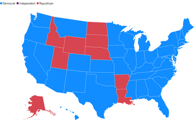
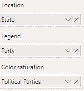
Struggling with a Shape Map for days. I am trying to get the colors based on the Political party (Democrat, Republican, Independent). Location value is "States" which is every state in the United States. In the Legends field is "Party"(the values are Democrat, Republican, Independent). I created a measure using COUNTROWS for the "Party".
Measure = COUNTROWS(FILTER('Table','Table'[Party] = Table'[Party]) )
I dragged the count rows measure into the Color saturation field. Next, I enter the format and set the data color for Democrat, Republican, Independent. Some states show the right color, majority do not. The ones that show the proper color, are the ones in which the rows in Party column are all the same value (whether it is Democrat or Republican) for the state. If it's a mix, the countrows somehow is counting by First in the list and uses the first State coloring ex blue for Democrat.
Here is an example, the State of Texas is showing as color Blue on the map. I expected it to show as color Red since majority Party is Republican per the data. In the Excel worksheet, State of Texas has over 30 representatives, 2 are in "Senate" and the majority are in the "House" (under Congress column). Party column shows most are Republican. Maybe i'm using the wrong dax formula? I don't know... I've used similar on other Shape maps and those work for the color saturation. Not sure why this one isn't working. I appreciate your help with this!!
Here is a snippet of the excel
Politician Party State Long State Short Congress
Rep1 Democrat Texas TX House
Rep2 Democrat Texas TX House
Rep3 Democrat Texas TX House
Rep4 Democrat Texas TX House
Rep5 Democrat Texas TX House
Rep6 Democrat Texas TX House
Rep7 Democrat Texas TX House
Rep8 Democrat Texas TX House
Rep9 Democrat Texas TX House
Rep10 Democrat Texas TX House
Rep11 Democrat Texas TX House
Rep12 Democrat Texas TX House
Rep13 Democrat Texas TX House
Rep14 Republican Texas TX Senate
Rep15 Republican Texas TX Senate
Rep16 Republican Texas TX House
Rep17 Republican Texas TX House
Rep18 Republican Texas TX House
Rep19 Republican Texas TX House
Rep20 Republican Texas TX House
Rep21 Republican Texas TX House
Rep22 Republican Texas TX House
Rep23 Republican Texas TX House
Rep24 Republican Texas TX House
Rep25 Republican Texas TX House
Rep26 Republican Texas TX House
Rep27 Republican Texas TX House
Rep28 Republican Texas TX House
Rep29 Republican Texas TX House
Rep30 Republican Texas TX House
Rep21 Republican Texas TX House
Rep22 Republican Texas TX House
Rep23 Republican Texas TX House
Rep24 Republican Texas TX House
Solved! Go to Solution.
- Mark as New
- Bookmark
- Subscribe
- Mute
- Subscribe to RSS Feed
- Permalink
- Report Inappropriate Content
Hi @Anonymous
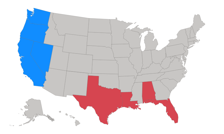
I created some dummy data for other states then I created a column to store the color for the majority party and used that as color saturation
Majority Color =

VAR _Dem = CALCULATE(COUNTROWS('Append1'), FILTER('Append1', 'Append1'[Party] = "Democrat" && 'Append1'[State Long] = EARLIER([State Long]) ))
VAR _Rep = CALCULATE(COUNTROWS('Append1'), FILTER('Append1', 'Append1'[Party] = "Republican" && 'Append1'[State Long] = EARLIER([State Long]) ))
VAR _Ind = CALCULATE(COUNTROWS('Append1'), FILTER('Append1', 'Append1'[Party] = "Independent" && 'Append1'[State Long] = EARLIER([State Long]) ))

RETURN

SWITCH(

    TRUE(),

    _Dem > _Rep && _Dem > _Ind, 0,

    _Rep > _Dem && _Rep > _Ind, 1,

    2

)
Because the Shape Map uses color shading, the different parties need discrete values to respresent them, each one can be assigned a specific color then.
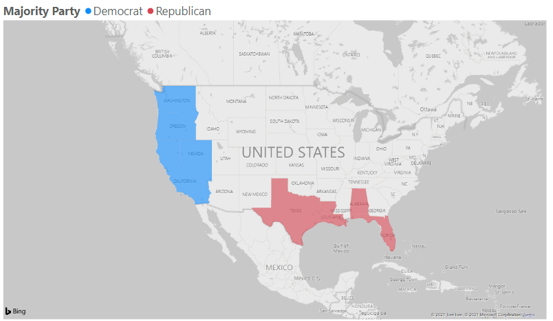
You can also do this with a Filled Map where I worked out the majority party (similar code to above)
Majority Party =

VAR _Dem = CALCULATE(COUNTROWS('Append1'), FILTER('Append1', 'Append1'[Party] = "Democrat" && 'Append1'[State Long] = EARLIER([State Long]) ))
VAR _Rep = CALCULATE(COUNTROWS('Append1'), FILTER('Append1', 'Append1'[Party] = "Republican" && 'Append1'[State Long] = EARLIER([State Long]) ))
VAR _Ind = CALCULATE(COUNTROWS('Append1'), FILTER('Append1', 'Append1'[Party] = "Independent" && 'Append1'[State Long] = EARLIER([State Long]) ))

RETURN

SWITCH(

    TRUE(),

    _Dem > _Rep && _Dem > _Ind, "Democrat",

    _Rep > _Dem && _Rep > _Ind, "Republican",

    "Independent"

)
Each party being assigned the relevant color.
The sample file above contains all this data and both maps.
Regards
Phil
Did I answer your question? Then please mark my post as the solution.
If I helped you, click on the Thumbs Up to give Kudos.
Blog :: YouTube Channel :: Connect on Linkedin
Proud to be a Super User!
- Mark as New
- Bookmark
- Subscribe
- Mute
- Subscribe to RSS Feed
- Permalink
- Report Inappropriate Content
@Anonymous
no worries 🙂
Did I answer your question? Then please mark my post as the solution.
If I helped you, click on the Thumbs Up to give Kudos.
Blog :: YouTube Channel :: Connect on Linkedin
Proud to be a Super User!
- Mark as New
- Bookmark
- Subscribe
- Mute
- Subscribe to RSS Feed
- Permalink
- Report Inappropriate Content
Hi @Anonymous
I created some dummy data for other states then I created a column to store the color for the majority party and used that as color saturation
Majority Color =

VAR _Dem = CALCULATE(COUNTROWS('Append1'), FILTER('Append1', 'Append1'[Party] = "Democrat" && 'Append1'[State Long] = EARLIER([State Long]) ))
VAR _Rep = CALCULATE(COUNTROWS('Append1'), FILTER('Append1', 'Append1'[Party] = "Republican" && 'Append1'[State Long] = EARLIER([State Long]) ))
VAR _Ind = CALCULATE(COUNTROWS('Append1'), FILTER('Append1', 'Append1'[Party] = "Independent" && 'Append1'[State Long] = EARLIER([State Long]) ))

RETURN

SWITCH(

    TRUE(),

    _Dem > _Rep && _Dem > _Ind, 0,

    _Rep > _Dem && _Rep > _Ind, 1,

    2

)
Because the Shape Map uses color shading, the different parties need discrete values to respresent them, each one can be assigned a specific color then.
You can also do this with a Filled Map where I worked out the majority party (similar code to above)
Majority Party =

VAR _Dem = CALCULATE(COUNTROWS('Append1'), FILTER('Append1', 'Append1'[Party] = "Democrat" && 'Append1'[State Long] = EARLIER([State Long]) ))
VAR _Rep = CALCULATE(COUNTROWS('Append1'), FILTER('Append1', 'Append1'[Party] = "Republican" && 'Append1'[State Long] = EARLIER([State Long]) ))
VAR _Ind = CALCULATE(COUNTROWS('Append1'), FILTER('Append1', 'Append1'[Party] = "Independent" && 'Append1'[State Long] = EARLIER([State Long]) ))

RETURN

SWITCH(

    TRUE(),

    _Dem > _Rep && _Dem > _Ind, "Democrat",

    _Rep > _Dem && _Rep > _Ind, "Republican",

    "Independent"

)
Each party being assigned the relevant color.
The sample file above contains all this data and both maps.
Regards
Phil
Did I answer your question? Then please mark my post as the solution.
If I helped you, click on the Thumbs Up to give Kudos.
Blog :: YouTube Channel :: Connect on Linkedin
Proud to be a Super User!
- Mark as New
- Bookmark
- Subscribe
- Mute
- Subscribe to RSS Feed
- Permalink
- Report Inappropriate Content
@PhilipTreacyThank you so much for this tremendous help! I have used your example and it worked with a tweak by adding the value 1 in Maximum field for the data color. I've tested it a few ways and it work exactly as I've been wanting it to. I'm still learning PowerBI and have to understand the backend functionality... Thank you, thank you for taking the time to help on this task!
Helpful resources

Microsoft Fabric Learn Together
Covering the world! 9:00-10:30 AM Sydney, 4:00-5:30 PM CET (Paris/Berlin), 7:00-8:30 PM Mexico City

Power BI Monthly Update - April 2024
Check out the April 2024 Power BI update to learn about new features.

| User | Count |
|---|---|
| 107 | |
| 97 | |
| 75 | |
| 65 | |
| 53 |
| User | Count |
|---|---|
| 144 | |
| 103 | |
| 98 | |
| 85 | |
| 64 |


