FabCon is coming to Atlanta
Join us at FabCon Atlanta from March 16 - 20, 2026, for the ultimate Fabric, Power BI, AI and SQL community-led event. Save $200 with code FABCOMM.
Register now!- Power BI forums
- Get Help with Power BI
- Desktop
- Service
- Report Server
- Power Query
- Mobile Apps
- Developer
- DAX Commands and Tips
- Custom Visuals Development Discussion
- Health and Life Sciences
- Power BI Spanish forums
- Translated Spanish Desktop
- Training and Consulting
- Instructor Led Training
- Dashboard in a Day for Women, by Women
- Galleries
- Data Stories Gallery
- Themes Gallery
- Contests Gallery
- QuickViz Gallery
- Quick Measures Gallery
- Visual Calculations Gallery
- Notebook Gallery
- Translytical Task Flow Gallery
- TMDL Gallery
- R Script Showcase
- Webinars and Video Gallery
- Ideas
- Custom Visuals Ideas (read-only)
- Issues
- Issues
- Events
- Upcoming Events
View all the Fabric Data Days sessions on demand. View schedule
- Power BI forums
- Forums
- Get Help with Power BI
- Desktop
- Re: Set default time at x-axis
- Subscribe to RSS Feed
- Mark Topic as New
- Mark Topic as Read
- Float this Topic for Current User
- Bookmark
- Subscribe
- Printer Friendly Page
- Mark as New
- Bookmark
- Subscribe
- Mute
- Subscribe to RSS Feed
- Permalink
- Report Inappropriate Content
Set default time at x-axis
Hi All,
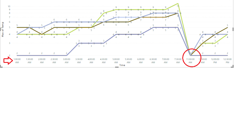
I want to set the time on the x-axis in the line chart starts from 11.00 PM to 7.30 AM. How to set. Please check my below graph.
- Mark as New
- Bookmark
- Subscribe
- Mute
- Subscribe to RSS Feed
- Permalink
- Report Inappropriate Content
Hi All
I want to set the time on the x-axis in the line chart starts from 11.00 PM to 7.30 AM. How to set. Please check my below graph.
- Mark as New
- Bookmark
- Subscribe
- Mute
- Subscribe to RSS Feed
- Permalink
- Report Inappropriate Content
Hello! Did you get a satisfactory solution to this - so you could carry on using a line chart? I have a similar need, due to using a fairly wide date-filter to allow calculation of previous year's values alongside the current year's. But I want the user to focus on far RHS of the chart to view values for the current and recent months. It would be nice if Power BI allowed me to preset the position on the x-axis scroll, so it automatically displays the far RHS. I remember being able to do this in a previous BI tool (not Microsoft).
Thanks for any input ... anyone?
BR Mark
- Mark as New
- Bookmark
- Subscribe
- Mute
- Subscribe to RSS Feed
- Permalink
- Report Inappropriate Content
That Scale Type Linear id supported in Stacked Bar chart column. Your requirement is for Line Chart. So In Line chart Scale type Linear is supported in Y-Axis Only. So you can do one of below approach to achieve your need:
Approach 1: Swap your scale in Line Chart. i.e. Put Time on Y-axis and other field in X-axis. As Linear Scale Type is only supported in Y-Axis of Line Chart.
Approach 2: You can replace Line Chart with Bar Chart and Set your default axis in X-axis itself. (Refer my prevoius reply)
Please don't forget to hit THUMBS UP and Accept this as a solution if it helps you!
Please take a quick glance at newly created dashboards : Restaurant Management Dashboard , HR Analytics Report , Hotel Management Report, Sales Analysis Report , Fortune 500 Companies Analysis , Revenue Tracking Dashboard
- Mark as New
- Bookmark
- Subscribe
- Mute
- Subscribe to RSS Feed
- Permalink
- Report Inappropriate Content
@vijay22kar , If my reply helped you so please give THUMBS UP for support and also mark it as a solution so it may help other member to find it more quickly.
Please take a quick glance at newly created dashboards : Restaurant Management Dashboard , HR Analytics Report , Hotel Management Report, Sales Analysis Report , Fortune 500 Companies Analysis , Revenue Tracking Dashboard
- Mark as New
- Bookmark
- Subscribe
- Mute
- Subscribe to RSS Feed
- Permalink
- Report Inappropriate Content
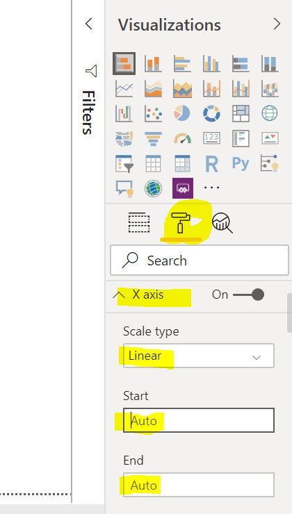
Find the below screen shot for your reference:
Please don't forget to hit THUMBS UP and Accept this as a solution if it helps you!
Please take a quick glance at newly created dashboards : Restaurant Management Dashboard , HR Analytics Report , Hotel Management Report, Sales Analysis Report , Fortune 500 Companies Analysis , Revenue Tracking Dashboard
- Mark as New
- Bookmark
- Subscribe
- Mute
- Subscribe to RSS Feed
- Permalink
- Report Inappropriate Content
Hello @vijay22kar,
You can set this from 'Format' pane of the visual.
Go to Format > X axis and then specify Start and End values.
Hope this helps.
Helpful resources

Power BI Monthly Update - November 2025
Check out the November 2025 Power BI update to learn about new features.

Fabric Data Days
Advance your Data & AI career with 50 days of live learning, contests, hands-on challenges, study groups & certifications and more!


