FabCon is coming to Atlanta
Join us at FabCon Atlanta from March 16 - 20, 2026, for the ultimate Fabric, Power BI, AI and SQL community-led event. Save $200 with code FABCOMM.
Register now!- Power BI forums
- Get Help with Power BI
- Desktop
- Service
- Report Server
- Power Query
- Mobile Apps
- Developer
- DAX Commands and Tips
- Custom Visuals Development Discussion
- Health and Life Sciences
- Power BI Spanish forums
- Translated Spanish Desktop
- Training and Consulting
- Instructor Led Training
- Dashboard in a Day for Women, by Women
- Galleries
- Data Stories Gallery
- Themes Gallery
- Contests Gallery
- QuickViz Gallery
- Quick Measures Gallery
- Visual Calculations Gallery
- Notebook Gallery
- Translytical Task Flow Gallery
- TMDL Gallery
- R Script Showcase
- Webinars and Video Gallery
- Ideas
- Custom Visuals Ideas (read-only)
- Issues
- Issues
- Events
- Upcoming Events
The Power BI Data Visualization World Championships is back! Get ahead of the game and start preparing now! Learn more
- Power BI forums
- Forums
- Get Help with Power BI
- Desktop
- Second glyph/plot segment in Charticulator
- Subscribe to RSS Feed
- Mark Topic as New
- Mark Topic as Read
- Float this Topic for Current User
- Bookmark
- Subscribe
- Printer Friendly Page
- Mark as New
- Bookmark
- Subscribe
- Mute
- Subscribe to RSS Feed
- Permalink
- Report Inappropriate Content
Second glyph/plot segment in Charticulator
Hi,
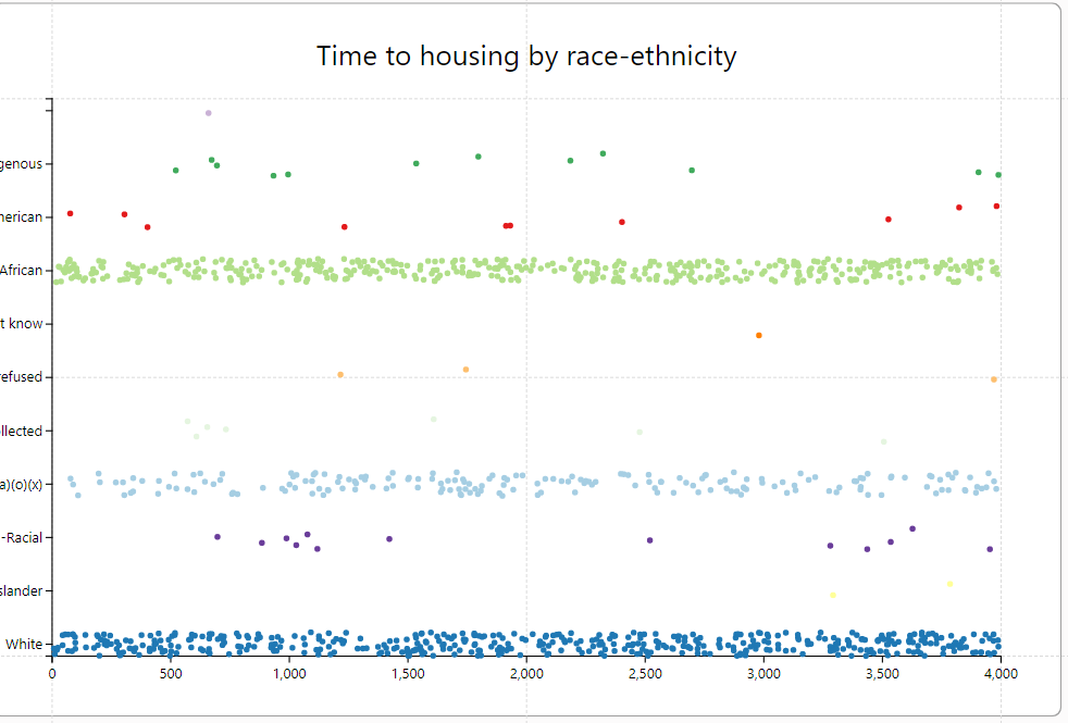
I'm trying to use Charticulator to make a template for a jitter chart with median and average lines. This is especially helpful for visualizing the variation within and between groups, including for racial equity. For an example, please take a look at the right chart in the attached photo (not produced in Power BI).
I've been able to get the jitter functionality in Charticulator - this seems simple enough, since the plot segment allows a jitter type. However, I can't figure out how to add a second glyph, or to attach the data to a second plot segment, in order to get median and average lines. Does this need a second data set? What is the workflow here?
- Mark as New
- Bookmark
- Subscribe
- Mute
- Subscribe to RSS Feed
- Permalink
- Report Inappropriate Content
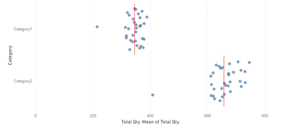
I think you'll have more flexibility with the Deneb visual for this one (based on Vega Lite). Here is a quick example.
Below is the JSON "spec" for the above chart that you can modify as needed. Also, here is a link with a good intro to Deneb - Getting Started | Deneb
{
  "data": {"name": "dataset"},
  "transform": [
    {
      "calculate": "random()",
      "as": "jitter"
    }
  ],
  "layer": [
    {
      "mark": {"type": "point"},
      "encoding": {
        "x": {
          "field": "Total Qty",
          "type": "quantitative"
        },
        "yOffset": {"field": "jitter"}
      }
    },
    {
      "mark": {
        "type": "tick",
        "size": 200,
        "color": "red"
      },
      "encoding": {
        "x": {
          "field": "Total Qty",
          "aggregate": "mean"
        },
        "detail": {"field": "Category"}
      }
    }
  ],
  "encoding": {
    "y": {
      "field": "Category",
      "type": "nominal"
    }
  }
}
Pat
Helpful resources

Power BI Dataviz World Championships
The Power BI Data Visualization World Championships is back! Get ahead of the game and start preparing now!

| User | Count |
|---|---|
| 37 | |
| 37 | |
| 33 | |
| 32 | |
| 29 |
| User | Count |
|---|---|
| 130 | |
| 88 | |
| 82 | |
| 68 | |
| 64 |


