cancel
Showing results for 
Search instead for 
Did you mean: 

Register now to learn Fabric in free live sessions led by the best Microsoft experts. From Apr 16 to May 9, in English and Spanish.

Reply
Anonymous
Not applicable

Ribbon Chart - Calculate % by legend

Hello,


I am trying to create a ribbon chart that shows a change in population as time increases. My Ribbon chart currently displays a count of the population by a value on the x-axis (time groupings (e.g. less than 30 mins, 30mins-1hour etc.), and is split by a priority order (1-5).


This leaves me with 5 ribbons moving across horizontally. However, one of the priority buckets has a higher population and therefore appears higher at time intervals when it proportionally isn't.

image.png

What I want to do is something like:


COUNTA(POPULATION) [grouped by priority and time block (done via chart at present)]

DIVIDED

COUNT OF PRIORITY


This would mean I would have 485 display as 485/COUNT(Population for priority 3)

1 ACCEPTED SOLUTION
v-chuncz-msft
Community Support
Community Support

@Anonymous ,


You may refer to the following post.

https://community.powerbi.com/t5/Desktop/Percentages-to-multi-line-report/m-p/378504#M172040

Community Support Team _ Sam Zha
If this post helps, then please consider Accept it as the solution to help the other members find it more quickly.

View solution in original post

2 REPLIES 2
v-chuncz-msft
Community Support
Community Support

@Anonymous ,


You may refer to the following post.

https://community.powerbi.com/t5/Desktop/Percentages-to-multi-line-report/m-p/378504#M172040

Community Support Team _ Sam Zha
If this post helps, then please consider Accept it as the solution to help the other members find it more quickly.
Anonymous
Not applicable

Thanks that post helped me fix it. Using the formula in the post I got this:

Measure = DIVIDE(
SUM('Generic ED Data'[POPULATION]),
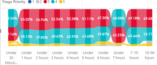
CALCULATE(SUM('Generic ED Data'[POPULATION]),ALLSELECTED('Generic ED Data','Generic ED Data'[Priority])))

However, this created a stacked column chart, which, whilst useful isn't exactly what I wanted.

Not correct version

I then used the following formula:

Measure 2= DIVIDE(
SUM('Generic ED Data'[POPULATION]),
CALCULATE(SUM('Generic ED Data'[POPULATION]),ALLEXCEPT('Generic ED Data','Generic ED Data'[Priority])))

which got me the result I wanted. Using ALLEXCEPT on timing showed which priority group had the most people leaving.  The other method just showed a % for each axis point as well. Which is useful if I want to see which proportion of the priority group left for each time.

image.png

Helpful resources

Announcements
Microsoft Fabric Learn Together

Microsoft Fabric Learn Together

Covering the world! 9:00-10:30 AM Sydney, 4:00-5:30 PM CET (Paris/Berlin), 7:00-8:30 PM Mexico City

PBI_APRIL_CAROUSEL1

Power BI Monthly Update - April 2024

Check out the April 2024 Power BI update to learn about new features.

April Fabric Community Update

Fabric Community Update - April 2024

Find out what's new and trending in the Fabric Community.