- Power BI forums
- Updates
- News & Announcements
- Get Help with Power BI
- Desktop
- Service
- Report Server
- Power Query
- Mobile Apps
- Developer
- DAX Commands and Tips
- Custom Visuals Development Discussion
- Health and Life Sciences
- Power BI Spanish forums
- Translated Spanish Desktop
- Power Platform Integration - Better Together!
- Power Platform Integrations (Read-only)
- Power Platform and Dynamics 365 Integrations (Read-only)
- Training and Consulting
- Instructor Led Training
- Dashboard in a Day for Women, by Women
- Galleries
- Community Connections & How-To Videos
- COVID-19 Data Stories Gallery
- Themes Gallery
- Data Stories Gallery
- R Script Showcase
- Webinars and Video Gallery
- Quick Measures Gallery
- 2021 MSBizAppsSummit Gallery
- 2020 MSBizAppsSummit Gallery
- 2019 MSBizAppsSummit Gallery
- Events
- Ideas
- Custom Visuals Ideas
- Issues
- Issues
- Events
- Upcoming Events
- Community Blog
- Power BI Community Blog
- Custom Visuals Community Blog
- Community Support
- Community Accounts & Registration
- Using the Community
- Community Feedback
Register now to learn Fabric in free live sessions led by the best Microsoft experts. From Apr 16 to May 9, in English and Spanish.
- Power BI forums
- Forums
- Get Help with Power BI
- Desktop
- Relative Date of the Month
- Subscribe to RSS Feed
- Mark Topic as New
- Mark Topic as Read
- Float this Topic for Current User
- Bookmark
- Subscribe
- Printer Friendly Page
- Mark as New
- Bookmark
- Subscribe
- Mute
- Subscribe to RSS Feed
- Permalink
- Report Inappropriate Content
Relative Date of the Month
Hi,
I would like to create a gantt chart that displays the start date, length, and end date of my projects. My idea for the visual is to show all data / projects for the current year. The issue I am facing is that I have projects that repeatedly start on certain days of each month (eg., always on the first or on the fifth and so on) and their deadline is also always on a certain day of each month (eg., 10th or 20th) of each month. The raw data I have includes one column that includes just a number of the respective start (eg., 1 or 5) and one column of the respective day on which the project has to be finished (eg., 10 or 20).
How can I create a measure / column that let's me display these repeated projects on a gantt chart or in a matrix?
Any suggestions on how to accomplish this? Thanks a lot!
Solved! Go to Solution.
- Mark as New
- Bookmark
- Subscribe
- Mute
- Subscribe to RSS Feed
- Permalink
- Report Inappropriate Content
Hi, @Anonymous
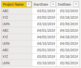
Based on your description, I created data to reproduce your scenario.
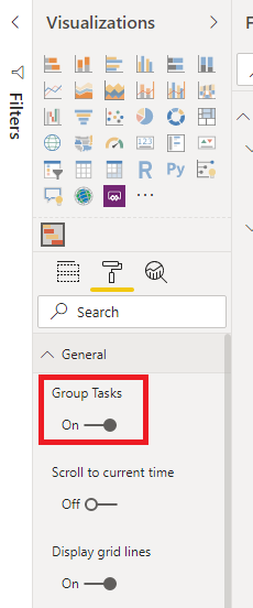
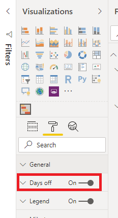
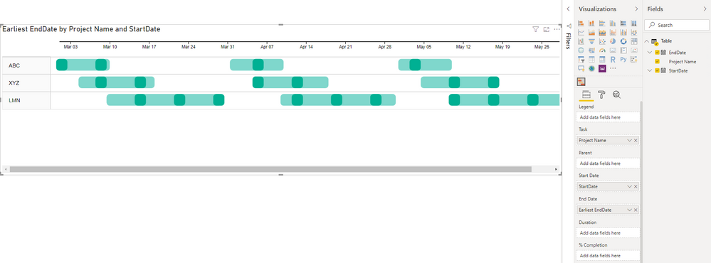
You may use Gnatt chart to display the result. Please make the visual selected, go to 'Format' ribbon, click 'General', set 'Group Tasks' on, then click 'Days off' and set it on.
Result:
Best Regards
Allan
If this post helps, then please consider Accept it as the solution to help the other members find it more quickly.
- Mark as New
- Bookmark
- Subscribe
- Mute
- Subscribe to RSS Feed
- Permalink
- Report Inappropriate Content
Hi, @Anonymous
If you take the answer of someone, please mark it as the solution to help the other members who have same problems find it more quickly. If not, let me know and I'll try to help you further. Thanks.
Best Regards
Allan
- Mark as New
- Bookmark
- Subscribe
- Mute
- Subscribe to RSS Feed
- Permalink
- Report Inappropriate Content
Hi, @Anonymous
Based on your description, I created data to reproduce your scenario.
You may use Gnatt chart to display the result. Please make the visual selected, go to 'Format' ribbon, click 'General', set 'Group Tasks' on, then click 'Days off' and set it on.
Result:
Best Regards
Allan
If this post helps, then please consider Accept it as the solution to help the other members find it more quickly.
- Mark as New
- Bookmark
- Subscribe
- Mute
- Subscribe to RSS Feed
- Permalink
- Report Inappropriate Content
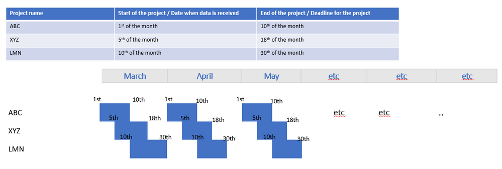
Hey, thanks for your quick reply. This is what I mean:
The table shows how my data looks like and the examplary gantt chart shows roughly how I would like to have my visual in the PowerBI report. Thanks!
- Mark as New
- Bookmark
- Subscribe
- Mute
- Subscribe to RSS Feed
- Permalink
- Report Inappropriate Content
The information you have provided is not making the problem clear to me. Can you please explain with an example.
Microsoft Power BI Learning Resources, 2023 !!
Learn Power BI - Full Course with Dec-2022, with Window, Index, Offset, 100+ Topics !!
Did I answer your question? Mark my post as a solution! Appreciate your Kudos !! Proud to be a Super User! !!
Helpful resources

Microsoft Fabric Learn Together
Covering the world! 9:00-10:30 AM Sydney, 4:00-5:30 PM CET (Paris/Berlin), 7:00-8:30 PM Mexico City

Power BI Monthly Update - April 2024
Check out the April 2024 Power BI update to learn about new features.

| User | Count |
|---|---|
| 111 | |
| 109 | |
| 89 | |
| 76 | |
| 66 |
| User | Count |
|---|---|
| 125 | |
| 111 | |
| 100 | |
| 83 | |
| 71 |
