- Power BI forums
- Updates
- News & Announcements
- Get Help with Power BI
- Desktop
- Service
- Report Server
- Power Query
- Mobile Apps
- Developer
- DAX Commands and Tips
- Custom Visuals Development Discussion
- Health and Life Sciences
- Power BI Spanish forums
- Translated Spanish Desktop
- Power Platform Integration - Better Together!
- Power Platform Integrations (Read-only)
- Power Platform and Dynamics 365 Integrations (Read-only)
- Training and Consulting
- Instructor Led Training
- Dashboard in a Day for Women, by Women
- Galleries
- Community Connections & How-To Videos
- COVID-19 Data Stories Gallery
- Themes Gallery
- Data Stories Gallery
- R Script Showcase
- Webinars and Video Gallery
- Quick Measures Gallery
- 2021 MSBizAppsSummit Gallery
- 2020 MSBizAppsSummit Gallery
- 2019 MSBizAppsSummit Gallery
- Events
- Ideas
- Custom Visuals Ideas
- Issues
- Issues
- Events
- Upcoming Events
- Community Blog
- Power BI Community Blog
- Custom Visuals Community Blog
- Community Support
- Community Accounts & Registration
- Using the Community
- Community Feedback
Register now to learn Fabric in free live sessions led by the best Microsoft experts. From Apr 16 to May 9, in English and Spanish.
- Power BI forums
- Forums
- Get Help with Power BI
- Desktop
- PowerBI bubble map - can a bubble show the averag...
- Subscribe to RSS Feed
- Mark Topic as New
- Mark Topic as Read
- Float this Topic for Current User
- Bookmark
- Subscribe
- Printer Friendly Page
- Mark as New
- Bookmark
- Subscribe
- Mute
- Subscribe to RSS Feed
- Permalink
- Report Inappropriate Content
PowerBI bubble map - can a bubble show the average of a column?
Hello
I would like to create a bubble map where a user can choose a time period and then sees the average temperature of this period for various places. (as it can be easily done with diagrams in PowerBI)
So far I couldn't manage it. Is there a way to do it?
My datas include the following columns: name of the station, coordinates, date, temperature of the day
Any hint or solution is appreciated
Solved! Go to Solution.
- Mark as New
- Bookmark
- Subscribe
- Mute
- Subscribe to RSS Feed
- Permalink
- Report Inappropriate Content
Hi @tkleiber
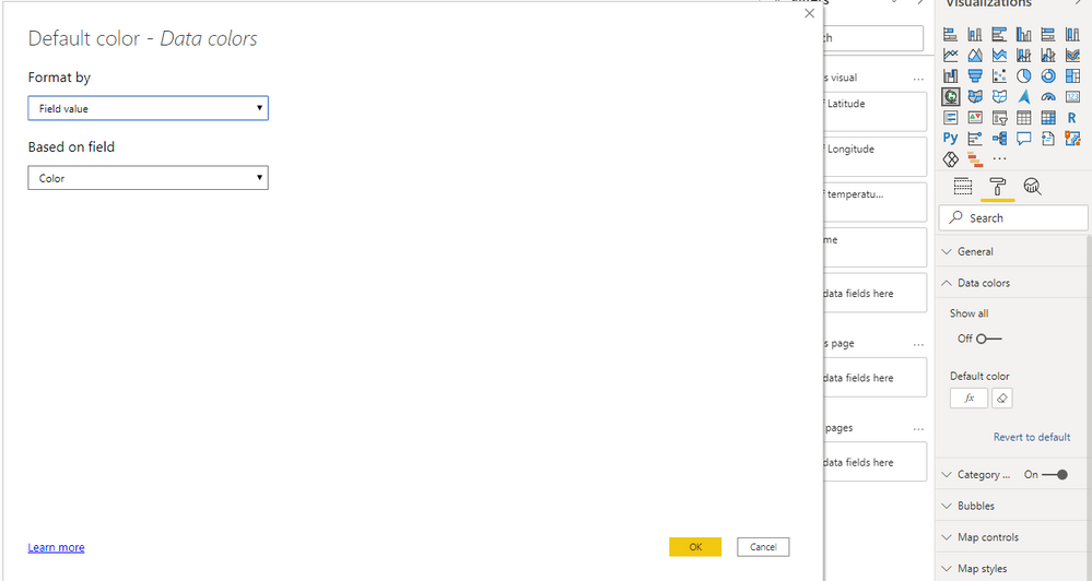
You can try conditional formatting function to custom the color. For using this function, you can't use legend in this visual.
I build a measure to caluclate the average temperature for each station and build a measure which could be added into the data color (color field).
Measure:
Average of temperature = AVERAGEX(FILTER('Table','Table'[Station Name]=MAX('Table'[Station Name])),'Table'[temperature of the day])Color =
IF([Average of temperature]<0,"Blue","Red")
Build a bubble map visual and add color measure into data color.
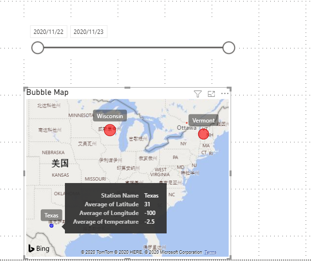
Result is as below. It will show bubbles which average >=0 in red and others in blue.
For more details for conditional formatting you may refer to this blog: Use conditional formatting in tables
You can download the pbix file from this link: File
Best Regards,
Rico Zhou
If this post helps, then please consider Accept it as the solution to help the other members find it more quickly.
- Mark as New
- Bookmark
- Subscribe
- Mute
- Subscribe to RSS Feed
- Permalink
- Report Inappropriate Content
- Mark as New
- Bookmark
- Subscribe
- Mute
- Subscribe to RSS Feed
- Permalink
- Report Inappropriate Content
Thank you very much @v-rzhou-msft .
But my idea was to show the average temperature with the color code of the station. (For example: all the stations with an average temnperature below 0 degrees have blue colors, all the others red colors.)
But anyway thanks for the reply 🙂
Best regards
Thomas
- Mark as New
- Bookmark
- Subscribe
- Mute
- Subscribe to RSS Feed
- Permalink
- Report Inappropriate Content
Hi @tkleiber
You can try conditional formatting function to custom the color. For using this function, you can't use legend in this visual.
I build a measure to caluclate the average temperature for each station and build a measure which could be added into the data color (color field).
Measure:
Average of temperature = AVERAGEX(FILTER('Table','Table'[Station Name]=MAX('Table'[Station Name])),'Table'[temperature of the day])Color =
IF([Average of temperature]<0,"Blue","Red")
Build a bubble map visual and add color measure into data color.
Result is as below. It will show bubbles which average >=0 in red and others in blue.
For more details for conditional formatting you may refer to this blog: Use conditional formatting in tables
You can download the pbix file from this link: File
Best Regards,
Rico Zhou
If this post helps, then please consider Accept it as the solution to help the other members find it more quickly.
- Mark as New
- Bookmark
- Subscribe
- Mute
- Subscribe to RSS Feed
- Permalink
- Report Inappropriate Content
Hi @tkleiber
I think you may want to show the average temperature of select period for various places.
Due to I don't know values in your data model, I build a sample table to have a test.
Sample Table:
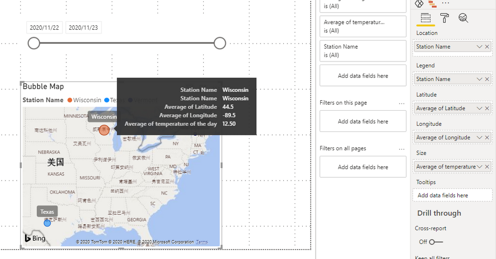
Build a slicer by Date column and build a map visual as below.
Add temperature column in Size and use average function.
Now Avg of temperature of Wisconsin is 15+10/ 2 = 12.5
You can download the pbix file from this link: PowerBI bubble map - can a bubble show the average of a column
Best Regards,
Rico Zhou
If this post helps, then please consider Accept it as the solution to help the other members find it more quickly.
Helpful resources

Microsoft Fabric Learn Together
Covering the world! 9:00-10:30 AM Sydney, 4:00-5:30 PM CET (Paris/Berlin), 7:00-8:30 PM Mexico City

Power BI Monthly Update - April 2024
Check out the April 2024 Power BI update to learn about new features.

| User | Count |
|---|---|
| 106 | |
| 105 | |
| 88 | |
| 75 | |
| 66 |
| User | Count |
|---|---|
| 126 | |
| 111 | |
| 100 | |
| 83 | |
| 71 |


