Hey Fellow users of PowerBI,
I am currently in the making of a dashboard / report and I have begun struggling, more specifically with the gridlines.
I have the following pictures:
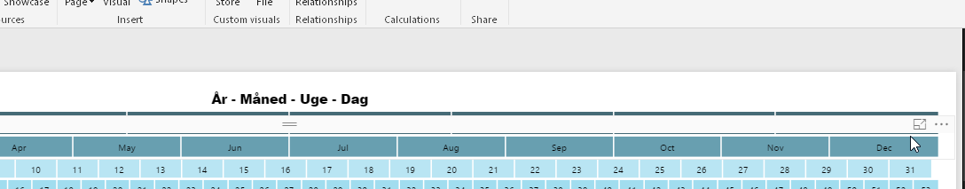
On the very first picture you see my cursor hovering over 2012 at the TOP and this works (hence why it is a light grey color)
On the second picture you see my cursor hovering over 2012 as well, but at the MIDDLE of the square, this DOESNT work because of all these stupid gridlines!
On the third picture you see which gridlines I am talking about in the power bi desktop, I had hoped these would go away once you have published a report / dashboard, but no! They just become invisible, but they are still there!
Anyways to turn off these gridlines or lock a visualization in place to people wont get these gridlines??? This ruins so many things in my report / dashboards and it makes it so ugly that you basicly need to put so much white / blank / useless space between each visualization to make sure the end user can even click on the various things!
Kind of blows my mind if it's not possible to remove gridlines yet!
1:
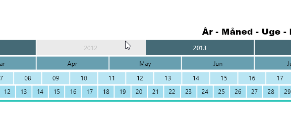
2:
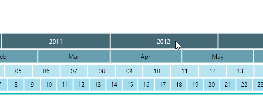
3: