- Power BI forums
- Updates
- News & Announcements
- Get Help with Power BI
- Desktop
- Service
- Report Server
- Power Query
- Mobile Apps
- Developer
- DAX Commands and Tips
- Custom Visuals Development Discussion
- Health and Life Sciences
- Power BI Spanish forums
- Translated Spanish Desktop
- Power Platform Integration - Better Together!
- Power Platform Integrations (Read-only)
- Power Platform and Dynamics 365 Integrations (Read-only)
- Training and Consulting
- Instructor Led Training
- Dashboard in a Day for Women, by Women
- Galleries
- Community Connections & How-To Videos
- COVID-19 Data Stories Gallery
- Themes Gallery
- Data Stories Gallery
- R Script Showcase
- Webinars and Video Gallery
- Quick Measures Gallery
- 2021 MSBizAppsSummit Gallery
- 2020 MSBizAppsSummit Gallery
- 2019 MSBizAppsSummit Gallery
- Events
- Ideas
- Custom Visuals Ideas
- Issues
- Issues
- Events
- Upcoming Events
- Community Blog
- Power BI Community Blog
- Custom Visuals Community Blog
- Community Support
- Community Accounts & Registration
- Using the Community
- Community Feedback
Register now to learn Fabric in free live sessions led by the best Microsoft experts. From Apr 16 to May 9, in English and Spanish.
- Power BI forums
- Forums
- Get Help with Power BI
- Desktop
- Power BI Column Series Issue in Stacked Bar Chart
- Subscribe to RSS Feed
- Mark Topic as New
- Mark Topic as Read
- Float this Topic for Current User
- Bookmark
- Subscribe
- Printer Friendly Page
- Mark as New
- Bookmark
- Subscribe
- Mute
- Subscribe to RSS Feed
- Permalink
- Report Inappropriate Content
Power BI Column Series Issue in Stacked Bar Chart
Hello guys, I want to do a Stacked Bar Chart that looks like this:
Each month have two stacked bars, the first one is the ideal result and the second one is the real result. Each stack is a cell that creates a certain ammount of products.
1. The data for the months stand alone are static values provided by the user, but the "Month" + .Planned data should be a dynamic value depending of the value of a Slicer (Parameter).
2. I should be able to filter with slicers through other features: Division --> Department --> Product and in the stacked bar charts should be displayed only the cells that fits this conditions.
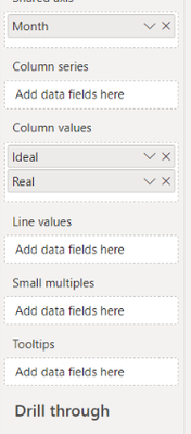
My problem is, I haven't be able to display the stacked columns. I already have the slicers working, the chart shows both bar charts but Power BI doesn't allow me to add a Column Series. I've tried a lot of things but anything seems to work.
Let me share with you some dummy data to work with:
| Scenario | Division | Department | Product | Cell | Jan | Jan.Planned | Feb | Feb.Planned | Mar | Mar.Planned |
| Ideal | X1 | Dep1 | P1 | Cell1 | 6 | 6 | 6 | |||
| Ideal | X1 | Dep1 | P1 | Cell2 | 7 | 1 | 5 | |||
| Ideal | X1 | Dep2 | P2 | Cell3 | 9 | 8 | 9 | |||
| Ideal | X1 | Dep2 | P2 | Cell4 | 8 | 2 | 6 | |||
| Ideal | X2 | Dep3 | P3 | Cell5 | 4 | 10 | 5 | |||
| Ideal | X2 | Dep3 | P3 | Cell6 | 5 | 6 | 7 | |||
| Ideal | X2 | Dep4 | P4 | Cell7 | 5 | 3 | 5 | |||
| Ideal | X2 | Dep4 | P4 | Cell8 | 7 | 1 | 10 | |||
| Real | X1 | Dep1 | P1 | Cell1 | 5 | 1 | 8 | |||
| Real | X1 | Dep1 | P1 | Cell2 | 6 | 2 | 9 | |||
| Real | X1 | Dep2 | P2 | Cell3 | 7 | 2 | 2 | |||
| Real | X1 | Dep2 | P2 | Cell4 | 8 | 5 | 7 | |||
| Real | X2 | Dep3 | P3 | Cell5 | 9 | 3 | 10 | |||
| Real | X2 | Dep3 | P3 | Cell6 | 7 | 10 | 10 | |||
| Real | X2 | Dep4 | P4 | Cell7 | 5 | 4 | 10 | |||
| Real | X2 | Dep4 | P4 | Cell8 | 2 | 10 | 10 |
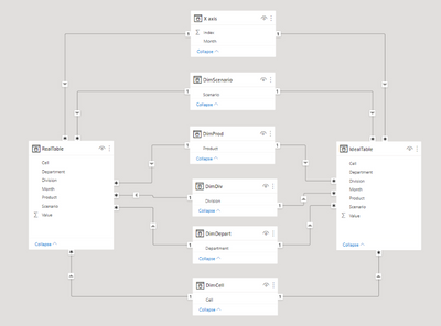
IMPORTANT: This table was splitted in two, one containing only the "Real" Scenario data and another for the "Ideal" Scenario data.
This is the visualization I already have:
I can not place the "Cell" field in the "Column Series Field"
The ideal and real fields are the following measures:
Real = SUM(RealTable[Value])
The Month field have two columns, the first one holding all the Months + Months.Planned and the second column an Index column to order the months from Jan to Dec.Planned. All this fields are related to each other. That's why I don't know the reason I can't add the "Cell" field to the Column Series of the stacked bar + line chart.
Solved! Go to Solution.
- Mark as New
- Bookmark
- Subscribe
- Mute
- Subscribe to RSS Feed
- Permalink
- Report Inappropriate Content
Hi , @CarlosDaniel
According to your description, you want to put the [Cell] to the Legend .
Thanks for your sample data first~I test it in my side and i found that when we put one more fields on the Y-axis , we may can not put other fields on the Lgend.
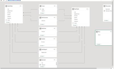
(1)We need to create a new dimension table and we do not need to create any relationship between other tables.
Row = {"Real","Ideal"}(2)Then we can create a measure like this:
Measure =
 var _row = MAX('Row'[Value])
 return
 IF(_row="Ideal" && SUM(IdealTable[Value]),
SUM(IdealTable[Value]) + (Parameter[Parameter Value] * 2),IF(_row="Real",SUM(RealTable[Value])))
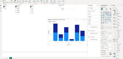
Then we can put the measure on the visual and we can get this:
Thank you for your time and sharing, and thank you for your support and understanding of PowerBI!
Best Regards,
Aniya Zhang
If this post helps, then please consider Accept it as the solution to help the other members find it more quickly
Helpful resources

Microsoft Fabric Learn Together
Covering the world! 9:00-10:30 AM Sydney, 4:00-5:30 PM CET (Paris/Berlin), 7:00-8:30 PM Mexico City

Power BI Monthly Update - April 2024
Check out the April 2024 Power BI update to learn about new features.

| User | Count |
|---|---|
| 114 | |
| 99 | |
| 82 | |
| 70 | |
| 60 |
| User | Count |
|---|---|
| 149 | |
| 114 | |
| 107 | |
| 89 | |
| 67 |


