Fabric Data Days starts November 4th!
Advance your Data & AI career with 50 days of live learning, dataviz contests, hands-on challenges, study groups & certifications and more!
Get registered- Power BI forums
- Get Help with Power BI
- Desktop
- Service
- Report Server
- Power Query
- Mobile Apps
- Developer
- DAX Commands and Tips
- Custom Visuals Development Discussion
- Health and Life Sciences
- Power BI Spanish forums
- Translated Spanish Desktop
- Training and Consulting
- Instructor Led Training
- Dashboard in a Day for Women, by Women
- Galleries
- Data Stories Gallery
- Themes Gallery
- Contests Gallery
- QuickViz Gallery
- Quick Measures Gallery
- Visual Calculations Gallery
- Notebook Gallery
- Translytical Task Flow Gallery
- TMDL Gallery
- R Script Showcase
- Webinars and Video Gallery
- Ideas
- Custom Visuals Ideas (read-only)
- Issues
- Issues
- Events
- Upcoming Events
Get Fabric Certified for FREE during Fabric Data Days. Don't miss your chance! Request now
- Power BI forums
- Forums
- Get Help with Power BI
- Desktop
- Plot count of two different date sets on single da...
- Subscribe to RSS Feed
- Mark Topic as New
- Mark Topic as Read
- Float this Topic for Current User
- Bookmark
- Subscribe
- Printer Friendly Page
- Mark as New
- Bookmark
- Subscribe
- Mute
- Subscribe to RSS Feed
- Permalink
- Report Inappropriate Content
Plot count of two different date sets on single date axis
Dear community,
I have a question which I think should be easy to solve, but I simply can't think of / find a smart solution so far.
I have the following dataset:
| Subject | Planned date | Date ready |
| Document 1 | 1-2-2020 | 1-2-2020 |
| Document 2 | 1-5-2020 | 1-8-2020 |
| Document 3 | 1-2-2020 | 1-5-2021 |
| Document 4 | 1-8-2020 | |
| Document 5 | 1-5-2021 | 1-5-2021 |
| Document 6 | 1-2-2021 | 1-2-2021 |
| Document 7 | 1-2-2021 | 1-5-2021 |
| Document 8 | 1-11-2020 | 1-11-2020 |
| Document 9 | 1-11-2021 | |
| Document 10 | 1-2-2020 | 1-5-2021 |
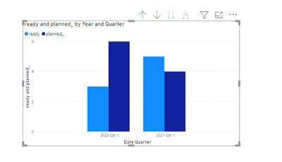
What I would like to visualize is very simple: a bar chart in which is shown how many documents have been planned for review every quarter (planned date) and how many have been finished (date ready) in that quarter. However, if I pick either one of the date columns as the x-axis the result is columns of equal hight, I somehow need a "neutral" date axis to show the count of the planned and ready amounts per quarter.
Is it possible to do this with a measure or should I maybe create a helping table?
Many thanks!
Solved! Go to Solution.
- Mark as New
- Bookmark
- Subscribe
- Mute
- Subscribe to RSS Feed
- Permalink
- Report Inappropriate Content
First, create a calendar table as the X axis of bar chart .
Then create measures like below:
planned_ = CALCULATE(COUNT('Table'[Subject]),FILTER('Table','Table'[Planned date]<=MAX('Table 2'[Date])&&'Table'[Planned date]>=MIN('Table 2'[Date])))ready = CALCULATE(COUNT('Table'[Subject]),FILTER('Table',NOT(ISBLANK('Table'[Date ready]))&&'Table'[Date ready]<=MAX('Table 2'[Date])&&'Table'[Date ready]>=MIN('Table 2'[Date])))
- Mark as New
- Bookmark
- Subscribe
- Mute
- Subscribe to RSS Feed
- Permalink
- Report Inappropriate Content
Brilliant, this was exactly what I was looking for. Only remaining question will be how to manage interactions if you add a table as a visual. How do you manage relations with Table 1 and table 2 in this case, you have to pick a column from table 1 (planned or ready) to connect with date in table 2. Which than makes it impossible to click on only the planned or a ready column in the bar chart, but you always open both against the chosen relationship.
Hope the explanation above makes sense, if not please let me know!
- Mark as New
- Bookmark
- Subscribe
- Mute
- Subscribe to RSS Feed
- Permalink
- Report Inappropriate Content
@Lumegu , You need to create a common date table and join with both dates. You can use userelationship wo activate inactive relationship
refer smiliar example
Helpful resources

Fabric Data Days
Advance your Data & AI career with 50 days of live learning, contests, hands-on challenges, study groups & certifications and more!

Power BI Monthly Update - October 2025
Check out the October 2025 Power BI update to learn about new features.


