- Power BI forums
- Updates
- News & Announcements
- Get Help with Power BI
- Desktop
- Service
- Report Server
- Power Query
- Mobile Apps
- Developer
- DAX Commands and Tips
- Custom Visuals Development Discussion
- Health and Life Sciences
- Power BI Spanish forums
- Translated Spanish Desktop
- Power Platform Integration - Better Together!
- Power Platform Integrations (Read-only)
- Power Platform and Dynamics 365 Integrations (Read-only)
- Training and Consulting
- Instructor Led Training
- Dashboard in a Day for Women, by Women
- Galleries
- Community Connections & How-To Videos
- COVID-19 Data Stories Gallery
- Themes Gallery
- Data Stories Gallery
- R Script Showcase
- Webinars and Video Gallery
- Quick Measures Gallery
- 2021 MSBizAppsSummit Gallery
- 2020 MSBizAppsSummit Gallery
- 2019 MSBizAppsSummit Gallery
- Events
- Ideas
- Custom Visuals Ideas
- Issues
- Issues
- Events
- Upcoming Events
- Community Blog
- Power BI Community Blog
- Custom Visuals Community Blog
- Community Support
- Community Accounts & Registration
- Using the Community
- Community Feedback
Register now to learn Fabric in free live sessions led by the best Microsoft experts. From Apr 16 to May 9, in English and Spanish.
- Power BI forums
- Forums
- Get Help with Power BI
- Desktop
- Re: Pivoting Measures into a new Table results in ...
- Subscribe to RSS Feed
- Mark Topic as New
- Mark Topic as Read
- Float this Topic for Current User
- Bookmark
- Subscribe
- Printer Friendly Page
- Mark as New
- Bookmark
- Subscribe
- Mute
- Subscribe to RSS Feed
- Permalink
- Report Inappropriate Content
Pivoting Measures into a new Table results in Two Values per Measure at lowest Level of the Data
Hello,
I pivoted 3 measures into a new table. The measures simply subtract two values derived from Calculate: A-B.
In the original table the difference is shown as a single value with a count of one.
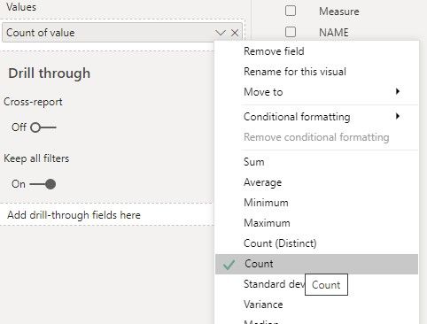
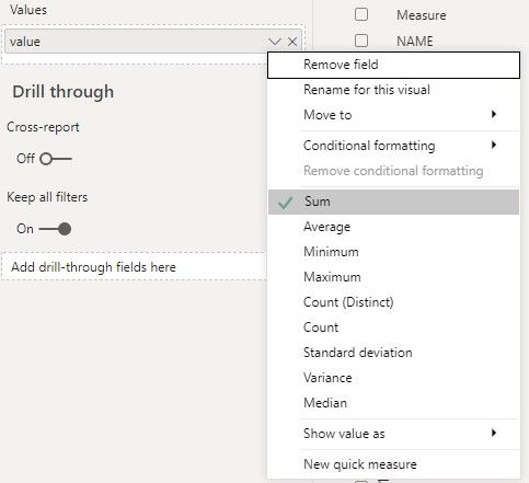
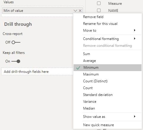
The new table has a Measure column and Value column, but the value from measures come in as two values at it's lowest level of data. The two values need to be summed to show the difference. I was expecting a single value which is the difference.
The difference is the correct value at the lowest level of data, but when the data is collapsed the values sum and no longer show the difference.
How do I bring in the difference as a single value rather than two values that require a sum?
Measures in original table.
Measure to create New Table:


- Mark as New
- Bookmark
- Subscribe
- Mute
- Subscribe to RSS Feed
- Permalink
- Report Inappropriate Content
Thanks for your help...
Just some more information to help with clarification.
All the new table scatter plot needs to show is the largest (MAXX) delta at any level in the data hierarchy.
It's not doing that and I'm now I am unsure I am doing things correctly.
- Mark as New
- Bookmark
- Subscribe
- Mute
- Subscribe to RSS Feed
- Permalink
- Report Inappropriate Content
That would be helpful...thank you!
Is it far to assume that your scatter plot is Measure A vs. Measure B? Or Measure A vs Measure C, etc.
- Mark as New
- Bookmark
- Subscribe
- Mute
- Subscribe to RSS Feed
- Permalink
- Report Inappropriate Content
@littlemojopuppy
https://drive.google.com/file/d/1b_-KSEway-TdS0Zrb7a1rTy6J0X7n2Wo/view?usp=sharing
Here's an accurate but simplified form of the data and scatter plots involved.
Original vs New Table
Orginal Scatter and Table on the left side,
and New Scatter and Table on the right side.
I want to plot the differences at any level of the data, but the differences are not maintained as the data is collapsed.
The New Table scatter plot should show deltas per Measure along the X-axis:
Y-axis = T0
X-axis = Maxx Delta T0-T1, Maxx Delta T0-T2, Maxx Delta T0-T3
- Mark as New
- Bookmark
- Subscribe
- Mute
- Subscribe to RSS Feed
- Permalink
- Report Inappropriate Content
Hi! Without explaining the mechanics of what you did, can you explain what you're trying to accomplish? Why did you pivot three measures into a new table? Because I'm willing to bet there's an easier way to do this.
And can you provide sample data and definition of the measures in question?
- Mark as New
- Bookmark
- Subscribe
- Mute
- Subscribe to RSS Feed
- Permalink
- Report Inappropriate Content
@littlemojopuppy
Sure.
The main reason for the new table is to show all the measures as legend in a Scatter Chart,
and show the results of the measures along the X-axis of the Scatter Chart.
Then I can view all the data along the X-axis as plotted against T in the Y-axis.
Each measure showing as a three distinct groupings in the scatter plot,
In the original table, each measure will show as it's own column. With only a single measure
getting plotted along the x-axis and showing in the legend at one time. Not all measure values can be plotted along the X-axis of the scatter chart in the original table. (I don't know how to get three separate measure into the X-axis and showing in the legend of the scatter chart).
I'll provide a sample set of data.
-Corrected.
Helpful resources

Microsoft Fabric Learn Together
Covering the world! 9:00-10:30 AM Sydney, 4:00-5:30 PM CET (Paris/Berlin), 7:00-8:30 PM Mexico City

Power BI Monthly Update - April 2024
Check out the April 2024 Power BI update to learn about new features.

| User | Count |
|---|---|
| 113 | |
| 97 | |
| 80 | |
| 69 | |
| 59 |
| User | Count |
|---|---|
| 150 | |
| 119 | |
| 104 | |
| 87 | |
| 67 |
