Fabric Data Days starts November 4th!
Advance your Data & AI career with 50 days of live learning, dataviz contests, hands-on challenges, study groups & certifications and more!
Get registered- Power BI forums
- Get Help with Power BI
- Desktop
- Service
- Report Server
- Power Query
- Mobile Apps
- Developer
- DAX Commands and Tips
- Custom Visuals Development Discussion
- Health and Life Sciences
- Power BI Spanish forums
- Translated Spanish Desktop
- Training and Consulting
- Instructor Led Training
- Dashboard in a Day for Women, by Women
- Galleries
- Data Stories Gallery
- Themes Gallery
- Contests Gallery
- Quick Measures Gallery
- Visual Calculations Gallery
- Notebook Gallery
- Translytical Task Flow Gallery
- TMDL Gallery
- R Script Showcase
- Webinars and Video Gallery
- Ideas
- Custom Visuals Ideas (read-only)
- Issues
- Issues
- Events
- Upcoming Events
Get Fabric Certified for FREE during Fabric Data Days. Don't miss your chance! Learn more
- Power BI forums
- Forums
- Get Help with Power BI
- Desktop
- Re: Pivot Chart as in Excel
- Subscribe to RSS Feed
- Mark Topic as New
- Mark Topic as Read
- Float this Topic for Current User
- Bookmark
- Subscribe
- Printer Friendly Page
- Mark as New
- Bookmark
- Subscribe
- Mute
- Subscribe to RSS Feed
- Permalink
- Report Inappropriate Content
Pivot Chart as in Excel
Good afternoon,
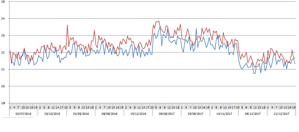
I'm trying to make a Pivot Chart like this one with Power BI :
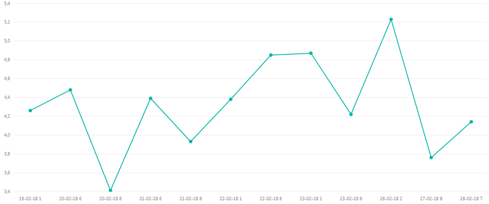
I tried with Power BI but I've got this king of graphic :
So I have the date and the number at the same place but I don't arrive to organize my X axis to get the same X axis as the one in Excel.
I would like to get a graph like that :
I have the two fields into the X axis : the date and the number.
Do you know how to make that please ?
Thank you for your help.
Solved! Go to Solution.
- Mark as New
- Bookmark
- Subscribe
- Mute
- Subscribe to RSS Feed
- Permalink
- Report Inappropriate Content
Hi @JonathanJohns,
If you want to achieve in Power BI similar to the screenshot below, follow this:
- In Fields pane -> Axis, place you Date first then Number below that.
- From the upper left of your column chart, click the icon that says Expand All Down One Level in the Hierarchy until your desired depth of hierarchy is shown.
- In Formatting Pane -> X-Axis,
- change Type to Categorical
- Turn off Concatenate labels
- And then sort the columns by value then Sort by Date Number (or whatever fields you have in X axis). Turning off label concatenation does not take effect until columns are sorty by a value first then sorty by category (it's probably a bug).
Dane Belarmino | Microsoft MVP | Proud to be a Super User!
Did I answer your question? Mark my post as a solution!
"Tell me and I’ll forget; show me and I may remember; involve me and I’ll understand."
Need Power BI consultation, get in touch with me on LinkedIn or hire me on UpWork.
Learn with me on YouTube @DAXJutsu or follow my page on Facebook @DAXJutsuPBI.
- Mark as New
- Bookmark
- Subscribe
- Mute
- Subscribe to RSS Feed
- Permalink
- Report Inappropriate Content
Hello,
This was super helpful. How can you order the totals from largest to smallest? I need to do this with my data. It is structured similar to the above.
- Mark as New
- Bookmark
- Subscribe
- Mute
- Subscribe to RSS Feed
- Permalink
- Report Inappropriate Content
Thank you for your answers. The way how you make @danextian works well with my data !
- Mark as New
- Bookmark
- Subscribe
- Mute
- Subscribe to RSS Feed
- Permalink
- Report Inappropriate Content
Hi @JonathanJohns,
By my test, your expected output may be not supported in Power BI currently.
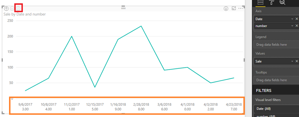
In Power BI, we could drag two column in X axis, but it will show like hierarchy. You need to click the Drill Down icon to show the values.
We could click the icon in red to get the output below. You could have a try if it could be a workaround.
In addition, you could post your new idea in Power BI idea Forum and add your comments there to improve Power BI and make this feature coming sooner.
Best Regards,
Cherry
If this post helps, then please consider Accept it as the solution to help the other members find it more quickly.
Helpful resources

Fabric Data Days
Advance your Data & AI career with 50 days of live learning, contests, hands-on challenges, study groups & certifications and more!

Power BI Monthly Update - October 2025
Check out the October 2025 Power BI update to learn about new features.


