- Power BI forums
- Updates
- News & Announcements
- Get Help with Power BI
- Desktop
- Service
- Report Server
- Power Query
- Mobile Apps
- Developer
- DAX Commands and Tips
- Custom Visuals Development Discussion
- Health and Life Sciences
- Power BI Spanish forums
- Translated Spanish Desktop
- Power Platform Integration - Better Together!
- Power Platform Integrations (Read-only)
- Power Platform and Dynamics 365 Integrations (Read-only)
- Training and Consulting
- Instructor Led Training
- Dashboard in a Day for Women, by Women
- Galleries
- Community Connections & How-To Videos
- COVID-19 Data Stories Gallery
- Themes Gallery
- Data Stories Gallery
- R Script Showcase
- Webinars and Video Gallery
- Quick Measures Gallery
- 2021 MSBizAppsSummit Gallery
- 2020 MSBizAppsSummit Gallery
- 2019 MSBizAppsSummit Gallery
- Events
- Ideas
- Custom Visuals Ideas
- Issues
- Issues
- Events
- Upcoming Events
- Community Blog
- Power BI Community Blog
- Custom Visuals Community Blog
- Community Support
- Community Accounts & Registration
- Using the Community
- Community Feedback
Register now to learn Fabric in free live sessions led by the best Microsoft experts. From Apr 16 to May 9, in English and Spanish.
- Power BI forums
- Forums
- Get Help with Power BI
- Desktop
- Percentage of total filtered count
- Subscribe to RSS Feed
- Mark Topic as New
- Mark Topic as Read
- Float this Topic for Current User
- Bookmark
- Subscribe
- Printer Friendly Page
- Mark as New
- Bookmark
- Subscribe
- Mute
- Subscribe to RSS Feed
- Permalink
- Report Inappropriate Content
Percentage of total filtered count
Hello,
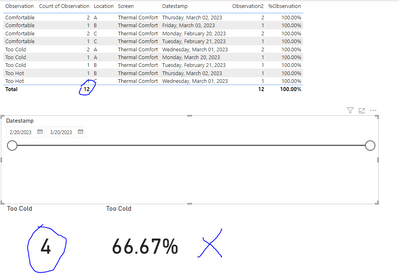
I am trying to show the count of specific observations as a percentage of the total observations made. My solution below works great but as soon as I add a datestamp slicer to the page, where I now want to see the percentage of specific responses made within a specific date range, the percentages no longer correspond.
This is the calculated measure:
%Observation =
DIVIDE(
    COUNT(Sheet1[Observation]),
    CALCULATE(
        COUNT(Sheet1[Observation]),ALL(Sheet1[Observation])
    )
)
So when I place a card visual with %Observation and filter for "Too Cold" which in the sample below is 4 out of 12 observations my card shows %33.33, Great
But once I add datestamp slicer and change the date range a little, the percentages do not make sense.
Sample data:
| Observation | Datestamp | Screen | Location |
| Too Cold | 3/1/2023 | Thermal Comfort | A |
| Too Hot | 3/2/2023 | Thermal Comfort | B |
| Too Hot | 3/1/2023 | Thermal Comfort | C |
| Too Cold | 3/1/2023 | Thermal Comfort | A |
| Too Cold | 3/20/2023 | Thermal Comfort | A |
| Too Cold | 2/21/2023 | Thermal Comfort | B |
| Comfortable | 2/21/2023 | Thermal Comfort | C |
| Comfortable | 2/20/2023 | Thermal Comfort | C |
| Comfortable | 2/20/2023 | Thermal Comfort | C |
| Comfortable | 3/2/2023 | Thermal Comfort | A |
| Comfortable | 3/2/2023 | Thermal Comfort | A |
| Comfortable | 3/3/2023 | Thermal Comfort | B |
Solved! Go to Solution.
- Mark as New
- Bookmark
- Subscribe
- Mute
- Subscribe to RSS Feed
- Permalink
- Report Inappropriate Content
Hi,
Check this file.
Regards,
Ashish Mathur
http://www.ashishmathur.com
https://www.linkedin.com/in/excelenthusiasts/
- Mark as New
- Bookmark
- Subscribe
- Mute
- Subscribe to RSS Feed
- Permalink
- Report Inappropriate Content
Hi,
Check this file.
Regards,
Ashish Mathur
http://www.ashishmathur.com
https://www.linkedin.com/in/excelenthusiasts/
- Mark as New
- Bookmark
- Subscribe
- Mute
- Subscribe to RSS Feed
- Permalink
- Report Inappropriate Content
Ashish, creating a new table with a continuous calendar resolved the issue. Thank you for providing the sample file.
- Mark as New
- Bookmark
- Subscribe
- Mute
- Subscribe to RSS Feed
- Permalink
- Report Inappropriate Content
You are welcome.
Regards,
Ashish Mathur
http://www.ashishmathur.com
https://www.linkedin.com/in/excelenthusiasts/
- Mark as New
- Bookmark
- Subscribe
- Mute
- Subscribe to RSS Feed
- Permalink
- Report Inappropriate Content
Helpful resources

Microsoft Fabric Learn Together
Covering the world! 9:00-10:30 AM Sydney, 4:00-5:30 PM CET (Paris/Berlin), 7:00-8:30 PM Mexico City

Power BI Monthly Update - April 2024
Check out the April 2024 Power BI update to learn about new features.

| User | Count |
|---|---|
| 114 | |
| 99 | |
| 82 | |
| 70 | |
| 60 |
| User | Count |
|---|---|
| 149 | |
| 114 | |
| 107 | |
| 89 | |
| 67 |


