- Power BI forums
- Updates
- News & Announcements
- Get Help with Power BI
- Desktop
- Service
- Report Server
- Power Query
- Mobile Apps
- Developer
- DAX Commands and Tips
- Custom Visuals Development Discussion
- Health and Life Sciences
- Power BI Spanish forums
- Translated Spanish Desktop
- Power Platform Integration - Better Together!
- Power Platform Integrations (Read-only)
- Power Platform and Dynamics 365 Integrations (Read-only)
- Training and Consulting
- Instructor Led Training
- Dashboard in a Day for Women, by Women
- Galleries
- Community Connections & How-To Videos
- COVID-19 Data Stories Gallery
- Themes Gallery
- Data Stories Gallery
- R Script Showcase
- Webinars and Video Gallery
- Quick Measures Gallery
- 2021 MSBizAppsSummit Gallery
- 2020 MSBizAppsSummit Gallery
- 2019 MSBizAppsSummit Gallery
- Events
- Ideas
- Custom Visuals Ideas
- Issues
- Issues
- Events
- Upcoming Events
- Community Blog
- Power BI Community Blog
- Custom Visuals Community Blog
- Community Support
- Community Accounts & Registration
- Using the Community
- Community Feedback
Register now to learn Fabric in free live sessions led by the best Microsoft experts. From Apr 16 to May 9, in English and Spanish.
- Power BI forums
- Forums
- Get Help with Power BI
- Desktop
- Percentage Bar Visual - Similar to progress bar.
- Subscribe to RSS Feed
- Mark Topic as New
- Mark Topic as Read
- Float this Topic for Current User
- Bookmark
- Subscribe
- Printer Friendly Page
- Mark as New
- Bookmark
- Subscribe
- Mute
- Subscribe to RSS Feed
- Permalink
- Report Inappropriate Content
Percentage Bar Visual - Similar to progress bar.
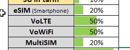
I have multiple columns that contain either "Yes" or "No" and would like to display a visual similar to the below where it will show a percentage of all the "Yes" values in each column. So, if there were 100 rows in the "eSIM" column and 20 "Yes" values, it would show the bar gague full by 20%
Firstly, is there a visual that can do this? I have look in the visual store and couldnt see one. There are curved gauges, but not bars. And then what would the calculation be to get this result.
Thanks in advance.
Solved! Go to Solution.
- Mark as New
- Bookmark
- Subscribe
- Mute
- Subscribe to RSS Feed
- Permalink
- Report Inappropriate Content
Hi @StuartSmith
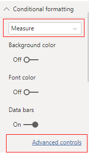
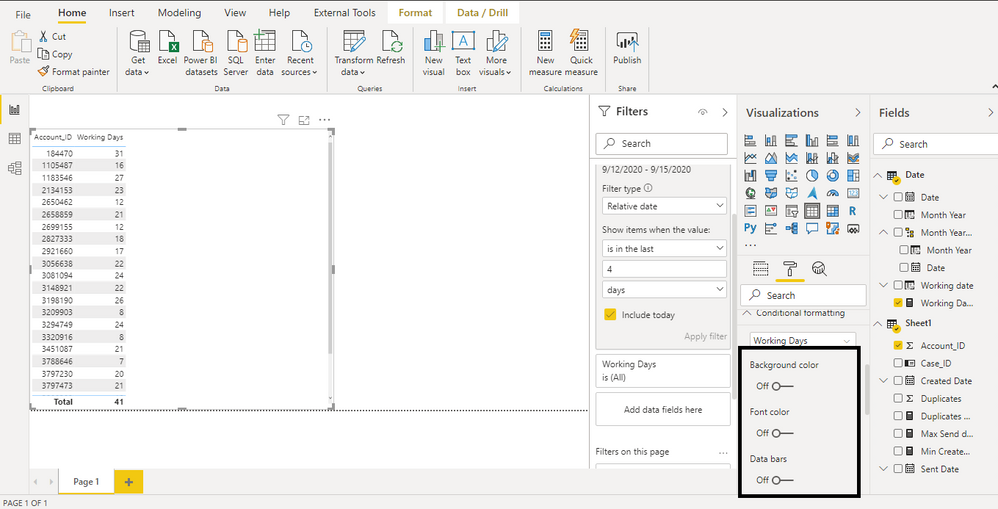
In addition to amitchandak's reply, you need to build a measure and then use Data Bars in Conditional Formatting.
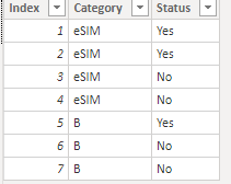
I build a table to have a test.
Measure:
Measure =
Var Yes = CALCULATE(COUNT('Table'[Category]),FILTER(ALL('Table'),'Table'[Category]=MAX('Table'[Category])&&'Table'[Status]="Yes"))
Var Total = CALCULATE(COUNT('Table'[Category]),FILTER(ALL('Table'),'Table'[Category]=MAX('Table'[Category])))
return
Yes/Total
Then we build a table visual and format the conditional formatting as below.
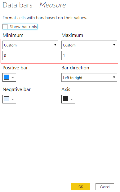
You need to change the Min and Max as 0 to 1 or the result will show incorrectly.
You can download the pbix file from this link: Percentage Bar Visual - Similar to progress bar.
Best Regards,
Rico Zhou
If this post helps, then please consider Accept it as the solution to help the other members find it more quickly.
- Mark as New
- Bookmark
- Subscribe
- Mute
- Subscribe to RSS Feed
- Permalink
- Report Inappropriate Content
@StuartSmith , This seems like conditional formatting data bars in matrix visual.
Microsoft Power BI Learning Resources, 2023 !!
Learn Power BI - Full Course with Dec-2022, with Window, Index, Offset, 100+ Topics !!
Did I answer your question? Mark my post as a solution! Appreciate your Kudos !! Proud to be a Super User! !!
- Mark as New
- Bookmark
- Subscribe
- Mute
- Subscribe to RSS Feed
- Permalink
- Report Inappropriate Content
Thanks again, you always seem to be helping me. I will have a read of the webpage.
- Mark as New
- Bookmark
- Subscribe
- Mute
- Subscribe to RSS Feed
- Permalink
- Report Inappropriate Content
Hi @StuartSmith
In addition to amitchandak's reply, you need to build a measure and then use Data Bars in Conditional Formatting.
I build a table to have a test.
Measure:
Measure =
Var Yes = CALCULATE(COUNT('Table'[Category]),FILTER(ALL('Table'),'Table'[Category]=MAX('Table'[Category])&&'Table'[Status]="Yes"))
Var Total = CALCULATE(COUNT('Table'[Category]),FILTER(ALL('Table'),'Table'[Category]=MAX('Table'[Category])))
return
Yes/Total
Then we build a table visual and format the conditional formatting as below.
You need to change the Min and Max as 0 to 1 or the result will show incorrectly.
You can download the pbix file from this link: Percentage Bar Visual - Similar to progress bar.
Best Regards,
Rico Zhou
If this post helps, then please consider Accept it as the solution to help the other members find it more quickly.
- Mark as New
- Bookmark
- Subscribe
- Mute
- Subscribe to RSS Feed
- Permalink
- Report Inappropriate Content
That worked great and once I pivioted the required columns, your steps worked perfectly.
Thanks very much.
Helpful resources

Microsoft Fabric Learn Together
Covering the world! 9:00-10:30 AM Sydney, 4:00-5:30 PM CET (Paris/Berlin), 7:00-8:30 PM Mexico City

Power BI Monthly Update - April 2024
Check out the April 2024 Power BI update to learn about new features.

| User | Count |
|---|---|
| 102 | |
| 101 | |
| 87 | |
| 73 | |
| 67 |
| User | Count |
|---|---|
| 116 | |
| 109 | |
| 94 | |
| 79 | |
| 72 |
