Join us at the 2025 Microsoft Fabric Community Conference
March 31 - April 2, 2025, in Las Vegas, Nevada. Use code MSCUST for a $150 discount! Early bird discount ends December 31.
Register Now- Power BI forums
- Get Help with Power BI
- Desktop
- Service
- Report Server
- Power Query
- Mobile Apps
- Developer
- DAX Commands and Tips
- Custom Visuals Development Discussion
- Health and Life Sciences
- Power BI Spanish forums
- Translated Spanish Desktop
- Training and Consulting
- Instructor Led Training
- Dashboard in a Day for Women, by Women
- Galleries
- Community Connections & How-To Videos
- COVID-19 Data Stories Gallery
- Themes Gallery
- Data Stories Gallery
- R Script Showcase
- Webinars and Video Gallery
- Quick Measures Gallery
- 2021 MSBizAppsSummit Gallery
- 2020 MSBizAppsSummit Gallery
- 2019 MSBizAppsSummit Gallery
- Events
- Ideas
- Custom Visuals Ideas
- Issues
- Issues
- Events
- Upcoming Events
Be one of the first to start using Fabric Databases. View on-demand sessions with database experts and the Microsoft product team to learn just how easy it is to get started. Watch now
- Power BI forums
- Forums
- Get Help with Power BI
- Desktop
- No Column Names Show for Lines (in a combo chart) ...
- Subscribe to RSS Feed
- Mark Topic as New
- Mark Topic as Read
- Float this Topic for Current User
- Bookmark
- Subscribe
- Printer Friendly Page
- Mark as New
- Bookmark
- Subscribe
- Mute
- Subscribe to RSS Feed
- Permalink
- Report Inappropriate Content
No Column Names Show for Lines (in a combo chart) in 'Show Data'
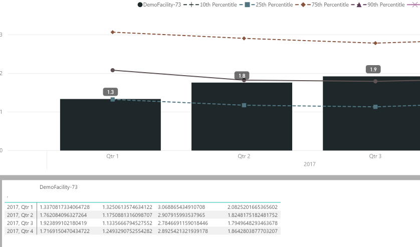
Hi, I am making a combo chart and there are multiple lines in the chart. When I click show data in the top right of my visual, there is no column names showing in the table.
Here is the visual:
This is my selection panel:
And this is the show data table:
As you can see, there is no column names for my lines. Anyone has idea what's going wrong? Thanks!
Solved! Go to Solution.
- Mark as New
- Bookmark
- Subscribe
- Mute
- Subscribe to RSS Feed
- Permalink
- Report Inappropriate Content
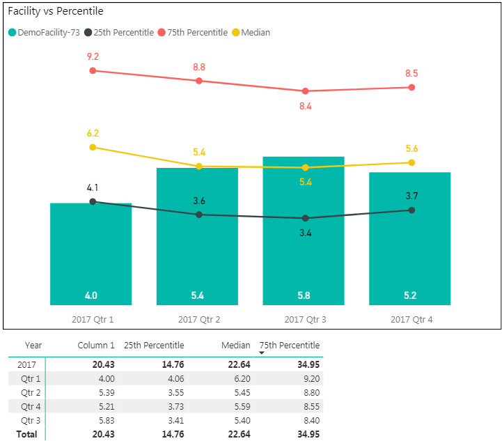
I don't have any way in my mind that can show those columns label with the combo chart and using line. Howerver, you can use different formating or put a table below to clarify the data:
One of my solution:
- Mark as New
- Bookmark
- Subscribe
- Mute
- Subscribe to RSS Feed
- Permalink
- Report Inappropriate Content
It looks like your column name referring to the DemoFacility-73, which doesn't show up in the table? It will be clearer if you can provide me with the sample data. Thanks.
Duc
- Mark as New
- Bookmark
- Subscribe
- Mute
- Subscribe to RSS Feed
- Permalink
- Report Inappropriate Content
| Year | Quarter | Month | Facility | 25th Percentitle | 75th Percentitle | Median | Column 1 |
| 2017 | Qtr 1 | January | DemoFacility-73 | 1.48781013 | 3.39152518 | 2.25243507 | 1.17008829 |
| 2017 | Qtr 1 | February | DemoFacility-73 | 1.21148268 | 2.70778573 | 1.86892594 | 1.1118973 |
| 2017 | Qtr 1 | March | DemoFacility-73 | 1.36500137 | 3.10383837 | 2.07693346 | 1.72169334 |
| 2017 | Qtr 2 | April | DemoFacility-73 | 1.20473895 | 2.76057724 | 1.90174327 | 1.80159892 |
| 2017 | Qtr 2 | May | DemoFacility-73 | 1.19911361 | 3.0464744 | 1.69109357 | 1.35025655 |
| 2017 | Qtr 2 | June | DemoFacility-73 | 1.14816633 | 2.99597003 | 1.85528757 | 2.23388808 |
| 2017 | Qtr 3 | July | DemoFacility-73 | 1.08833042 | 2.95330641 | 1.75647415 | 2.46029971 |
| 2017 | Qtr 3 | August | DemoFacility-73 | 1.16963904 | 2.88387787 | 1.91754554 | 1.40745954 |
| 2017 | Qtr 3 | September | DemoFacility-73 | 1.15473441 | 2.5619129 | 1.7252534 | 1.96099793 |
| 2017 | Qtr 4 | October | DemoFacility-73 | 1.19094879 | 2.9607698 | 1.74249758 | 2.02342918 |
| 2017 | Qtr 4 | November | DemoFacility-73 | 1.1656383 | 2.63401821 | 1.80831826 | 1.81591193 |
| 2017 | Qtr 4 | December | DemoFacility-73 | 1.37209906 | 2.95066735 | 2.04370382 | 1.3735006 |
Column Names for lines that repersent median, 25th and 75th percentiles didn't show in the 'show table'. Column 1 is the value for bar, facility is the value for bar series. Thanks.
- Mark as New
- Bookmark
- Subscribe
- Mute
- Subscribe to RSS Feed
- Permalink
- Report Inappropriate Content
Got ya, the reason why your data table of the visualization doesn't show header for 25th, 75th and median is that those are aggregated columns.
If you are trying to represent the data table next to the chart, I recommend to create a table.
Otherwise, if you still want to show all these column header in data table, you will have to unpivot the columns.
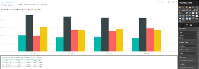
In Power Query, select columns 25th, 75th, Median and Column 1 then Transform -> Unpivot Columns:
Then you can import and create visualization as follow:
- Mark as New
- Bookmark
- Subscribe
- Mute
- Subscribe to RSS Feed
- Permalink
- Report Inappropriate Content
Hi Duc,
Thank you for replying. What I would like to see is a combo chart (bar and lines together). So that it will be very clear that whether demofacility76 is below or above those percentiles. Instead of showing all of them in bars, is this possible to show the combo and show those line names in 'Show Data'?
- Mark as New
- Bookmark
- Subscribe
- Mute
- Subscribe to RSS Feed
- Permalink
- Report Inappropriate Content
I don't have any way in my mind that can show those columns label with the combo chart and using line. Howerver, you can use different formating or put a table below to clarify the data:
One of my solution:
Helpful resources

Join us at the Microsoft Fabric Community Conference
March 31 - April 2, 2025, in Las Vegas, Nevada. Use code MSCUST for a $150 discount!

We want your feedback!
Your insights matter. That’s why we created a quick survey to learn about your experience finding answers to technical questions.

Microsoft Fabric Community Conference 2025
Arun Ulag shares exciting details about the Microsoft Fabric Conference 2025, which will be held in Las Vegas, NV.

| User | Count |
|---|---|
| 124 | |
| 87 | |
| 85 | |
| 70 | |
| 51 |
| User | Count |
|---|---|
| 205 | |
| 153 | |
| 97 | |
| 79 | |
| 69 |


