- Power BI forums
- Updates
- News & Announcements
- Get Help with Power BI
- Desktop
- Service
- Report Server
- Power Query
- Mobile Apps
- Developer
- DAX Commands and Tips
- Custom Visuals Development Discussion
- Health and Life Sciences
- Power BI Spanish forums
- Translated Spanish Desktop
- Power Platform Integration - Better Together!
- Power Platform Integrations (Read-only)
- Power Platform and Dynamics 365 Integrations (Read-only)
- Training and Consulting
- Instructor Led Training
- Dashboard in a Day for Women, by Women
- Galleries
- Community Connections & How-To Videos
- COVID-19 Data Stories Gallery
- Themes Gallery
- Data Stories Gallery
- R Script Showcase
- Webinars and Video Gallery
- Quick Measures Gallery
- 2021 MSBizAppsSummit Gallery
- 2020 MSBizAppsSummit Gallery
- 2019 MSBizAppsSummit Gallery
- Events
- Ideas
- Custom Visuals Ideas
- Issues
- Issues
- Events
- Upcoming Events
- Community Blog
- Power BI Community Blog
- Custom Visuals Community Blog
- Community Support
- Community Accounts & Registration
- Using the Community
- Community Feedback
Register now to learn Fabric in free live sessions led by the best Microsoft experts. From Apr 16 to May 9, in English and Spanish.
- Power BI forums
- Forums
- Get Help with Power BI
- Desktop
- Need help - Scatter plot - how to colorize all dat...
- Subscribe to RSS Feed
- Mark Topic as New
- Mark Topic as Read
- Float this Topic for Current User
- Bookmark
- Subscribe
- Printer Friendly Page
- Mark as New
- Bookmark
- Subscribe
- Mute
- Subscribe to RSS Feed
- Permalink
- Report Inappropriate Content
Need help - Scatter plot - how to colorize all data above a certain value?
Hi Guys,
I have a scatter plot with Days on the x-axis (going from 1-365), and TPC on the y-axis.
Days are created from "Day = RELATED('Calendar daily'[DayNoOfYear])"
In the below I have Days as dont summarize and and TPC as dont summarize. As summarizing makes no sense. I would like to color all data points above >10.000 red.
When I try to do this through format --> data colors, I can only choose to change one data point at a time as can be seen in the second image.
I can also choose to put my y-axis (TPC) into legends and not summarize my y-axis. This still gives me the same data plot, however, now I have a million colors and the issue is the same.
How do I choose to colorize a range - in this instance all data points >10.000 colored red?
Thank you for all help. 🙂
Solved! Go to Solution.
- Mark as New
- Bookmark
- Subscribe
- Mute
- Subscribe to RSS Feed
- Permalink
- Report Inappropriate Content
What version of Power BI desktop are you on?
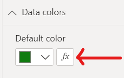
Can you see this option to conditionally format the colour?
If so, this blog might help with transparency...
Dynamically Changing the Color Transparency in Power BI | Sandeep Pawar (pawarbi.github.io)
Or this blog with just colour using field value:
Conditional formatting by field value in Power BI - Power BI Docs
Did I answer your question? Mark my post as a solution!
Proud to be a Super User!
- Mark as New
- Bookmark
- Subscribe
- Mute
- Subscribe to RSS Feed
- Permalink
- Report Inappropriate Content
Dude... that was totally easy. I have it solved already. Not sure how I could miss that field.
Thanks alot! 🙂
- Mark as New
- Bookmark
- Subscribe
- Mute
- Subscribe to RSS Feed
- Permalink
- Report Inappropriate Content
You're welcome 🙂
Did I answer your question? Mark my post as a solution!
Proud to be a Super User!
- Mark as New
- Bookmark
- Subscribe
- Mute
- Subscribe to RSS Feed
- Permalink
- Report Inappropriate Content
Hi,
The newest version I assume. Company should keep it up to date.
Yes I see that field - didnt really notice it before now. I will try to read your material and see if I can solve it. Thanks 🙂
Helpful resources

Microsoft Fabric Learn Together
Covering the world! 9:00-10:30 AM Sydney, 4:00-5:30 PM CET (Paris/Berlin), 7:00-8:30 PM Mexico City

Power BI Monthly Update - April 2024
Check out the April 2024 Power BI update to learn about new features.

| User | Count |
|---|---|
| 107 | |
| 98 | |
| 78 | |
| 65 | |
| 53 |
| User | Count |
|---|---|
| 144 | |
| 104 | |
| 100 | |
| 86 | |
| 64 |


