Join us at the 2025 Microsoft Fabric Community Conference
March 31 - April 2, 2025, in Las Vegas, Nevada. Use code MSCUST for a $150 discount! Early bird discount ends December 31.
Register Now- Power BI forums
- Get Help with Power BI
- Desktop
- Service
- Report Server
- Power Query
- Mobile Apps
- Developer
- DAX Commands and Tips
- Custom Visuals Development Discussion
- Health and Life Sciences
- Power BI Spanish forums
- Translated Spanish Desktop
- Training and Consulting
- Instructor Led Training
- Dashboard in a Day for Women, by Women
- Galleries
- Community Connections & How-To Videos
- COVID-19 Data Stories Gallery
- Themes Gallery
- Data Stories Gallery
- R Script Showcase
- Webinars and Video Gallery
- Quick Measures Gallery
- 2021 MSBizAppsSummit Gallery
- 2020 MSBizAppsSummit Gallery
- 2019 MSBizAppsSummit Gallery
- Events
- Ideas
- Custom Visuals Ideas
- Issues
- Issues
- Events
- Upcoming Events
Be one of the first to start using Fabric Databases. View on-demand sessions with database experts and the Microsoft product team to learn just how easy it is to get started. Watch now
- Power BI forums
- Forums
- Get Help with Power BI
- Desktop
- Monthly Average of Previous 5 Years
- Subscribe to RSS Feed
- Mark Topic as New
- Mark Topic as Read
- Float this Topic for Current User
- Bookmark
- Subscribe
- Printer Friendly Page
- Mark as New
- Bookmark
- Subscribe
- Mute
- Subscribe to RSS Feed
- Permalink
- Report Inappropriate Content
Monthly Average of Previous 5 Years
I have a data in below format.
The Data is for every day.
Date,Region,Refinery,CapacityShutdown
2018-01-01,Africa,GP Oil, 26
2018-01-02,Africa,GP Oil, 27
2018-01-03,Africa,GP Oil, 26
For previous 10 Years and for future years as well.
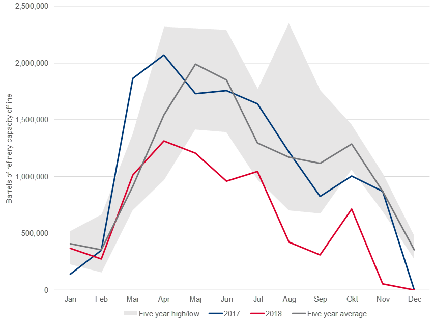
I want to show a seasonality graph like mentioned in the below picture.
Along with this, I need filter on Region as well.
Measures: Previous 5 Year monthly high, Previous 5 Year monthly low (Shaded region from low to high), 5 Year monthly average, previous year monthy shutdown, current year monthly shutdown.
X Axis : Months (Jan to Dec)
Y Axis : Capacity shutdown.
How to calculate this measures using DAX?
Regards,
Akash
Solved! Go to Solution.
- Mark as New
- Bookmark
- Subscribe
- Mute
- Subscribe to RSS Feed
- Permalink
- Report Inappropriate Content
You may try the following measure.
Measure =
AVERAGEX (
    SUMMARIZE (
        FILTER (
            Table1,
            YEAR ( Table1[Date] )
                >= YEAR ( TODAY () ) - 5
                && YEAR ( Table1[Date] ) < YEAR ( TODAY () )
        ),
        Table1[Date].[Year]
    ),
    CALCULATE ( SUM ( Table1[CapacityShutdown] ) )
)
If this post helps, then please consider Accept it as the solution to help the other members find it more quickly.
Helpful resources

Join us at the Microsoft Fabric Community Conference
March 31 - April 2, 2025, in Las Vegas, Nevada. Use code MSCUST for a $150 discount!

We want your feedback!
Your insights matter. That’s why we created a quick survey to learn about your experience finding answers to technical questions.

Microsoft Fabric Community Conference 2025
Arun Ulag shares exciting details about the Microsoft Fabric Conference 2025, which will be held in Las Vegas, NV.

| User | Count |
|---|---|
| 132 | |
| 90 | |
| 88 | |
| 64 | |
| 58 |
| User | Count |
|---|---|
| 203 | |
| 141 | |
| 107 | |
| 73 | |
| 70 |

