- Power BI forums
- Updates
- News & Announcements
- Get Help with Power BI
- Desktop
- Service
- Report Server
- Power Query
- Mobile Apps
- Developer
- DAX Commands and Tips
- Custom Visuals Development Discussion
- Health and Life Sciences
- Power BI Spanish forums
- Translated Spanish Desktop
- Power Platform Integration - Better Together!
- Power Platform Integrations (Read-only)
- Power Platform and Dynamics 365 Integrations (Read-only)
- Training and Consulting
- Instructor Led Training
- Dashboard in a Day for Women, by Women
- Galleries
- Community Connections & How-To Videos
- COVID-19 Data Stories Gallery
- Themes Gallery
- Data Stories Gallery
- R Script Showcase
- Webinars and Video Gallery
- Quick Measures Gallery
- 2021 MSBizAppsSummit Gallery
- 2020 MSBizAppsSummit Gallery
- 2019 MSBizAppsSummit Gallery
- Events
- Ideas
- Custom Visuals Ideas
- Issues
- Issues
- Events
- Upcoming Events
- Community Blog
- Power BI Community Blog
- Custom Visuals Community Blog
- Community Support
- Community Accounts & Registration
- Using the Community
- Community Feedback
Register now to learn Fabric in free live sessions led by the best Microsoft experts. From Apr 16 to May 9, in English and Spanish.
- Power BI forums
- Forums
- Get Help with Power BI
- Desktop
- Making the page filter show all records from accum...
- Subscribe to RSS Feed
- Mark Topic as New
- Mark Topic as Read
- Float this Topic for Current User
- Bookmark
- Subscribe
- Printer Friendly Page
- Mark as New
- Bookmark
- Subscribe
- Mute
- Subscribe to RSS Feed
- Permalink
- Report Inappropriate Content
Making the page filter show all records from accumulated totals using standard code for accumulating
I have a graph that is showing accumulated totals as generated by:
Received_Accumulated =
CALCULATE (
    SUM ( 'ExportedRecords'[Received_Counter] ),
        FILTER(ALL ( 'Date Dimension'),
        'Date Dimension'[Date] <= (MAX('Date Dimension'[Date]))
))
This works for the graph, but I also have a data grid on the same page which should show the list of all records that are included in the totals for recieved POs. When I select one of the weeks in the accumulation graph, I want to see all records which compose that total, but it only shows me the records which transacted on the selected week. How do I change this behavior?
- Mark as New
- Bookmark
- Subscribe
- Mute
- Subscribe to RSS Feed
- Permalink
- Report Inappropriate Content
Hi, @Ocoder
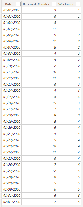
Based on your description, I created data to reproduce your scenario.
Date Dimension:
Date Dimension = CALENDARAUTO()
There is no relationship between two tables.
You may create calculated columns and measures as below.
Calculated column:
Weeknum1 = WEEKNUM('Date Dimension'[Date])
Weeknum2 = WEEKNUM(ExportedRecords[Date])

Measure:
Received_Accumulated =
CALCULATE(
    SUM(ExportedRecords[Received_Counter]),
    FILTER(
        ALL('ExportedRecords'),
        'ExportedRecords'[Date]<=MAX('Date Dimension'[Date])
    )
)
Visual control =
IF(
    ISFILTERED('Date Dimension'[Weeknum1]),
    IF(
        WEEKNUM(SELECTEDVALUE(ExportedRecords[Date]))<=SELECTEDVALUE('Date Dimension'[Weeknum1]),
        1,0
    ),
    1
)
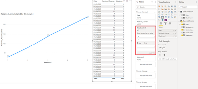
Finally you need to put the 'Visual control' in the visual level filter of the table visual to display the result.
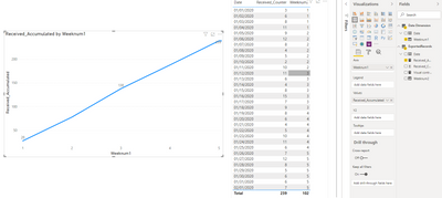
Week = 2:
Week = 3:
Best Regards
Allan
If this post helps, then please consider Accept it as the solution to help the other members find it more quickly.
- Mark as New
- Bookmark
- Subscribe
- Mute
- Subscribe to RSS Feed
- Permalink
- Report Inappropriate Content
This doesn't seem to work for me. I have also tried putting the visual control marker as a calculated column, but still no. I can't get the list to filter based on whether visual filter is 1 or 0 and if I have a test visual that counts up the visual control filter totals, it still only adds up the current week.
- Mark as New
- Bookmark
- Subscribe
- Mute
- Subscribe to RSS Feed
- Permalink
- Report Inappropriate Content
Hi, @Ocoder
Could you share some sample data and expected result with OneDrive for Business? Do mask sensitive data before uploading. Thanks
Best Regards
Allan
- Mark as New
- Bookmark
- Subscribe
- Mute
- Subscribe to RSS Feed
- Permalink
- Report Inappropriate Content
Thanks for your help and attention to my question.
My task has changed such that this topic is no longer relevant to completion. I can't spend more time on it at the moment, so I will have to leave this as it stands.
- Mark as New
- Bookmark
- Subscribe
- Mute
- Subscribe to RSS Feed
- Permalink
- Report Inappropriate Content
@v-alq-msft Thanks for the help. I am implementing these changes now. I have one question though, why did you say to create calculated column Weeknum2 when it doesn't seem to be used anywhere? And I assume you mean that those calculated columns go into the tables they refer to respectively.
EDIT: Nevermind, I see that you're using Weeknum2 in the visual.
- Mark as New
- Bookmark
- Subscribe
- Mute
- Subscribe to RSS Feed
- Permalink
- Report Inappropriate Content
Hi, @Ocoder
'Weeknum2' is unimportant. It is just used to show the week num in the table visual for better understanding.
Best Regards
Allan
If this post helps, then please consider Accept it as the solution to help the other members find it more quickly.
- Mark as New
- Bookmark
- Subscribe
- Mute
- Subscribe to RSS Feed
- Permalink
- Report Inappropriate Content
@OcoderMaybe you can use the edit interactions feature to stop the chart from filtering the tabular data and separately render the tabular data up to the desired date.
https://docs.microsoft.com/en-us/power-bi/service-reports-visual-interactions
Helpful resources

Microsoft Fabric Learn Together
Covering the world! 9:00-10:30 AM Sydney, 4:00-5:30 PM CET (Paris/Berlin), 7:00-8:30 PM Mexico City

Power BI Monthly Update - April 2024
Check out the April 2024 Power BI update to learn about new features.

| User | Count |
|---|---|
| 114 | |
| 100 | |
| 81 | |
| 70 | |
| 62 |
| User | Count |
|---|---|
| 148 | |
| 116 | |
| 104 | |
| 90 | |
| 65 |


