- Power BI forums
- Updates
- News & Announcements
- Get Help with Power BI
- Desktop
- Service
- Report Server
- Power Query
- Mobile Apps
- Developer
- DAX Commands and Tips
- Custom Visuals Development Discussion
- Health and Life Sciences
- Power BI Spanish forums
- Translated Spanish Desktop
- Power Platform Integration - Better Together!
- Power Platform Integrations (Read-only)
- Power Platform and Dynamics 365 Integrations (Read-only)
- Training and Consulting
- Instructor Led Training
- Dashboard in a Day for Women, by Women
- Galleries
- Community Connections & How-To Videos
- COVID-19 Data Stories Gallery
- Themes Gallery
- Data Stories Gallery
- R Script Showcase
- Webinars and Video Gallery
- Quick Measures Gallery
- 2021 MSBizAppsSummit Gallery
- 2020 MSBizAppsSummit Gallery
- 2019 MSBizAppsSummit Gallery
- Events
- Ideas
- Custom Visuals Ideas
- Issues
- Issues
- Events
- Upcoming Events
- Community Blog
- Power BI Community Blog
- Custom Visuals Community Blog
- Community Support
- Community Accounts & Registration
- Using the Community
- Community Feedback
Register now to learn Fabric in free live sessions led by the best Microsoft experts. From Apr 16 to May 9, in English and Spanish.
- Power BI forums
- Forums
- Get Help with Power BI
- Desktop
- Re: Maintenance End Date
- Subscribe to RSS Feed
- Mark Topic as New
- Mark Topic as Read
- Float this Topic for Current User
- Bookmark
- Subscribe
- Printer Friendly Page
- Mark as New
- Bookmark
- Subscribe
- Mute
- Subscribe to RSS Feed
- Permalink
- Report Inappropriate Content
Maintenance End Date
Hi,
I am struggling and I was hoping someone could advise what to do.
My Table 'Device List' has a column: [Maintenance End Date]
I want to use a Stacked column chart that will display number of Maintenance End Dates each month.
So that the x-axis has my Maintenance End Dates and my y-axis counts the rows (IDs).
I have tried bins, group by bins - size of bins, Bin size: 12.
For some reason I am getting different results, comparing that to my excel spreadsheet.
I do not know what to do.
- Mark as New
- Bookmark
- Subscribe
- Mute
- Subscribe to RSS Feed
- Permalink
- Report Inappropriate Content
It sounds like you are trying to create a stacked column chart in Power BI that shows the number of Maintenance End Dates each month. Here are some steps that may help you achieve this:
Make sure your [Maintenance End Date] column is in date format. If it is not, you can convert it to a date format by selecting the column, clicking on "Modeling" in the ribbon, and choosing "Data Type" > "Date/Time".
Create a new column called "Month" that extracts the month from your [Maintenance End Date] column. You can do this by selecting the column, clicking on "Modeling" in the ribbon, and choosing "New Column". Then enter the formula "=MONTH([Maintenance End Date])".
Create a stacked column chart by selecting your [Maintenance End Date] column and your new "Month" column, and choosing "Stacked Column Chart" from the "Visualizations" pane.
Drag the "Month" column to the "Axis" section of the "Visualizations" pane, and drag the [Maintenance End Date] column to the "Values" section.
You should now have a chart that shows the number of Maintenance End Dates for each month. If the results are not matching your Excel spreadsheet, make sure your data is correctly formatted in both Power BI and Excel.
I hope this helps!
- Mark as New
- Bookmark
- Subscribe
- Mute
- Subscribe to RSS Feed
- Permalink
- Report Inappropriate Content
Please provide a sample of the data where the issue exists, as this question cannot be resolved without knowing the location of the discrepancy.
Regards,
Ritesh
- Mark as New
- Bookmark
- Subscribe
- Mute
- Subscribe to RSS Feed
- Permalink
- Report Inappropriate Content
Thank you Ritesh,
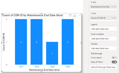
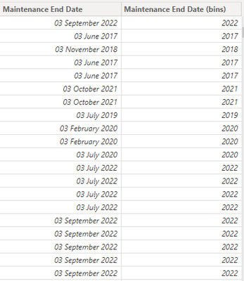
It actually works. I have just checked it again. What happened was that I had a filter and I waned to filter by Date so when I filtered by 2022 it just gave me a different number, which was lower by almost a 100 to the (bins) summary. Below is justan example of what I am working with. Hopefully this will help understand what I am working with.
So as I said, the bins actually work. What I want to be able to do in addition is to Filter either via the bar visual or with my Date hierarhy Filter to see the brakedown also by quarter, month and day.
I want to be able to filter by the 'Calendar' filter for a particular quarter, or month or a day, not just a year. Should I create a related measure, or something? Please advise.
Helpful resources

Microsoft Fabric Learn Together
Covering the world! 9:00-10:30 AM Sydney, 4:00-5:30 PM CET (Paris/Berlin), 7:00-8:30 PM Mexico City

Power BI Monthly Update - April 2024
Check out the April 2024 Power BI update to learn about new features.

| User | Count |
|---|---|
| 117 | |
| 107 | |
| 70 | |
| 70 | |
| 43 |
| User | Count |
|---|---|
| 148 | |
| 106 | |
| 104 | |
| 89 | |
| 65 |


