- Power BI forums
- Get Help with Power BI
- Desktop
- Service
- Report Server
- Power Query
- Mobile Apps
- Developer
- DAX Commands and Tips
- Custom Visuals Development Discussion
- Health and Life Sciences
- Power BI Spanish forums
- Translated Spanish Desktop
- Training and Consulting
- Instructor Led Training
- Dashboard in a Day for Women, by Women
- Galleries
- Community Connections & How-To Videos
- COVID-19 Data Stories Gallery
- Themes Gallery
- Data Stories Gallery
- R Script Showcase
- Webinars and Video Gallery
- Quick Measures Gallery
- 2021 MSBizAppsSummit Gallery
- 2020 MSBizAppsSummit Gallery
- 2019 MSBizAppsSummit Gallery
- Events
- Ideas
- Custom Visuals Ideas
- Issues
- Issues
- Events
- Upcoming Events
- Community Blog
- Power BI Community Blog
- Power BI 中文博客
- Community Support
- Community Accounts & Registration
- Using the Community
- Community Feedback
Get certified in Microsoft Fabric—for free! For a limited time, the Microsoft Fabric Community team will be offering free DP-600 exam vouchers. Prepare now
- Power BI forums
- Forums
- Get Help with Power BI
- Desktop
- Linear gauge modifications
- Subscribe to RSS Feed
- Mark Topic as New
- Mark Topic as Read
- Float this Topic for Current User
- Bookmark
- Subscribe
- Printer Friendly Page
- Mark as New
- Bookmark
- Subscribe
- Mute
- Subscribe to RSS Feed
- Permalink
- Report Inappropriate Content
Linear gauge modifications
Hello,
I have two values.
"allowed level" aka permit level
"actual amount" aka pumpage
In short, I want my visual to show something like this below, where the maximum range is the permit level, and the pumpage is visualized to see how much is remaining. For locations where there's no exceedance, this works fine like below.
For locations such as the one selected, where the pumpage exceeds the permit level, how do I edit the values under the visual to show exceedance? Here's what I see now, it just defaults to show 50% full.
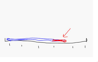
What I want is something like this (excuse my drawing ability)
- Mark as New
- Bookmark
- Subscribe
- Mute
- Subscribe to RSS Feed
- Permalink
- Report Inappropriate Content
Hi, @water-guy-5 ;
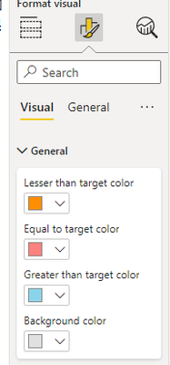
Sorry this is not supported; Since this is a custom visual, I don't see that you can use conditional formatting to set colors, so this does not support different colors;
You may vote the idea and comment there to improve this feature.
Best Regards,
Community Support Team _ Yalan Wu
If this post helps, then please consider Accept it as the solution to help the other members find it more quickly.
Helpful resources

Power BI Monthly Update - October 2024
Check out the October 2024 Power BI update to learn about new features.

Microsoft Fabric & AI Learning Hackathon
Learn from experts, get hands-on experience, and win awesome prizes.

| User | Count |
|---|---|
| 113 | |
| 96 | |
| 91 | |
| 82 | |
| 69 |
| User | Count |
|---|---|
| 159 | |
| 125 | |
| 116 | |
| 111 | |
| 95 |


