- Power BI forums
- Updates
- News & Announcements
- Get Help with Power BI
- Desktop
- Service
- Report Server
- Power Query
- Mobile Apps
- Developer
- DAX Commands and Tips
- Custom Visuals Development Discussion
- Health and Life Sciences
- Power BI Spanish forums
- Translated Spanish Desktop
- Power Platform Integration - Better Together!
- Power Platform Integrations (Read-only)
- Power Platform and Dynamics 365 Integrations (Read-only)
- Training and Consulting
- Instructor Led Training
- Dashboard in a Day for Women, by Women
- Galleries
- Community Connections & How-To Videos
- COVID-19 Data Stories Gallery
- Themes Gallery
- Data Stories Gallery
- R Script Showcase
- Webinars and Video Gallery
- Quick Measures Gallery
- 2021 MSBizAppsSummit Gallery
- 2020 MSBizAppsSummit Gallery
- 2019 MSBizAppsSummit Gallery
- Events
- Ideas
- Custom Visuals Ideas
- Issues
- Issues
- Events
- Upcoming Events
- Community Blog
- Power BI Community Blog
- Custom Visuals Community Blog
- Community Support
- Community Accounts & Registration
- Using the Community
- Community Feedback
Register now to learn Fabric in free live sessions led by the best Microsoft experts. From Apr 16 to May 9, in English and Spanish.
- Power BI forums
- Forums
- Get Help with Power BI
- Desktop
- Line chart showing individual lines from individua...
- Subscribe to RSS Feed
- Mark Topic as New
- Mark Topic as Read
- Float this Topic for Current User
- Bookmark
- Subscribe
- Printer Friendly Page
- Mark as New
- Bookmark
- Subscribe
- Mute
- Subscribe to RSS Feed
- Permalink
- Report Inappropriate Content
Line chart showing individual lines from individual results within the same groupId
Hi
Im having trouble showing my data the way I want to in a line chart in Power Bi and would like som help trying to figure out how to do this.
My data looks like this:
| BatchId | ResultId | PlateGroupId | Result |
| BatchA | 1 | 0 | 82 |
| BatchA | 2 | 0 | 82 |
| BatchA | 3 | 1 | 86 |
| BatchA | 4 | 1 | 86 |
| BatchA | 5 | 2 | 88 |
| BatchA | 6 | 2 | 82 |
| BatchA | 7 | 3 | 86 |
| BatchA | 8 | 3 | 74 |
| BatchA | 9 | 4 | 90 |
| BatchA | 10 | 4 | 88 |
| BatchA | 11 | 5 | 80 |
| BatchA | 12 | 5 | 84 |
| BatchB | 13 | 0 | 92 |
| BatchB | 14 | 0 | 90 |
| BatchB | 15 | 1 | 90 |
| BatchB | 16 | 1 | 94 |
| BatchB | 17 | 2 | 86 |
| BatchB | 18 | 2 | 88 |
| BatchB | 19 | 3 | 92 |
| BatchB | 20 | 3 | 80 |
| BatchB | 21 | 4 | 84 |
| BatchB | 22 | 4 | 88 |
| BatchB | 23 | 5 | 76 |
| BatchB | 24 | 5 | 72 |
| BatchC | 25 | 0 | 82 |
| BatchC | 26 | 0 | 82 |
| BatchC | 27 | 0 | 86 |
| BatchC | 28 | 1 | 86 |
| BatchC | 29 | 1 | 88 |
| BatchC | 30 | 1 | 82 |
| BatchC | 31 | 2 | 86 |
| BatchC | 32 | 2 | 74 |
| BatchC | 33 | 2 | 90 |
| BatchC | 34 | 3 | 88 |
| BatchC | 35 | 3 | 80 |
| BatchC | 36 | 3 | 84 |
| BatchC | 37 | 4 | 82 |
| BatchC | 38 | 4 | 82 |
| BatchC | 39 | 4 | 86 |
| BatchC | 40 | 5 | 86 |
| BatchC | 41 | 5 | 88 |
| BatchC | 42 | 5 | 82 |
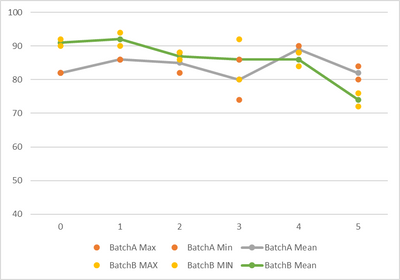
And I would like to be able to visualize it something like this (dont mind the lables):
For each "PlateGroup" There are two (sometimes more) replicates and I want to show them under the same "PlateGroup" togheter with the mean result. Meaning the x-axis should be "PlateGroup" and the y-axis should be result. But I dont know how to show the individual result values (from the different "ResultId") under the same "PlateGroup" without them being summarized or calculated somehow.
At the same time I would like to filter/slize the line chart based on the BatchId. As I have it now in my report, I only show the mean values with the BatchId as the legend. So if I have a slicer for BatchId and slice it between the different BatchId´s I see the mean line in the line chart only and I see the line connected to the BatchId chosen in the slicer.
Hope anyone out there can help me with this, I´ve been thinking too long on this now so my brain is fried and cant think out of the box anymore 🙂
Kind regards
Robert
Solved! Go to Solution.
- Mark as New
- Bookmark
- Subscribe
- Mute
- Subscribe to RSS Feed
- Permalink
- Report Inappropriate Content
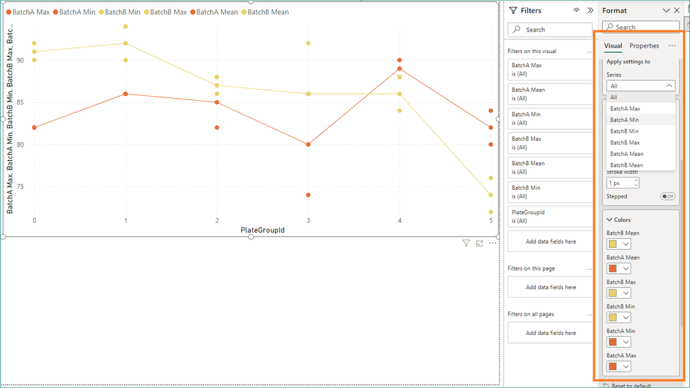
Hi @robasp ,
Please check the model and the format setting.
Best Regards,
Gao
Community Support Team
If there is any post helps, then please consider Accept it as the solution to help the other members find it more quickly. If I misunderstand your needs or you still have problems on it, please feel free to let us know. Thanks a lot!
How to get your questions answered quickly -- How to provide sample data in the Power BI Forum
Helpful resources

Microsoft Fabric Learn Together
Covering the world! 9:00-10:30 AM Sydney, 4:00-5:30 PM CET (Paris/Berlin), 7:00-8:30 PM Mexico City

Power BI Monthly Update - April 2024
Check out the April 2024 Power BI update to learn about new features.

| User | Count |
|---|---|
| 111 | |
| 100 | |
| 80 | |
| 64 | |
| 58 |
| User | Count |
|---|---|
| 146 | |
| 110 | |
| 93 | |
| 84 | |
| 67 |


