- Power BI forums
- Updates
- News & Announcements
- Get Help with Power BI
- Desktop
- Service
- Report Server
- Power Query
- Mobile Apps
- Developer
- DAX Commands and Tips
- Custom Visuals Development Discussion
- Health and Life Sciences
- Power BI Spanish forums
- Translated Spanish Desktop
- Power Platform Integration - Better Together!
- Power Platform Integrations (Read-only)
- Power Platform and Dynamics 365 Integrations (Read-only)
- Training and Consulting
- Instructor Led Training
- Dashboard in a Day for Women, by Women
- Galleries
- Community Connections & How-To Videos
- COVID-19 Data Stories Gallery
- Themes Gallery
- Data Stories Gallery
- R Script Showcase
- Webinars and Video Gallery
- Quick Measures Gallery
- 2021 MSBizAppsSummit Gallery
- 2020 MSBizAppsSummit Gallery
- 2019 MSBizAppsSummit Gallery
- Events
- Ideas
- Custom Visuals Ideas
- Issues
- Issues
- Events
- Upcoming Events
- Community Blog
- Power BI Community Blog
- Custom Visuals Community Blog
- Community Support
- Community Accounts & Registration
- Using the Community
- Community Feedback
Register now to learn Fabric in free live sessions led by the best Microsoft experts. From Apr 16 to May 9, in English and Spanish.
- Power BI forums
- Forums
- Get Help with Power BI
- Desktop
- Re: Line and column chart at different date granul...
- Subscribe to RSS Feed
- Mark Topic as New
- Mark Topic as Read
- Float this Topic for Current User
- Bookmark
- Subscribe
- Printer Friendly Page
- Mark as New
- Bookmark
- Subscribe
- Mute
- Subscribe to RSS Feed
- Permalink
- Report Inappropriate Content
Line and column chart at different date granularities
Hi everyone!
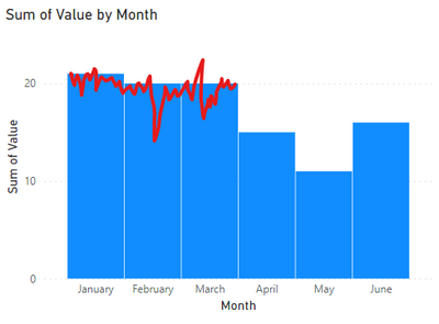
I'm trying to see if this is possible in Power BI. I have data that is recorded daily that I want to summarize per month with a column. However, I also want to see the daily data. See the screenshot as a quick example.
Ideas?
Solved! Go to Solution.
- Mark as New
- Bookmark
- Subscribe
- Mute
- Subscribe to RSS Feed
- Permalink
- Report Inappropriate Content
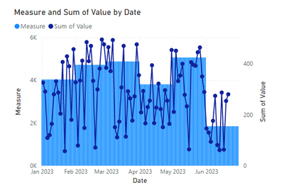
I was able to get something pretty close.
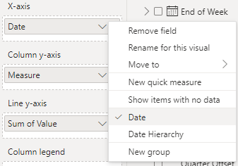
For this you have to use the 'Date' in the x-axis and NOT the 'Date Heirarchy'. This gives you a zoomed out view of all your days so you don't have the scroll bar on the bottom.
Then all thats left is to create a measure that evaluates to your monthly value you'd like to show and set it as your columns. For this one, the DAX was...
Measure = CALCULATE(SUM('Table'[Value]),REMOVEFILTERS('Date_dim'[Date]),VALUES(Date_dim[Year-Month]))
- Mark as New
- Bookmark
- Subscribe
- Mute
- Subscribe to RSS Feed
- Permalink
- Report Inappropriate Content
That's pretty smart. This does add more data points to the plots though. Hopefully your date range is not big otherwise it will impact the rendering of the entire report.
- Mark as New
- Bookmark
- Subscribe
- Mute
- Subscribe to RSS Feed
- Permalink
- Report Inappropriate Content
Hi @Syk
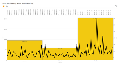
This visual is possible with our GUI based Editor tool - PBIVizEdit. Below is the viz you needed. I have attached the .pbix and .pbiviz in case you need to refer those. If you want to tinker around for settings let me know and I can share the editor template for this visual (for any further modification to the visual) with you.
The visual is free and without any limitations on Desktop.
https://drive.google.com/file/d/10jrwebLPy40QI0CLauSW3MvTgNZzeEPB/view?usp=sharing
https://drive.google.com/file/d/1i16jJ9OcxPdxnU_Dj0HH18dD7ZzMwyEn/view?usp=sharing
Helpful resources

Microsoft Fabric Learn Together
Covering the world! 9:00-10:30 AM Sydney, 4:00-5:30 PM CET (Paris/Berlin), 7:00-8:30 PM Mexico City

Power BI Monthly Update - April 2024
Check out the April 2024 Power BI update to learn about new features.

| User | Count |
|---|---|
| 114 | |
| 99 | |
| 83 | |
| 70 | |
| 60 |
| User | Count |
|---|---|
| 150 | |
| 115 | |
| 104 | |
| 89 | |
| 65 |


